Jack Roles - Senior Designer.
I’ll explain the first phase of creating our Babylon DNA, the design system for Babylon Health, and how we moved the Babylon design team from Sketch to Figma.
If you work in the digital design industry, you’ve more than likely read a dozen articles about the big transition from Sketch to Figma, it’s nothing new.
However, in this post I’ll walk you through the difficulties the team where facing using the previous setup, why we selected Figma, and what we’re still learning.

Getting up to speed
In July 2019 I joined Babylon with the task of starting to create Babylon DNA - Babylon Health’s new design system.
As a new designer in a fast-growing business, it was essential for me to get up to speed quickly and efficiently. To do that, I had to look at the tools being used by the design team, their ways of working, and the condition of the existing design system and pattern libraries.
My main focus was to streamline and improve the native iOS and Android design libraries and the tools the team were using. It was crucial to communicate with the design and engineering teams to understand what was working well, what wasn’t, and to analyse the existing process.
The obstacles our designers faced
After speaking with the existing design team, we identified several areas of concern. The most notable amongst designers was the sheer number of design tools they had to work with.
On a day-to-day basis, our designers were reliant on multiple tools including Sketch, Miro, Zeplin, Abstract, Invision, JIRA and other methods of prototyping. Designers using this amount of software is not uncommon, and it was clearly causing issues here at Babylon.
Designers were also working from multiple, unmanaged Sketch libraries. We spent some time observing our designers, watching them try, painstakingly, to use the Sketch set up. We found it took them longer to find components than to design the actual screens. With no ownership over these libraries, they had become extremely difficult to navigate and use.
Once designs were completed, they were uploaded and split between two design hand-off tools, Abstract and Zeplin. With both being used it was incredibly difficult to know which tool an image had been uploaded to, and where it could be found.
Zeplin had become a dumping ground for design and there was very little management of it within the team. Not all screens were tagged and many designs would sit under ‘untitled’ sections, making it extremely difficult for anyone to navigate.
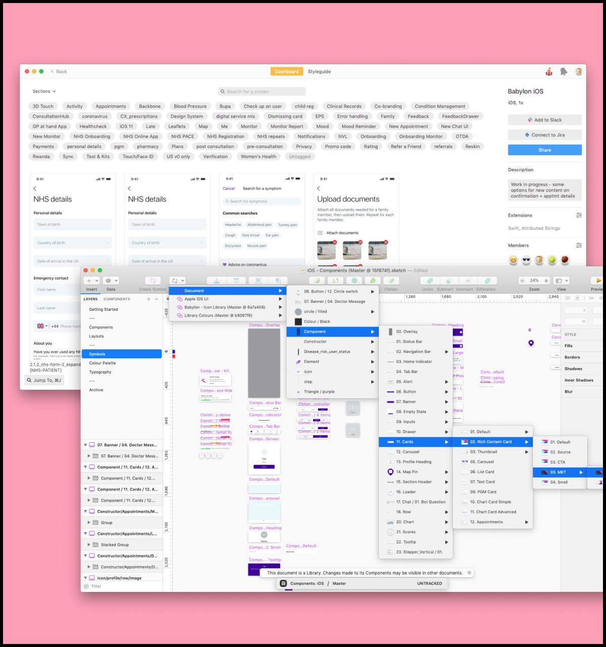
A snapshot of our iOS Zeplin project and Sketch library.
And many of the team had come to loathe the combination of Sketch and Abstract, too. It had become painfully slow and frustrating to use, and designers felt it hindered the speed with which they could work. Its consistent ability to lose and failure to commit work had earned it a bad reputation with the design team.
A lack of documentation and rules around existing components was causing complications. It was unclear what existing components or patterns were for, or how they should be used. As a result, components were being used incorrectly and implemented in products and scenarios they were never intended for. Designers were calling out for clear documentation and a dedicated design systems team.
Frustrated engineers
Designers weren’t the only ones feeling frustrated. With no access to the Sketch libraries, our native engineers had zero visibility of what our designers were designing from. They were reliant on the files in Zeplin and Abstract being up to date.
Design focused on iOS first and then Android, with iOS design patterns often filtering into Android designs. Engineers were not being included in the design process and would only see designs at the hand-off stage. At this point, there was often back and forth, as engineers and designers had to agree a compromise between what had been designed and what could be implemented. This lack of transparency was fundamentally reducing the speed of delivery.
We also discovered that our native engineering teams had access to their own extensive UI galleries that our designers were unaware of. Set up by Maxime Mazzone and Sergey Shulga, the galleries contained all the core UI components. These galleries also had ‘unsupported components’ which were not intended for widespread use. The main purpose of these galleries was to provide visibility of all components that had been created.
“We just wanted to list what was available for our engineers. After a few weeks we added the ‘unsupported components’ as a request from Android engineers that wanted to know all the components, not only the official ones.”
Maxime Mazzone, Android Software Engineer
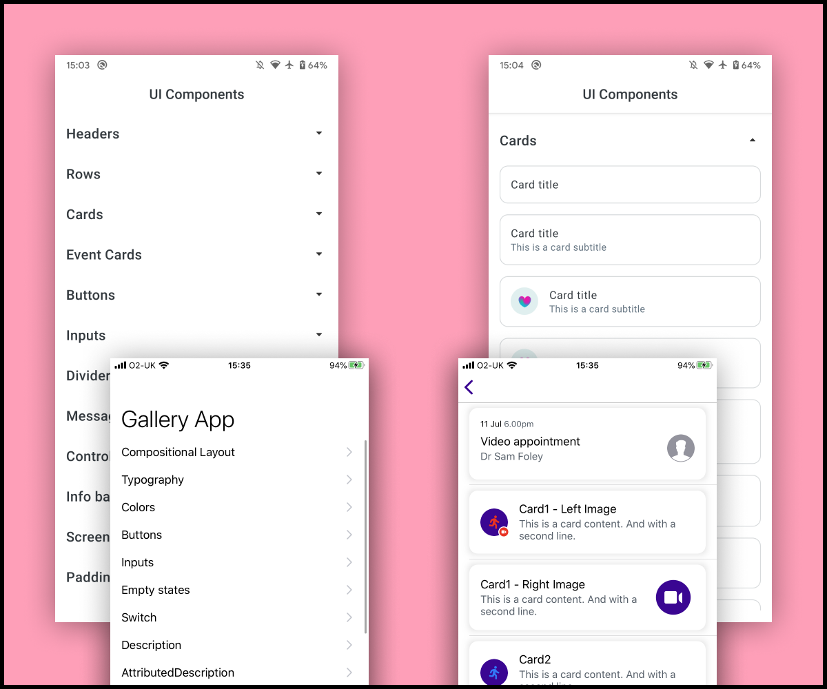
The pre existing Android and iOS UI galleries
What was needed?
Our initial idea was to clean up the existing libraries and hand off tools. But this still would not have solved problems such as the lack of collaboration, and would not have made our design libraries visible to our engineers.
It was clear that we needed a fresh start, and we needed to provide our designers, engineers and squads with a better experience when designing and building healthcare products. Collaboration was key, and we needed to identify a viable tool or process that would encourage this.
Someone needed to own this work, too. Teams across Babylon needed a central point of contact for libraries, components and the design system.
Moving away from Sketch was our starting point.
Experimenting with Figma
To begin with, we considered 2 options; Figma or Framer. We feared that Framer would involve too much upskilling and we needed the team to adapt quickly and efficiently. So me, Daniel Souza, Chris Clarke, Ed Russel, Romi Fellows and Joao Araujo experimented with Figma.
We listed the pros and cons of our current set up and used that as a benchmark to see if Figma could work for us. The pros eclipsed any cons we could find.
Here are just a few of the benefits we identified:
•By virtue of being browser based, Figma allows access to files anywhere with an internet connection; perfect for working remotely, our international teams, and sharing files throughout the business
•Multiple users can work on the same file, all with different access requirements
•It offers a commenting and tagging feature
•It lets you add descriptions to components
•Figma’s speed and performance is significantly better than Sketch
•Existing Sketch files can be uploaded
•Lots of useful library features, like version control
•Figma is set up in a similar way to Sketch, so in theory the move could be straightforward and would only require a small amount of up skilling.
•Built in analytics tools let us see how people are using the libraries
After experimenting and using the list of pros and cons, our decision was made: we were going to move to Figma.
Recreating the UI galleries with Figma
Initially we decided to focus on creating the component libraries for Android and iOS.
We could have simply uploaded the existing Sketch libraries into Figma and continued from there, but we wanted to test Figma in its entirety. We agreed to bypass existing files from Sketch, Zeplin and Abstract and start again using what was in our coded native UI galleries.
Working with Maxime and Sergey, it was crucial the master components in our new Figma library matched what was in the UI galleries already built. The master component would live within the library, and designers would be using a copy of the component in their designs.
Using Figma’s sharing and comments feature ensured that everyone had visibility of progress, and that we could provide direct feedback on a component if it was incorrect. I also introduced a post-it note component to highlight important aspects that needed to be addressed. The fact that Figma is browser-based allowed us all to interact and participate in the file at the same time, which was invaluable as Maxime works remotely in a different part of the UK.
An example of one of our Figma frames using post-it notes to help raise awareness within the library.
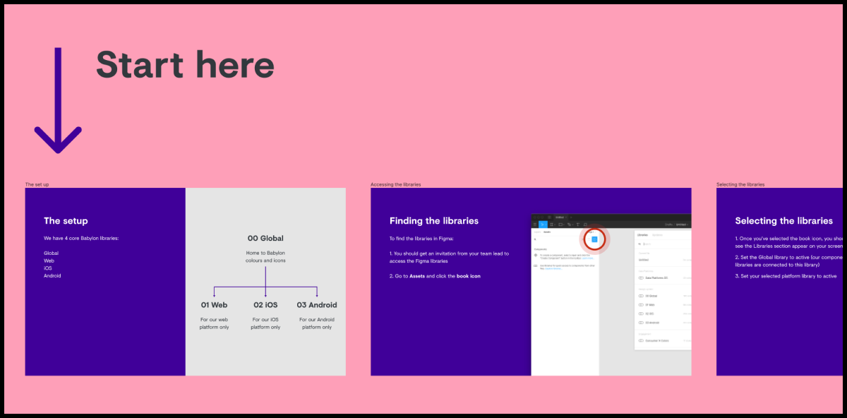
Our Figma setup
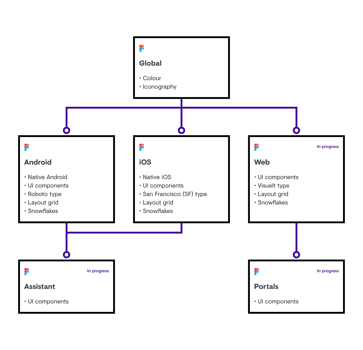
Our setup consists of four core libraries; 00 Global, 01 Web, 02 iOS and 03 Android. Owned by the design system squad, only certain users have access to edit to the master components.
The 00 Global library is arguably our most important library. It hosts the foundations of our products including colours, icons and will soon contain illustrations. 00 Global feeds our iOS and Android libraries, any alterations we make here then filter down into the libraries that are linked to it. Approaching it this way reduces any unwanted potential rebranding, colour or iconography updates to the component libraries.
We had to add our text styles to each of the specific platform libraries. Currently we use different fonts; Roboto for Android, San Francisco (SF) for iOS and Visuelt for Web. Ideally we would use one type style across all platforms, and host this within the 00 Global library.
For our native libraries we included larger type sizes, so that designers can see how their designs work if a user has larger accessible sizes selected. This is similar to what I did in a previous role, instead of just text we included components with larger text sizes to illustrate the importance of accessibility when designing layouts.
An overview of our Figma set up
We consciously avoided the popular atomic model in the setup of our component libraries. We needed to highlight the vast number of components we already had available to use. It also meant we could organize our components more effectively by displaying and naming them by function, like app bar, banner or bottom navigation, making them easier for designers to find.
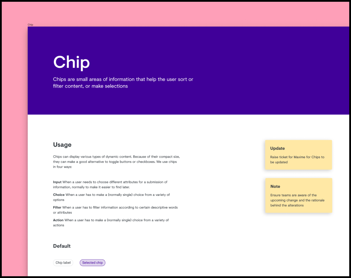
All components are organised within frames. Each frame acts as the grouping for that particular component - containing any variants and applications - as well as making it easier to scan and identify components. Organising within frames also lets us include lightweight documentation and examples of components to show how they should be used - for example, highlighting the different rules for using separators on iOS and Android.
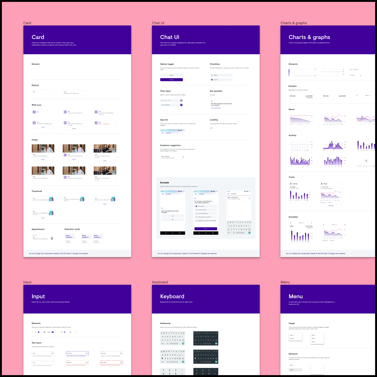
An example of how our library is structured and supported with lightweight documentation
At a component level we applied and set up the correct constraints so that we could define how components react when they’re resized. This allows designs to be tested across varying screen sizes.
Components can be updated using different instances, for example replacing one alert style with another. Instances within a component can also be updated, an example being updating or removing an icon.
Snowflakes
These are components that we think are useful, but aren't quite ready for widespread use in the component library.
We adopted the term ‘Snowflake’ based on the article ‘Design Systems: Why Snowflakes Are Counterintuitively Integral’ by Mike Rivera. However, our ‘Snowflakes’ were inspired by the existing work in the Android UI gallery and their non-supported UI area. This area was already acting as a ‘Snowflakes’ section within our coded UI gallery. To provide greater visibility we decided everything would go into our Figma libraries, and created a ‘Snowflakes’ page.
We wanted to demonstrate that the new libraries would not hamper creativity, and instead show that we actively encourage it.
We still ask creators to add some basic documentation to their Snowflakes though, so it’s clear to everyone what each element is and what it’s being used for.
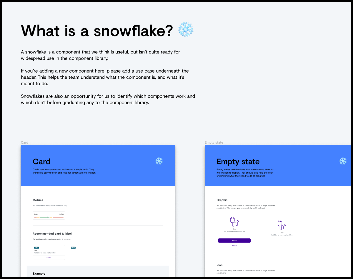
An example of our Snowflake area
Zeroheight
Whilst creating components in Figma, we synchronized the completed components to Zeroheight; an online platform teams can use to create and maintain design system documentation.
Zeroheight allowed us to quickly create documentation and share it with the wider team. The tool was extremely impressive and worked well with Figma, making updates easy.
This was an interim solution until we were in a position to share the Figma libraries throughout the business and had a dedicated team to build our own platform, which would give us more flexibility.
Releasing Figma
During the process of recreating the libraries, a few members of the team had access to test them out, most notably Joao Araujo. Joao tested components, the library and file structures for us, and he even generated a pain and gains file in Figma to share his feedback
We then started the rollout with one squad using the Figma libraries. The rollout was gradual, with our US team based in Austin being one of the first adopters. We collated feedback from our first set of users, and quickly rectified any inaccuracies or issues with components.
Moving individual squads over gradually meant we could identify and solve any problems early on. It allowed us to answer and resolve any concerns about the libraries and Figma in smaller batches and in greater detail.
After this, we were confident enough to roll Figma out to each squad ready to use the libraries. Before releasing globally we included a ‘Getting started’ guide for new users to Figma and our libraries, which explained how the libraries worked, the file structure used, and who to contact for support.
A snippet of out ‘getting started’ area
Figma Auto Layout
Figma also released a new feature just before launch, Auto Layout. Auto Layout ‘allows you to create dynamic Frames that respond to their contents’. In simple terms, if your content needs to grow, then Auto Layout will respond and grow with it.
For now, we’ve only added this to a few components, as including this in every one effectively would mean completely refactoring the libraries. The absence of Auto Layout isn’t currently blocking anyone, and for the moment, it’s vital we have visibility in every instance available.
The team's reaction
After releasing Figma we had to gauge how our teams were adapting to the move. We asked several members of the team how they found the initial transition.
“The biggest benefit has been sharing. Loads of other little features are nice (autolayout etc.) but I used to have to spend ages exporting things, putting them in Miro, or in Drive, sending people screenshots for feedback. Don’t have to anymore and it has saved me a lot of my sanity.”
“Having everything available and not just a list of screenshots, compared to Zeplin, is really useful.”
“Some of the biggest benefits have been not having to use Zeplin, not having to use Abstract and being able to collaborate with content in one space. My main pain now is not being able to link screens in a flow easily. Sometimes I'll still use Miro but then it means exporting it and managing a second lot of screens. Overall though it's definitely been positive. Also positive for the speed of my computer!”
“Moving to Figma has made life easier as I can now collaborate and iterate much quicker. It helps me try out ideas, layouts and hierarchies in context and share these with designers or stakeholders, without having to worry about merge conflicts.”
Nick Cowan, Lead UX Writer
“I like that everything is linked and you can go and see master components. I also like being able to extract icons myself.”
“It's made content/designer collaboration much easier, and particularly asynchronous collaboration. There are still some things I don't love about it – particularly in comments, which I find hard to organise and sometimes don't seem to show up; and navigation. But overall it's a beautiful tool.”
“Well I haven't really used Abstract/Sketch at Babylon because I joined as we switched, but based on using abstract/sketch at my previous place the biggest thing would be Shareability. Being able to send someone a link so that they can leave comments is great, and it means you can collaborate between engineers and design much easier because there's instant visibility. Also in my previous company opening a Sketch file via Abstract could take 10/15 minutes so even if you were just trying to show someone something on your own screen it was hard to share/reference a selection of files.”
So far the move to Figma has proven to be a wholly positive experience and a welcome move by the team. However, there is more we can do to improve the set up for everyone.
What next?
Analytics
Using the built-in analytics feature, we plan on identifying which components are being detached from the library and why. This will help us understand how the libraries are being used and which areas to focus on improving. We can also investigate components that are not being adopted by teams. We’ll ask why they’re not being used and can archive them if necessary, to make sure the libraries only contain what they need to.
Accessibility improvements
Not all of our components passed WCAG 2.1 AA accessibility criteria when we began this work. Now that the libraries are visible to everyone in the business, we can begin to roll out fundamental accessibility changes and improvements. Any changes we make to components can be updated across all files linked to the libraries.
Contribution
Creating contribution guidelines is one of our biggest upcoming areas to focus on. We need to learn the best way to help teams contribute new components to the design system and our Figma libraries. It’s important that the design system team doesn’t become a bottleneck and that the process is clear, obvious and accessible for everyone and something they can easily follow.
Web
Now that we've completed the first phase of work on our iOS and Android components, we’re moving our attention to the web. We’ve got our work cut out for us, as there’s a lot more variation across our web platforms than in native. Once we’ve completed the transition of our web library, we can then take our final steps of sunsetting programs such as Sketch, Zeplin, Abstract and Zeroheight.
The move to Figma and updating our libraries is just the first step in our design system journey. The process wasn’t perfect and it took time to get it to where it is now. Most importantly, we’re still learning.
How can we continue to collaboratively build our libraries?
How can we help our designers follow a consistent file structure?
How can we better support contribution?
Our team is working tirelessly to find answers to these questions, as well as continuing to grow our design system. One thing is for certain, the move to Figma was a good one, and our teams are reaping the rewards of collaboration.
Figma London
I also spoke about our successful move to Figma at Figma London in June 2020. Designers from Spotify, Deliveroo and Figma also talked about their workflow, plugins they're using and ways they document their work.
COVID-19 and Figma
With the outbreak of COVID-19, Babylon has moved swiftly to generate a Coronavirus care plan. The goal was to provide a self-isolation care plan for patients that contained information, and symptom tracking. This was for patients that had been directed to self-isolate by a clinician due to a possible case of COVID-19.
With the outbreak of COVID-19 the team had to work remotely and deliver this critical piece of work.
“We had to work collaboratively for an entire weekend, that would have been impossible with Sketch. Copywriters, designers and stakeholders all got directed to Figma to review and work in the same file.
We did have some issues when we had more than 20 viewers in the file. But that gives you an idea of how many people were involved and needed to be in the file. ❤️ Figma.”
Adrian Lopez, Lead Product Designer Health Management Tribe
“The Babylon DNA design system was instrumental in allowing us to put our new COVID flows in production quickly and easily, to experiment and iterate - focusing on nailing the content only, while relying on a robust design library. It’s also allowed us to prototype concepts really fast, for the next phase of COVID Care Assistant.”
This work demonstrated the brilliance of Figma's collaboration features. It allowed the team to deliver rapidly under pressure, and in uncertain times. With the whole team having to work remotely, this speed of delivery would have been impossible under the previous work flow.