What is a design system?
A design system is an assortment of reusable UI building blocks, influenced by rules and processes, that are available to the design and development team in order to design and build.
At the heart of the system is the pattern library. We created ours using Sketch and their library feature. This library houses all the building blocks that allow us to design in a coherent, consistent and nimble way. The library is most effective when those building blocks are replicated in code, this reduces the time to build as well providing consistency between designs and final product.
The design system is more than just a library of UI building blocks. It requires getting everyone on board, not just your design team. Standardising the tools to use, clear communication and working collaboratively as a product team are just as important.
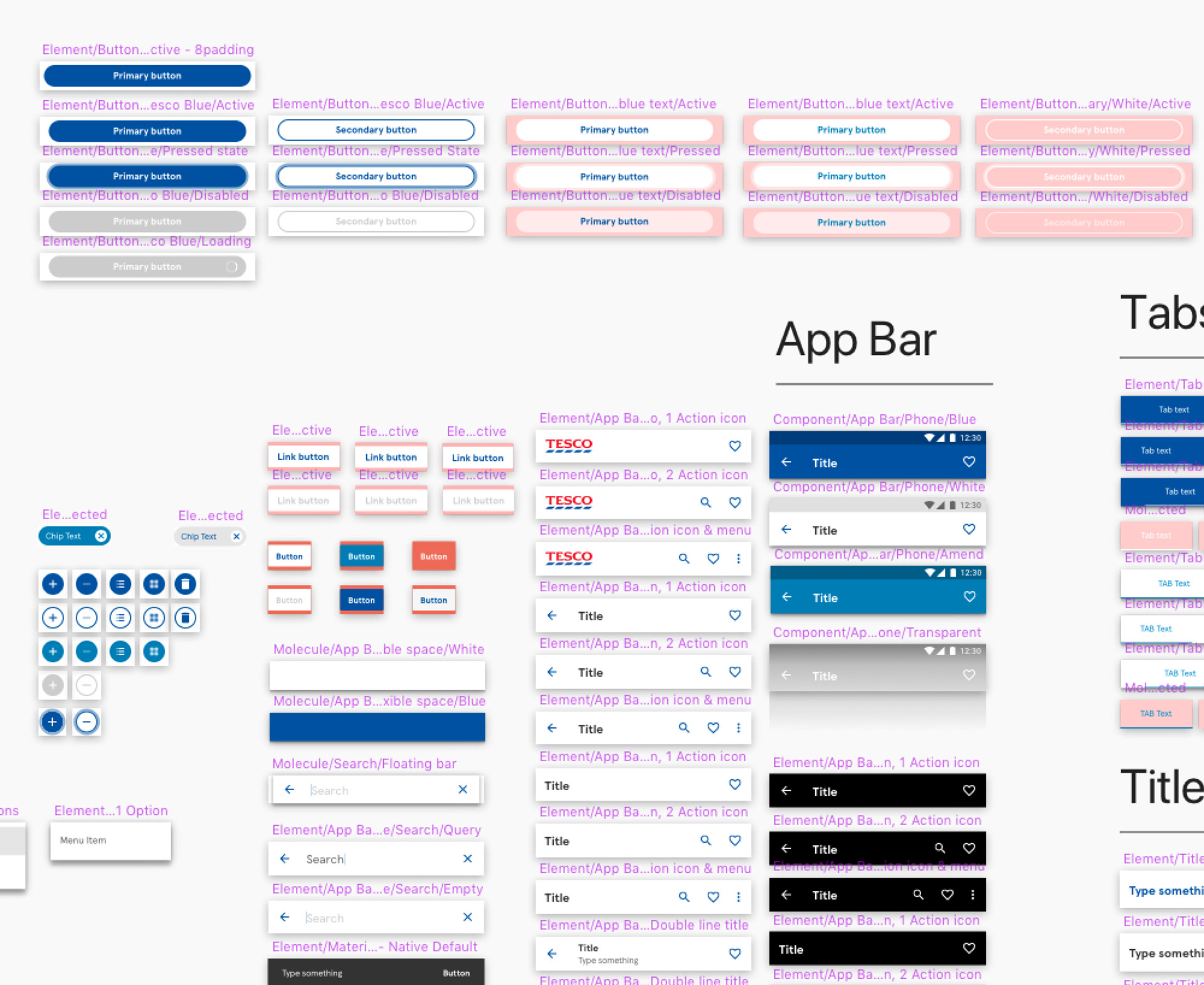
A small snippet of our Android design system.
Why did we need one?
Over the years our range of apps all followed separate design toolkits, UX patterns and guidelines. Design teams working in silos on different apps and none of them following the same patterns or design tool kit.
With the redesign and re-platform of the grocery app, this was an opportunity to create a system and pattern library that we could use on all existing and future apps.
Creating the system would allow the team to be more effective and efficient in our work-flow. It would allow us to move faster and focus on solutions to problems, not the pixels. No more redesigning a product tile or changing the colour of the button, as we would already have establish these components and elements in our pattern library.
How did we create our system?
We used Sketch’s powerful and effective library feature to create our pattern libraries, for iOS and Android. We based our components and elements on native first, looking at all existing UI elements from Apple and Android, then incorporated it with Tesco’s digital design language (DDL). Replacing Apple and Android fonts, icons and colours with those of the DDL. We also made sure that all components and elements we created considered accessibility before they made it into the pattern library.
We shared our pattern libraries with the iOS and Android developers; we had to ensure that a component and element in design was the same when built.
The pattern libraries could only be saved by 2 members of the team. This was to prevent other members of the team making changes that could ultimately affect the libraries.
Aspects of our pattern libraries are based on Atomic design, coined by Brad Frost. This atomic approach allows the design team to focus on components and elements that users interact with and how they fit together as a whole. Our system involved more than just extensive pattern libraries and a well defined JIRA board. We had 3 other factors that helped our overall system.
1. Communication.
We had to ensure there was clear and concise communication between design and development. As a wider team we made sure there was a design presence at every stand up and developer meeting, and no working in siloed meetings when it come to delivery. Development is design. With the design team working more closely with developers it ensured that our pattern library and designs were realistic and feasible. It also ensured that our final products looked and functioned as intended. If the pattern library wasn’t working for a particular problem the design team would convene together to help solve the issue. Collectively we would agree, or disagree, if a new component or element needed to be added to the pattern library. This often took place around our desks for speed and effectiveness.
We had to ensure there was clear and concise communication between design and development. As a wider team we made sure there was a design presence at every stand up and developer meeting, and no working in siloed meetings when it come to delivery. Development is design. With the design team working more closely with developers it ensured that our pattern library and designs were realistic and feasible. It also ensured that our final products looked and functioned as intended. If the pattern library wasn’t working for a particular problem the design team would convene together to help solve the issue. Collectively we would agree, or disagree, if a new component or element needed to be added to the pattern library. This often took place around our desks for speed and effectiveness.
2. Keeping the design simple and flexible.
By thinking native first it enabled us to design components and elements quicker and in their simplest form. We would then improve upon them depending on where and how they were being used. As Tesco is an international brand used by a range of different users, we had to ensure our components and elements allowed for spacing, truncating and growing text sizes for accessibility. We also made a conscious decision that every component and element we made had to be reusable, fundamentally speeding up our design and delivery process.
3. Clear objectives.
It was important for the team to have clear-cut measurable objectives. We had 3 key objectives; re-platform the grocery app, design native first and align designs with the updated Tesco brand. This allowed the team to establish standards and evaluate our performance.e button, as we would already have establish these components and elements in our pattern library.
How did it work?
The library has Tesco’s design language and native patterns at it’s core. The system encourages the re-use of components and elements when constructing pages or products. By encouraging the reuse of components and elements it resulted in reduced duplication, greater design consistency and fewer designs coming back for amends and checks.
We made a conscious decision that every component and element we made had to be reusable, fundamentally speeding up our design and delivery process. The nested symbols and overrides feature encouraged the re-use of components. This meant that we had fewer symbols that were similar and gave us more power and control over individual instances.
We built in the padding and margin, following a 4px grid, to all components and elements within the system. Doing this made the design elements stackable, creating a LEGO style structure.
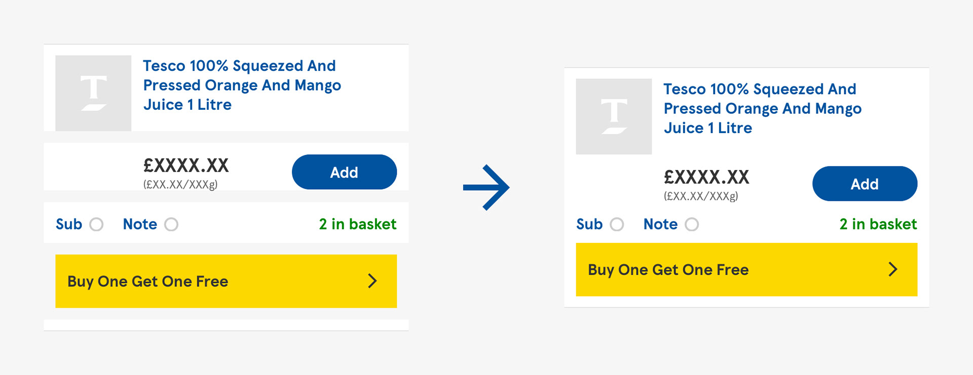
Example of how our stackable elements worked.
Present and future benefits.
With an array of different apps to support, we had to ensure that our system and library was scalable.
We had to ensure that our design system was flexible enough to withstand the numerous edge-cases with e-commerce as well as being malleable enough to work across tablet, future and existing apps.
Going forward, all future apps would use the same design system and code base as the new grocery app. The biggest challenge lies with moving existing apps, like Clubcard, over to the same design system and code base.
After re-designing the grocery app, we used the same system to create a concept scanning app. This app gave users the ability to scan products as they shopped and checkout on their own device. We called it Scan Pay Go. Using the system to create and build Scan Pay Go demonstrated its efficacy and scalability. We were able to go from concept to reality within in 6 months. This further verified to the team the success of the system and its ability to support all current and future apps going forward.
The system has proved it's scalability as we use it to design and build our new tablet apps.
The system was more than just a pattern library.
Zeplin was the perfect place for us to have up-to-date designs. It acted as a single source of truth for final designs that had been through grooming, and allowed developers to build the app to accurate specifications. All work in Zeplin had to be sectioned and tagged so it could be discoverable by the whole team. The notes tool also helped the team work closely with our off shore engineers, by communicating directly on designs.
We introduced weekly design peer reviews for the team to share designs at any stage in it’s process. The idea for the reviews was to reinforce design solutions, ensure that the design system was being used and if required, provide a clear route to an improved solution. The reviews acted as an opportunity to see how effective the system was and if any elements or components needed to be added or improved upon.
Developing a theming architecture.
Finally, we also established that we could run a different theme through our design system. The same system allowed us to create the Jack's: Shop Smart app. Working with our engineers we developed a theming architecture which allowed us to change an app’s fonts, assets, colours and other styling options. This meant we could quickly and easily rebrand and restyle an entire app by changing just one line of code.
This also enabled us to use different fonts for each theme, and even have multiple fonts in one theme if necessary, with perfectly calculated font line heights allowing for pixel perfect design.
The design system we created at Tesco paved the way for more effective collaboration between designers and engineers, which ultimately enabled us to deliver such an elegant theming solution as well as a greater level of design consistency across our apps.
⭐️
Our system and pattern library is changing the way we design, making the team more aware of the problems they're trying to solve. It has demonstrated the benefits of having clear communication, objectives and keeping designs simple.
The system is far from being perfect but we’re extremely proud of how far it’s come along. We are continuously reviewing it’s efficacy by getting it into users hands, allowing research and testing to feedback and assess its benefits and identify improvements. A huge thank you to everyone involved in getting the design system to where it is now and a huge call out to Chris Clarke, Iain McConchie and Jay Clark.