Jack Roles - Senior Designer.
Babylon Health wants to put an accessible and affordable health service in the hands of every person on earth. However, our web components were failing us in this mission. This post will talk through what Babylon’s DNA design system team did to fix this.
What was wrong with the existing web components?
The existing web components were based on designs from our iOS app. With no dedicated design resource, the engineering team attempted to align the design between the different platforms.
More importantly, the existing components were not accessible. Numerous components failed in 4 areas:
More importantly, the existing components were not accessible. Numerous components failed in 4 areas:
• Text colour and graphical objects failed minimum contrast ratios
• Inputs had no associated labels
• Components could not be accessed with a keyboard alone
• Links relied on colour to show it was active
There were also no design files or component libraries for designers to access. The GIF below gives you an indication to my reaction at finding this out!

My reaction to finding out we had no existing web UI libraries
Luckily, our engineers were organised.
The engineering team had created a storybook library, named internally as MedKit, displaying all the components used across our consumer facing sites. Storybook contained components including alerts, buttons, card styles, inputs and more.
We needed a plan of action
To get started we created a priority list. Using the MedKit Storybook as a starting point, myself and Amy Hupe, the DNA design systems Product Manager, generated a list of specifics we felt we should focus on initially. Using our prior experiences from Tesco and GDS, we focused on areas that we believed would add the most value and make a significant difference.
First, Foundations
We decided to focus on colour and typography, as these would determine the style and look of each component.
We used the colours already available from our global palette already being used for our iOS and Android products as we wanted to ensure that we only used existing colours. The reason for this was that our products recently updated to a new set of colours that teams were still getting used to and we wanted to avoid running the risk of causing confusion. By sticking with the existing colours we could create more detailed guidance around their usage, while at the same time strive for consistency across our products.
We also decided to stick with the existing Visuelt font. Although the font wasn’t the most accessible, especially for functional type, we decided to continue using it for the interim and generate a clearer type hierarchy. We knew decisions about the font choice still needed to be made and we didn’t want this to act as a blocker. By setting up the hierarchy correctly at the beginning this would make transitioning to a font easier in the future.
Since we made the decision to stick with Visuelt there have been some updates with the font for legibility and accessibility reasons. We now only use Visuelt for large headings and, after testing multiple fonts, we use Inter for all functional copy.
3 key components followed: Buttons, Links and Inputs
After looking at the foundations, the team would then move on to look at these 3 key components. Updating these core areas would have a crucial impact across our web platform, further demonstrating the value of the Design System team. More importantly just by focusing on these three core areas would fix a host of accessibility issues.
Design principles and process
Design principles
We needed design principles to measure our components against. Without design principles, design reviews and feedback would become opinion based without anything to measure and/or justify them against. We quickly pulled together some principles we could get behind; these were:
• Simple — communicate the intent of your design and don’t over-embellish
• Accessible — create inclusive products: start with best practice and ensure designs meet WCAG 2.1 AA accessibility criteria as minimum
• Scalable — does it work across different screen sizes, platforms, type sizes and languages?
These principles were based on a previous example I had used successfully at Tesco. Generating design principles can be time consuming and there have been several workshops and attempts at getting these right at Babylon. However we needed something to work with immediately that was simple, effective and allowed us to move quickly while still delivering quality.
Researching what was already out there
Before we began designing each component, we researched what already existed within Babylon, third party examples and recommended best practice. We also relied on our team’s previous experience and knowledge, with many of the team having worked on components for companies such as GDS, Tesco, Sainsburys and Ebay.
The team’s existing knowledge was pivotal as we had little resource to carry out extensive research and testing. We were also extremely lucky to have Ian Pouncey, an accessibility expert from TetraLogical supporting the team.
Share regularly, review often
We would have weekly design reviews with the just the DNA design system team. In sessions we went through the designs and early concepts to identify potential edge cases and accessibility concerns. For some of these sessions, I used a digital version of a method I had previous experience with at Tesco, based on the book Discussing Design.
Before the meeting it was important to identify the goals and purpose of the review:
• What are the objectives and user problems?
• What is the hypothesis behind the solution?
• What is it you need support with?
• Specify the desired feedback from the team
While reviewing the designs in Figma, comments would be made on 3 separate Figma frames: Positives, Solutions and Concerns. The purpose of this was to make it easier to view, organise and filter through the comments. A feature that’s not yet possible on Figma.
For each review it was important to have the core DNA team available to ensure visibility of the progress made. Everyone could then see the design progress, the challenges we faced and it would provide everyone with greater context around the decisions being made regarding our components. This was especially important for content and engineering, as they would now have full context around the component as we started documenting and building them.
We made sure to involve Ian Pouncey, from TetraLogical, in every review session. Ian’s knowledge and feedback was fundamental. He provided us items to consider, not just for design, but from an engineering point of view from the very beginning.
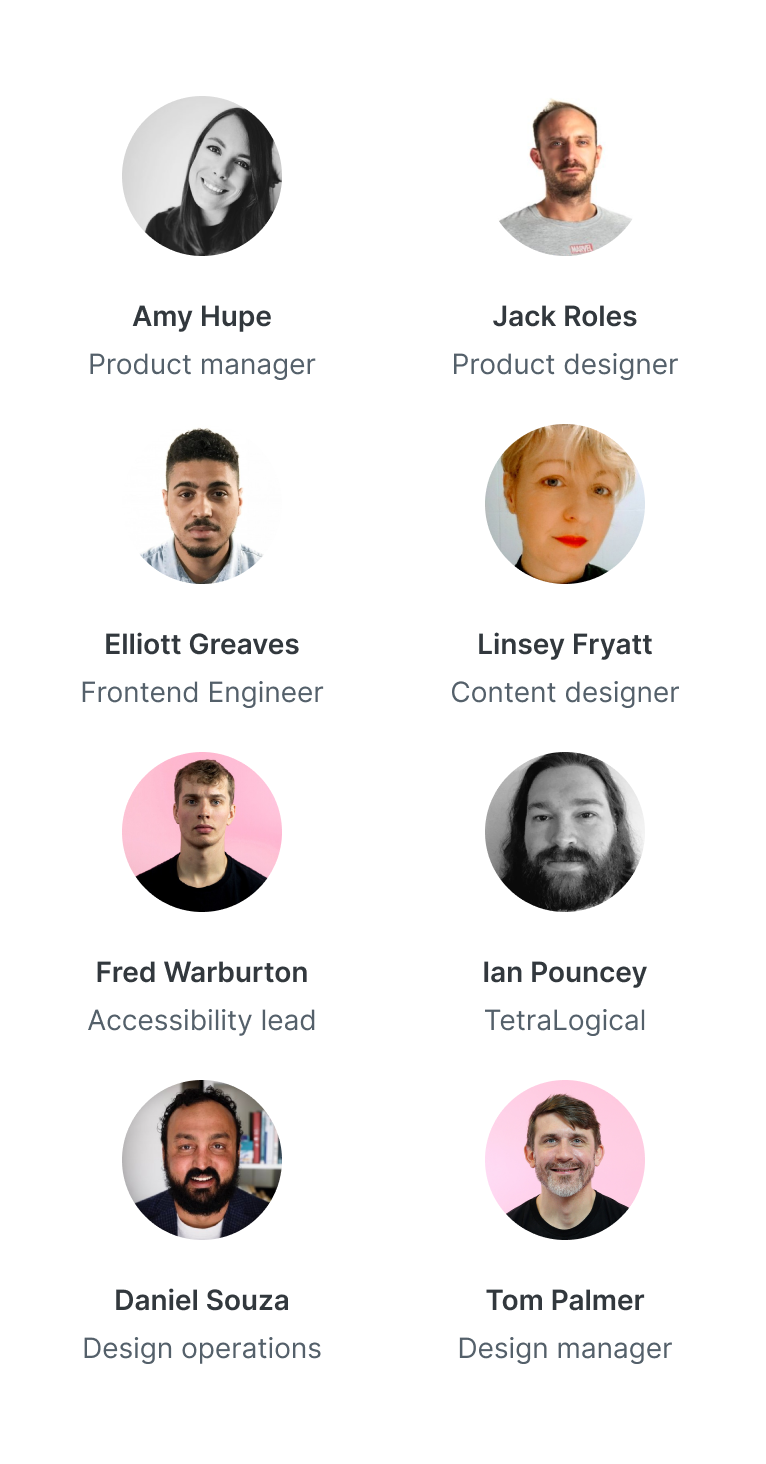
The usual suspects in our design reviews. Amy Hupe, Jack Roles, Elliott Greaves, Linsey Fryatt, Fred Warburton, Ian Pouncey, Daniel Souza and Tom Palmer.
Atomic Thursdays
We would share our progress and request feedback at our weekly ‘Atomic’ Thursday sessions. The purpose of the sessions were to obtain comments and feedback from the wider team and identify any edge cases or scenarios we may have missed. It also helped us identify why a team might find certain patterns popular, cards being an example. These sessions were also an opportunity for the wider team to ask detailed questions regarding the components and the direction they were heading in.
We also used the same review method that we used for the DNA team. In some cases we would ask additional questions within the file to help the team to move forward. The example below shows the beginning of our ‘card’ audit, where we wanted to know things such as ‘Why are cards so popular in our products?’ and ‘What should we be using cards for?’.
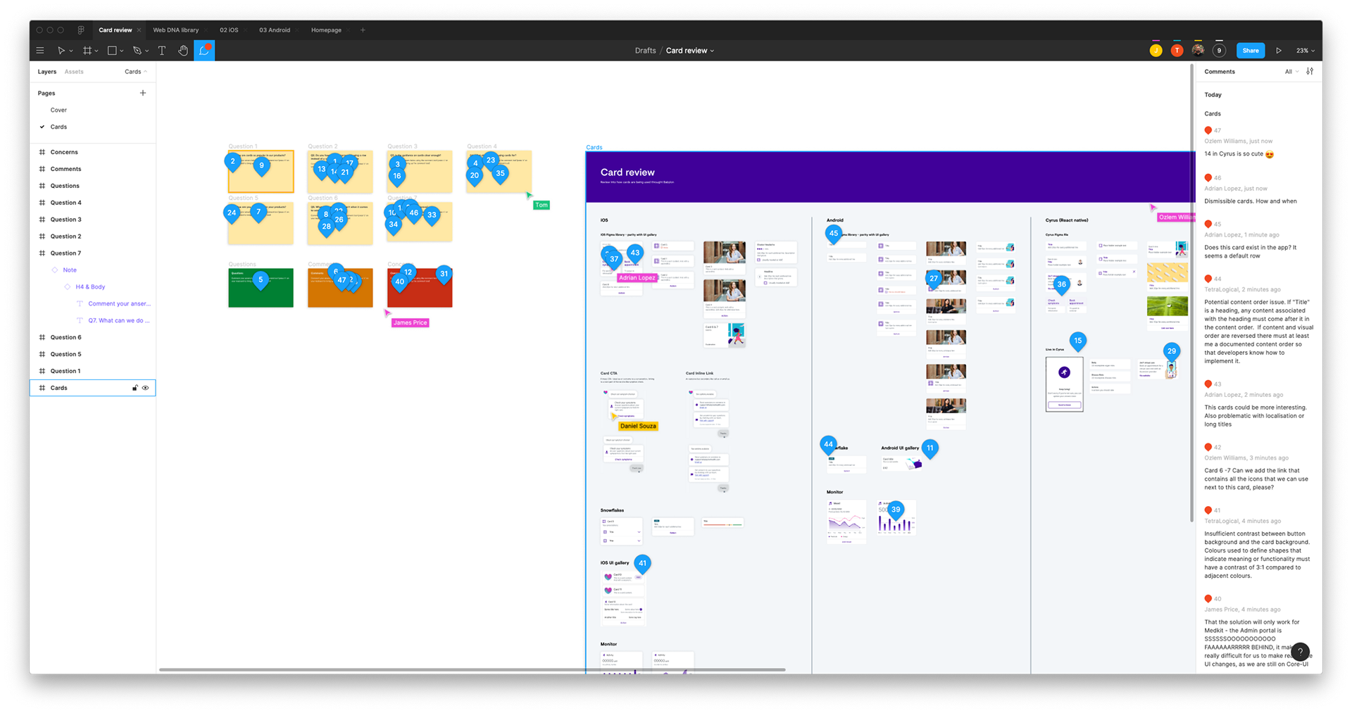
The early stages of our card audit
Our base set of components
Now I’ll go through some of the base level components we’ve created so far. These components have changed in style ever so slightly. For example; at the beginning we decided against using any radii on our input components. At the time our products used varying radii, so we held off until we could make a decision that best reflected the brand style. Since then the design language has evolved, we now use a 4px radii for all our input components, which is due to be released soon.
Button
The button set consists of natural and forced minimum width sizes, the latter usually used for mobile. We’re using a tap target of 48px, while maintaining a visual appearance of 40px. This reduces the amount of visual space our buttons could take up on screen, especially on smaller devices. We use an 8px radius, this ensured consistency with our iOS and Android platforms.
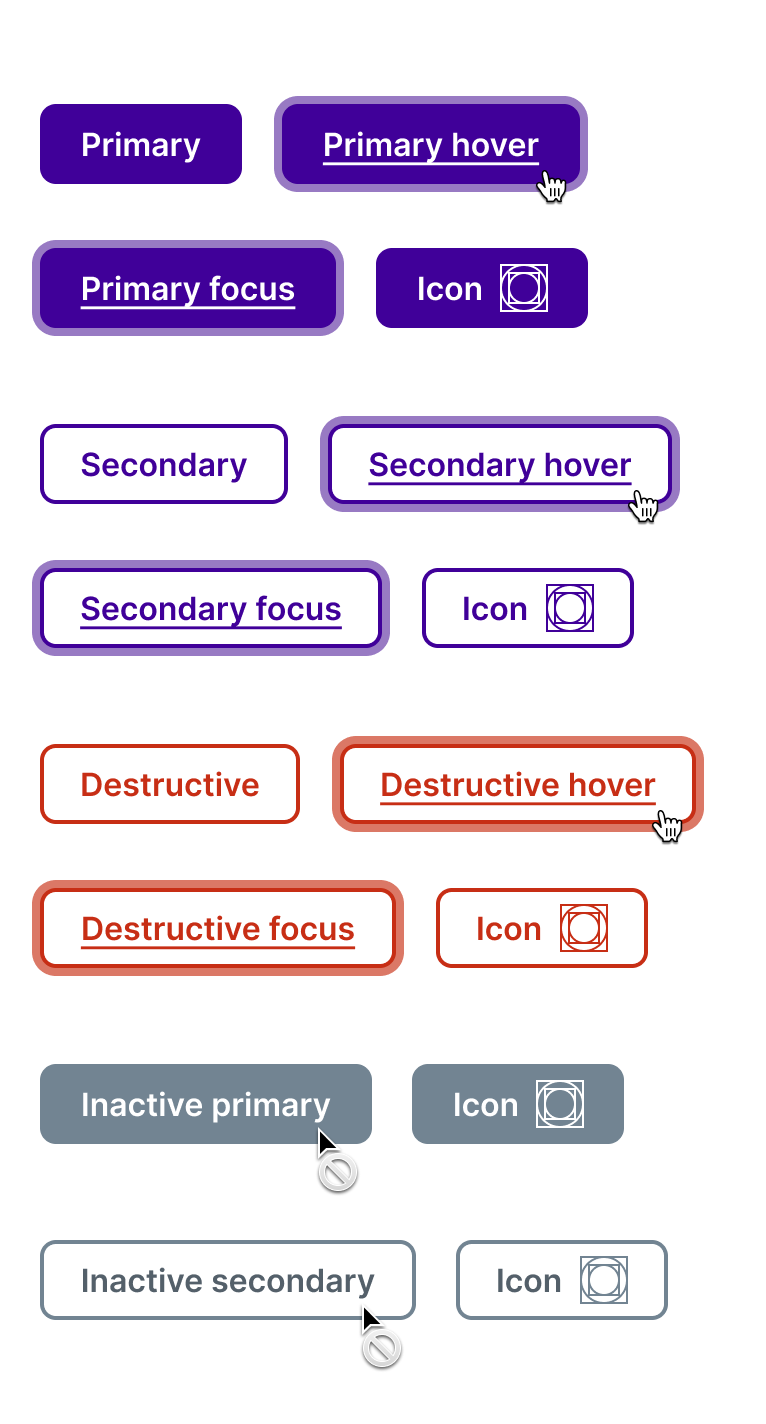
Example of all our button types and states
We also provided the buttons in two different widths, forced minimum and natural width. Forced minimum width is when the button is set to a fixed minimum width, usually determined by the width of the mobile viewport. With natural width buttons the padding stays the same as text grows.
Inactive buttons can confuse users, especially when the colour used passes the required 3:1 contrast ratio. Is it active or not? We wanted to avoid using them if possible. However, we had to support them in order to prevent any breaking changes to our existing products.
The focus state needed to be clearly visible, accessible and scalable so that it could work with our text fields, radios and checkboxes. It was also important that our inputs looked and felt as if they were all from the same group. The focus state itself simply grew 4px outwards from the component, using a toned down version of the Babylon Violet. This new violet passes the 3:1 contrast ratio for graphical objects, it works when applied to a white background and when Babylon Violet is applied on top.
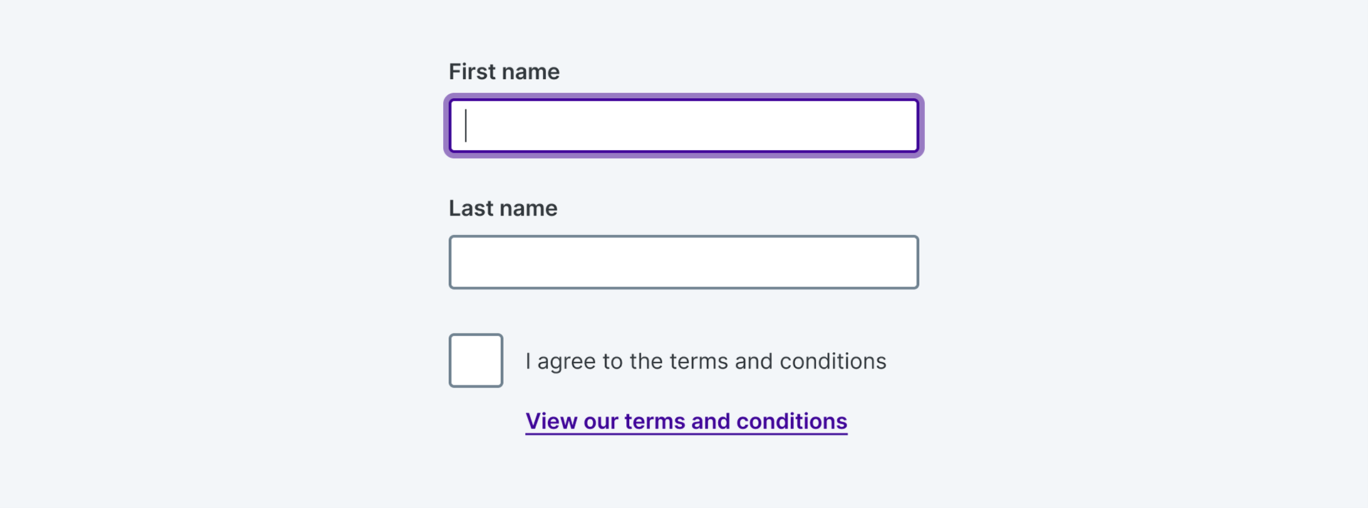
Links
We introduced an underline as a default to our standalone, inline and enhanced standalone links, instantly making them more accessible. Standalone links also followed the same 48px touch target rule as our buttons.
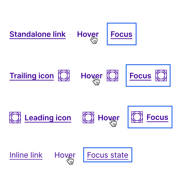
Example of our text links and it’s varying states
We updated our guidance on links that appear in a sentence or passage of copy. If links are required, they should appear at the end or in a list directly underneath. Making them more screen reader friendly.
"The link text change fixed 600 instances of accessibility defects in the web app."
Fred Warburton, accessibility lead
Fred Warburton, accessibility lead
Text fields
These followed the same tap area we used for our buttons, with a visual height of 40px with a tap/click area of 48px.
It was important for the radii on our inputs to differ from our buttons, the rationale was to give pages that use inputs, radios, check boxes and buttons a clear visual hierarchy. I experimented with the input shape, size and radius, then paired them with our newly defined button and link styles to see how they looked alongside each other.
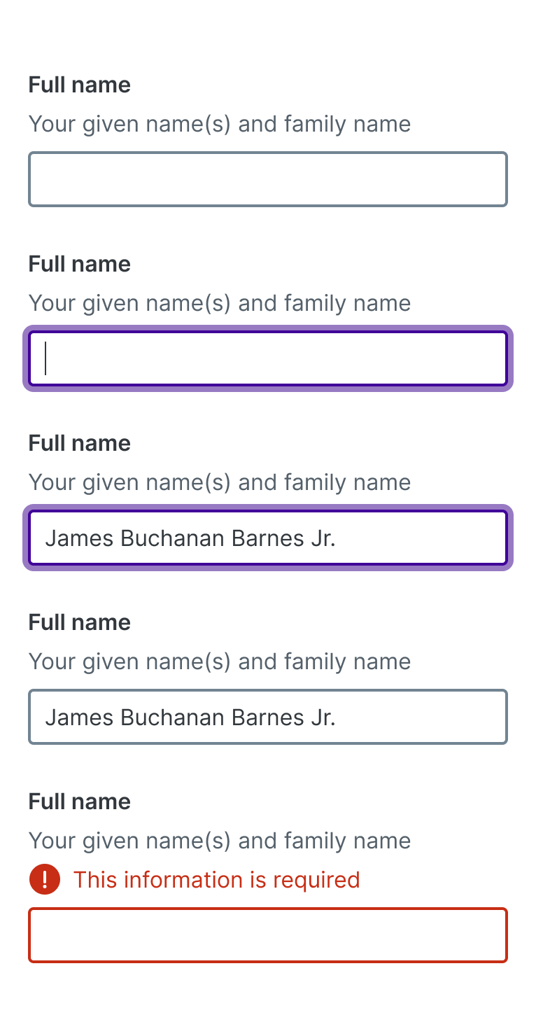
Example of our text input and it’s varying states
The shape and style also needed to be flexible to support different variants that include hints, hover, focus and error states. The final style had to be flexible enough to work for other input components, so it was key that we got this right.
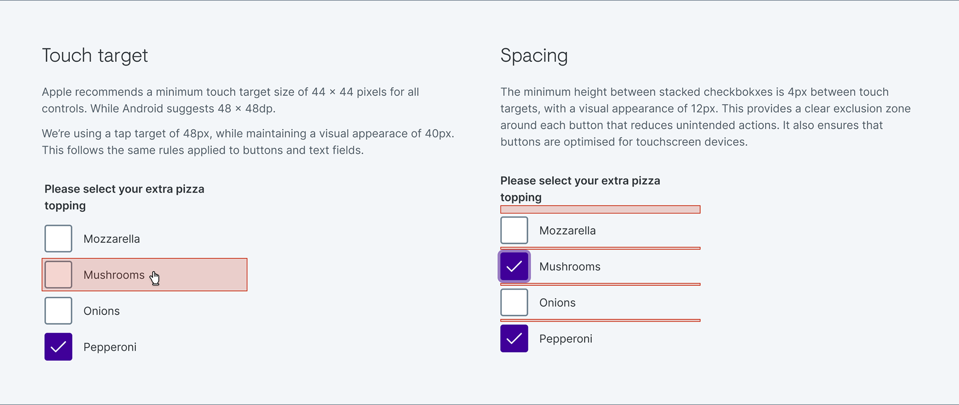
Checkbox and radio controls
These followed the same tap area we used for buttons and inputs, visual height of 40px with a tap/click area of 48px. This was controversial with many people asking why they need to be so big, however, the team unanimously agreed that these are equally as important as text inputs so why should they be any smaller?
These components are also used throughout our triage experience on our web platform, so it was crucial that they were large enough to tap and easily accessible.
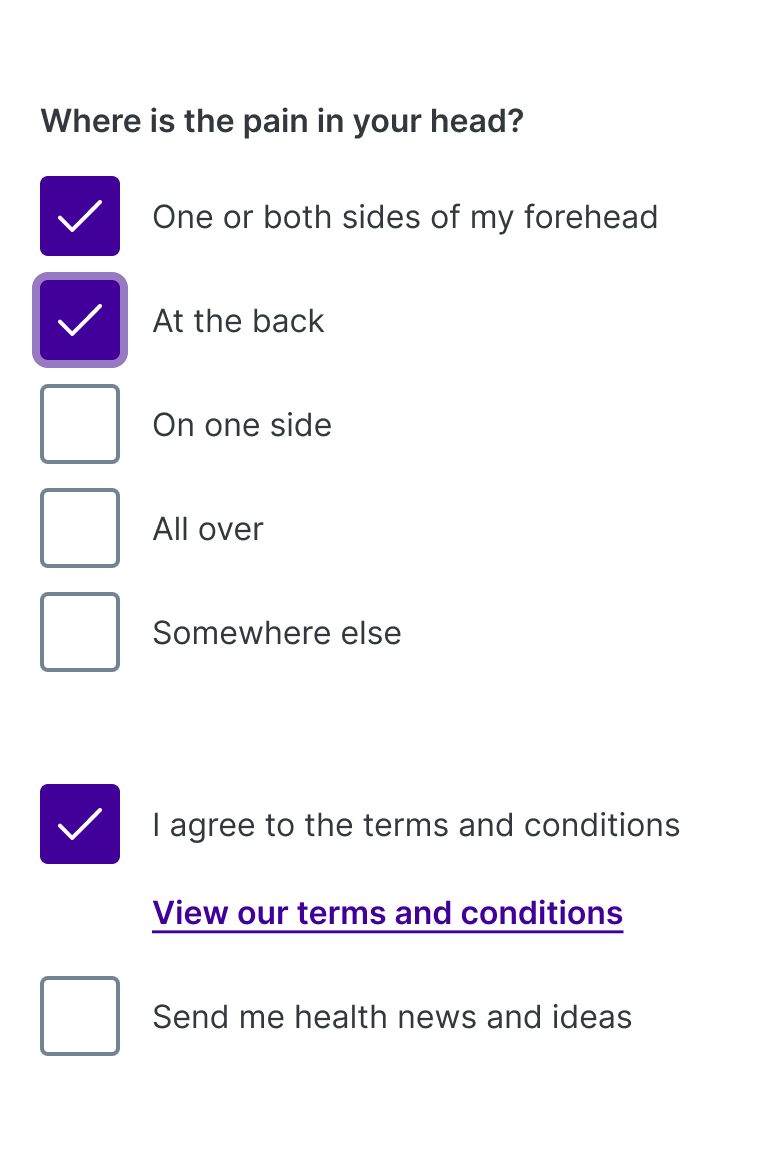
Examples of our checkbox controls
Examples of our radio controls, including an example to conditionally reveal content
We universally agreed that the field and the label had to be clickable. Much of the radio and checkbox design was inspired by Amy’s previous work at GDS, and the research they had carried out on radio and checkbox controls. This research supported the team’s rationale for having larger radio and checkboxes. Read about GDS radio and checkbox research here.
The checkbox and radio also use the same focus style that we created for our text inputs. This demonstrated how fundamental creating a focus style that could scale between components was.
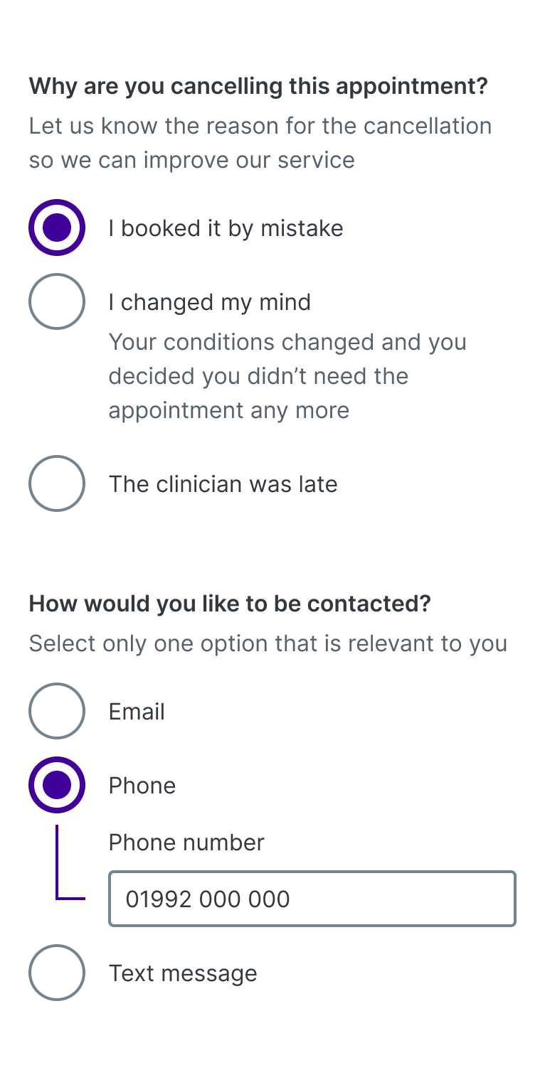
Error placement
We positioned our error text below the text field label. Placing the error directly below the label would provide more flexibility for implementation as the error could be part of the label or separate. Because the association between errors and input fields for screen readers happens at the code level, it generally doesn’t matter what the position is for them, so this decision was more for visual association.
Consistency for grouped controls was also another factor. Because the error comes before the input, the error can be positioned with the group label and clearly associated with the group, rather than after the group and potentially being confused as an error for a particular field within the group, which may have their own error messages. Radio and checkbox groups are great examples of this.
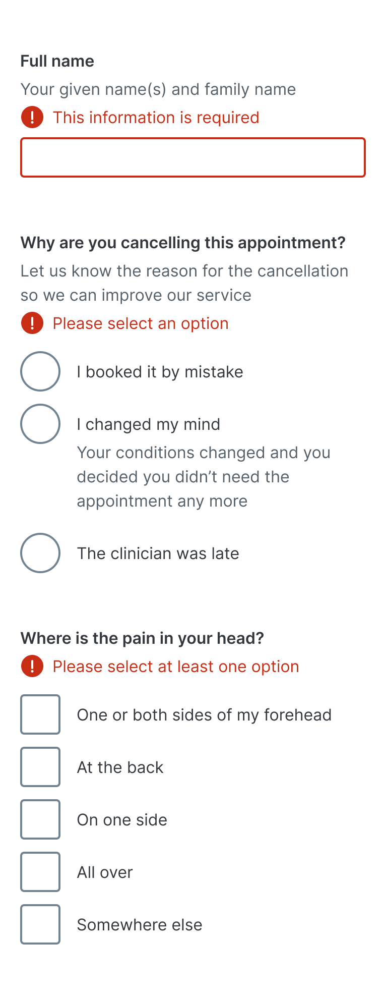
Examples of error placement on our input controls
Placement under the label also makes it clearer for screen zoom users. The label would need to be read by a screen zoom user, placing the error in proximity to the label rather than below the field means they are much more likely to be seen.
Another benefit of this approach is that it can be used to replace or update instructions. It offers flexibility to group errors with instructions, replace instructions with errors, or amend instructions to include errors; instructions should be placed before fields, this flexibility wouldn’t be possible with a different placement.
Components in context
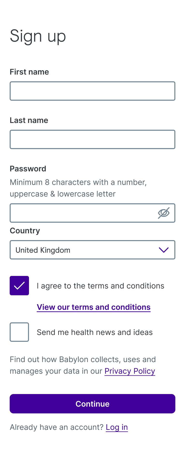
Sign up screen using the newly designed inputs
"I’m about as much of a super user as the web app has, and have seen the Registration page a million times but was still shocked by how much more usable it felt with the new input designs."
Conor Cussell, Lead Engineer.
Conor Cussell, Lead Engineer.
Theming
Every component we designed and built took theming into consideration. We had to ensure that our components were themeable so we could support localisation and potential third party clients. Colour, font and radius could all be altered and thanks to Elliott we could now experiment with this through storybook.
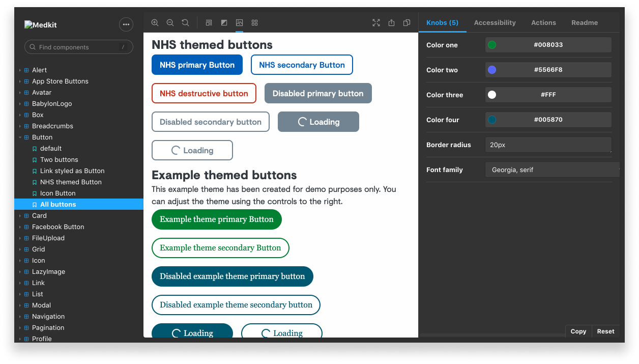
Experimenting with theming in our Storybook library, medkit
Documenting our components
After each component was completed we added extensive design, content and engineering documentation to our DNA site. Design would work a sprint ahead, that way we were not acting as a bottleneck for the rest of the team. We had to ensure that the documentation covered design, content and engineering aspects. Linsey and Elliott were involved in every stage of the process, from ideation to the final design. This enabled our components to be feasible and took different content scenarios into account from the very beginning.
As mentioned previously, it was extremely important that the team had full context throughout. Including everyone from start to finish made the documentation and building process more straightforward. The documentation wasn’t just for design, it had to work for our content and engineering teams.
We also applied lightweight documentation to Figma for designers. We assumed that designers that had worked with the components for a period of time wouldn’t always need to go to our documentation site for the answers they may need.
An example of the light weight documentation we included in our Figma library
Conclusion
In conclusion, these components have helped to bring greater consistency to our products. More importantly they have contributed in making our web platform more accessible. We are not finished yet, but these components and processes have aided Babylon’s mission to put accessible and affordable health service in the hands of every person on earth.