Jack Roles - Lead Designer
The idea of shopping without checkouts is not something new. The emergence of Amazon go and similar apps from competitors, demonstrated that this was an idea users were open to.
For Tesco, there was a clear opportunity to explore this and discover the user benefits in shopping this way.
Scan Pay Go.
What was our hypothesis for this way of shopping?
We speculated that the frustration of queuing and store checkouts was what made users want to shop checkout free.
This was also an opportunity to see if this technology and app could benefit the business by helping to reduce store operating costs. Could this app get more colleagues onto the shop floor helping customers?
We believed that reducing the nuisance of checkout on convenience shops would also drive customer loyalty to Tesco.
Research and testing had to guide our designs.
The aim of the research was to advise the design and development of the app to ensure it was usable. We quickly built a functioning prototype that was built in browser, using Cordova, that used Tesco Labs APIs and an existing barcode scanner.
We designed and built the early prototypes to be recyclable, not disposable. We were not precious about the design details at this stage, we knew that we would need to make changes based on research findings. We used original assets where possible, and even used animated GIFs to impersonate animations, to allow us to move as quickly as we could.
The purpose of the research was to gather early feedback to understand customers’ needs, perceived benefits/value and potential barriers.
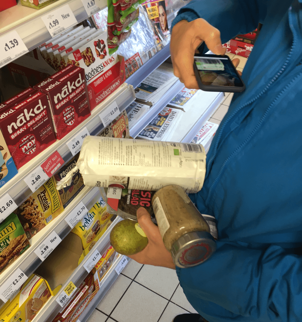
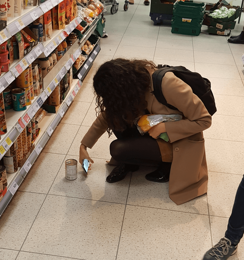
We found some issues through in-store testing and research.
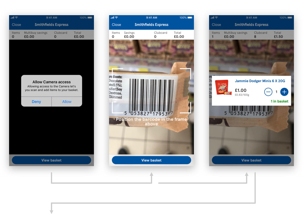
Early issues were with scanning. Initial designs simply showed the scanner, with no navigation to other parts of the app. Only when an item was scanned would the screen update and display additional navigational content. This made the users feel trapped and with no indication of how to use the app.
So we made changes to the app in order to address the issues. We identified the issues with the UI, UX and the build of the Cordova app. We made changes there and then and re-tested the app with new users.
By doing this we could see if our tweaked designs and ideas were effective on the same day. Fail fast, learner faster.
Not all issues could be solved by tweaking the UI.
Some of the challenges that couldn't be solved by UI improvements.
These core issues came down to factors out of the apps control::
1. Customers juggling items without a bag or basket.
2. It wasn’t clear where to get a bag.
3. Blocking other customers or feeling uncomfortable when packing in the middle of the store.
4. Feeling uncomfortable when leaving the store.
We had to work close with our store teams to identify ways of solving these issues if a final product was to be launched at scale.
We now had enough insight that allowed us to move onto the next phase.
Overall, the in-store research provided us with the insight that allowed us to move into the development phase, knowing that the app design was usable and there was an appetite for this type of product. This project was still an unproven proposition, which added an element of risk even as we headed into development.
With a deadline now set, we also needed clear design direction. Tesco was launching Heart, it’s new cashless store, in May 2018 at it’s Welwyn Garden City campus. Dave Lewis, CEO of Tesco, wanted Scan Pay Go to be a major part of the launch.
Ideas to add store locator and shopping lists had to be pushed back. It was crucial for design and development to focus on 3 key areas:
1. User and store location.
2. Scanning items.
3. Taking payment.
Development is design.
We wanted to ensure that the whole team had visibility to the scenarios we faced and that everyone felt comfortable sharing ideas and solutions.
Development is design, working closely with developers ensured that our ideas and designs were realistic and feasible. It also ensured that the final product looked and functioned as intended, as well as being accessible across a host of screen sizes.
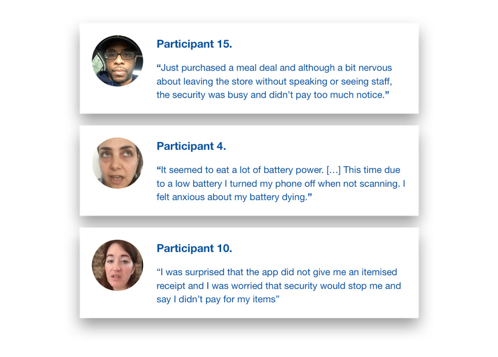
We needed to learn more through a qualitative diary study.
The aim of the diary study was to establish if Scan Pay Go was ready for a minimum viable experiment and to improve Scan Pay Go as required in the future.
19 participants used the app on their own phone and in their own time over the course of 2.5 weeks. Participants kept a diary of their use online and the team ran follow-up sessions in-store to understand their use in more detail.
We measured average sales/contact on first time use and user satisfaction on first time use.
Releasing the app to the new Heart store.
With Scan Pay Go being a major part of the opening of the new Heart building in Welwyn Garden City, we had to make sure that the app was rolled out to a restricted number of colleagues.
We asked them to fill in a survey to measure sales/contact and user satisfaction, and to understand what issues they experienced. The aim was to help us quantify some of the issues identified in the diary study carried out several weeks before so we could improve upon it.
Due to the publicity of the app within the business, we we’re concerned that Tesco colleagues in the heart store might not provide a good indication of how other customers might use and feel about Scan Pay Go.
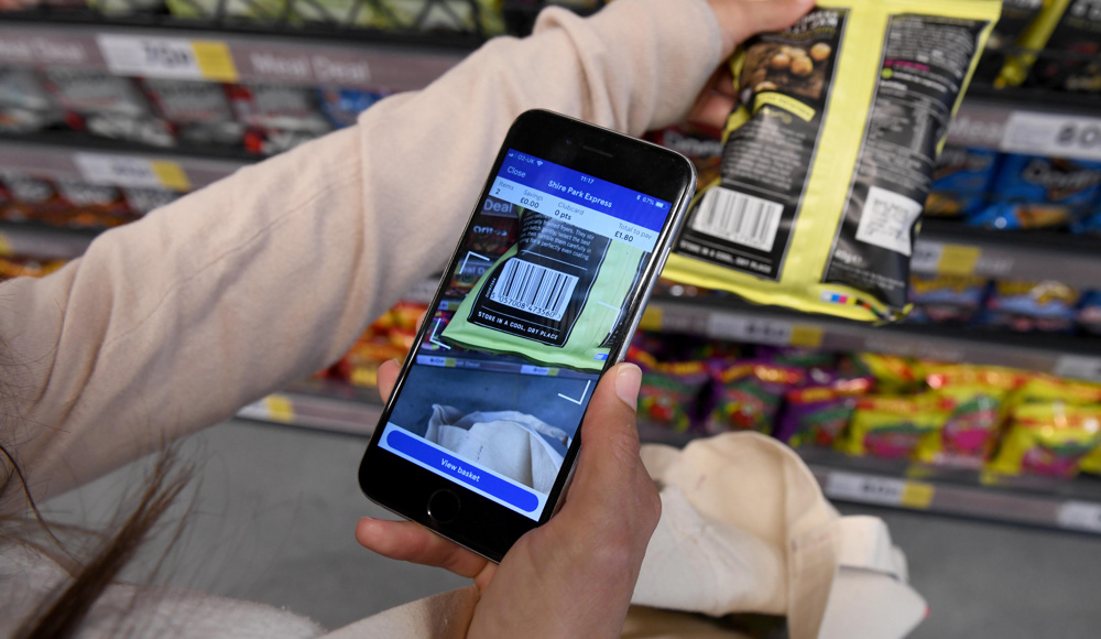
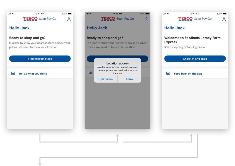
The flow of Scan Pay Go.
The first release of Scan Pay Go allowed our users to checkout directly on their phone without interacting with staff or going to a designated area.
We had to make customers feel confident that colleagues and other customers know they have paid, so that they didn’t get anxious about leaving the store. It was also very difficult for in-store colleagues to identify paying customers passively, especially while performing their everyday job.
The solution would have to scale and not just work for the Heart building.
After several workshops and rounds of testing we released an updated version of app and introduced an exit barcode in the Heart store. Users would scan the barcode in order to complete their shop, with payment taken after the scan.
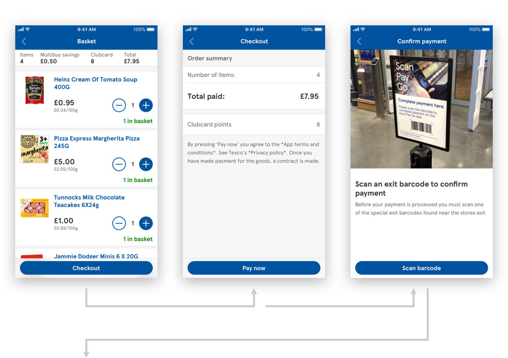
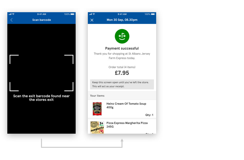
The core flow of Scan Pay Go with the exit barcode.
The design system and the new grocery app benefited from my designs.
Using the design system I was able to generate the core flow for both iOS and Android. Within a month I had designs and flows for areas such as adding a payment card, store location, home screens, scanning, basket, checkout and payment. We were then able to swiftly move on and focus our attention to other parts of the app, including sign in, scanning to removing items and service checks.
Our work was also able to benefit the design system and the new grocery app as we had the opportunity to create components, screens and flows that were still required. Barcode scanner, form language and sign-in flows are examples that are now in the design system and live on both Scan Pay Go and then new groceries app.
Introducing shopping lists and card management.
The last two major releases for Scan Pay Go saw us introduce card management and shopping lists.
By introducing shopping lists we wanted to see if users would use a list feature within the app to plan, prepare and aid them in their shops. The designs and functionality we’re kept simple, with lists fundamentally being a simple text editor. We were releasing and testing an unproven proposition and therefore didn’t want to invest too much resources until we had confidence that this was a feature customers would use. Users could create and edit their lists from the home screen and the scan screen.
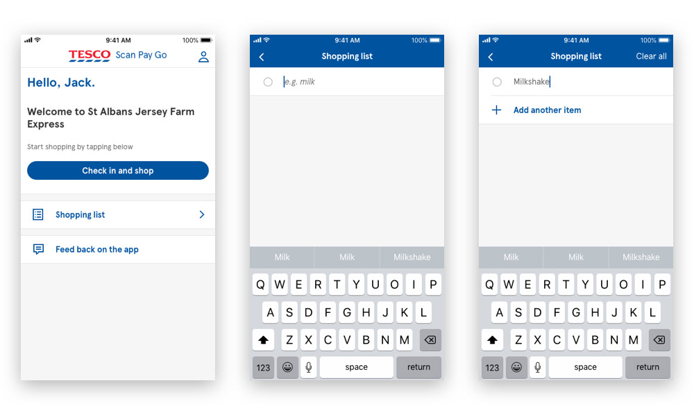
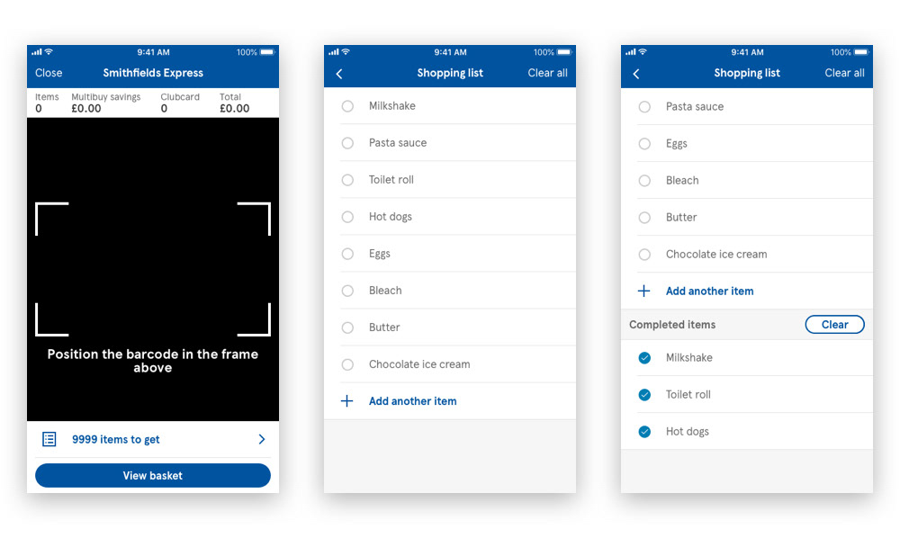
The lists feature could be accessed from the home screen or on the scanning screen.
Card management was a feature we needed not only for Scan Pay Go but for the new groceries app. We received numerous amounts of feedback from the Heart trial regarding payment cards. The first version of the app only allowed users to add one payment card with no way of removing it.
Their feedback informed us that they wanted the freedom to add more than one card and even the added security of the removing their card before deleting app.
I kept the pattern to remove cards consistent across iOS and Android, resisting the urge to to use the native edit pattern on iOS. The main reason was to maintain a consistent approach across both platforms as we we’re working towards a tight deadline. It also meant that we could resolve any concerns in combined design reviews with our Android and iOS developers.
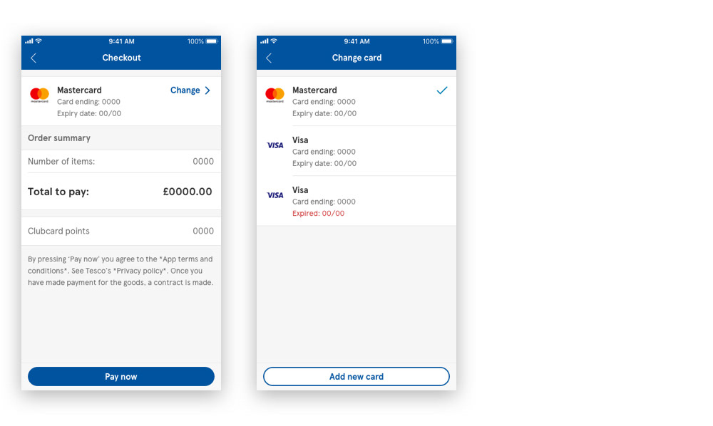
Users could change their card through the checkout process.
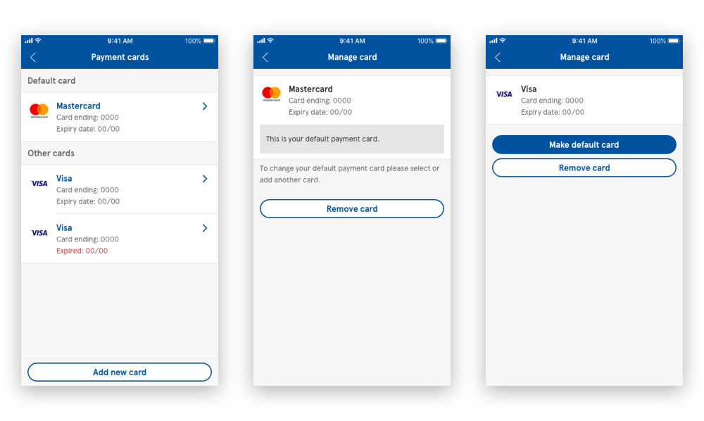
Users could add, remove and set their default payment card through the account page.
What does the future hold for Scan Pay Go?
Before the app can be rolled out to customers, service checks must introduced as part of the process. The reason for this is shrink. Shrink is the loss of inventory that can be attributed to factors such as employee theft, shoplifting and other errors. Currently there is no way to monitor the impact Scan Pay Go could have on shrink until we introduce service checks.
The introduction of detailed receipts and transaction history will also prove crucial to the success of Scan Pay Go. Providing users with transaction history may increase confidence in the app and reduce the feelings of being uncomfortable when checking out and leaving.
The app continues to be used by hundreds of Tesco colleagues in the Welwyn Garden City.
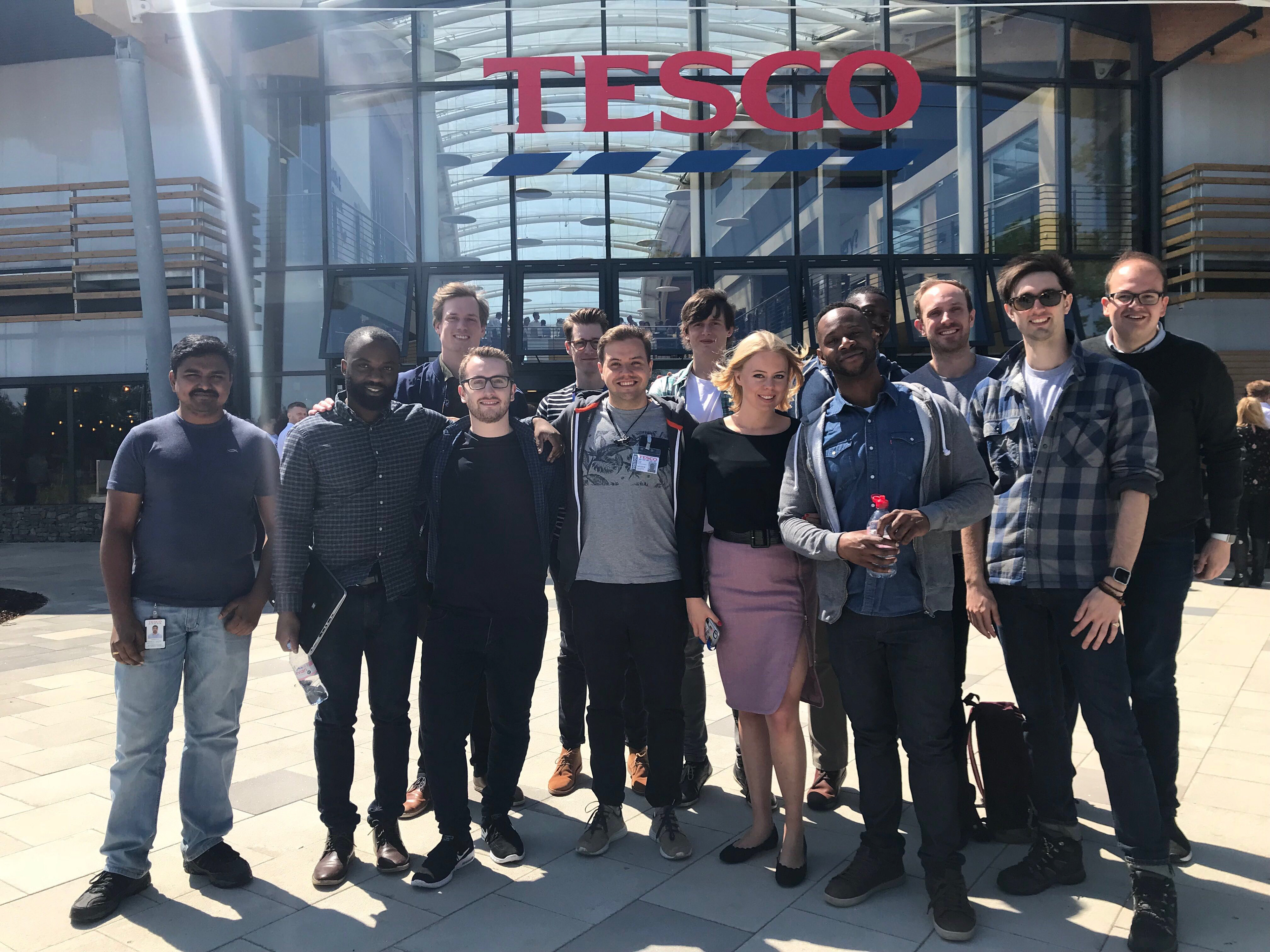
The Scan Pay Go team.