Concept one.
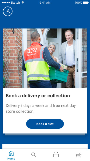
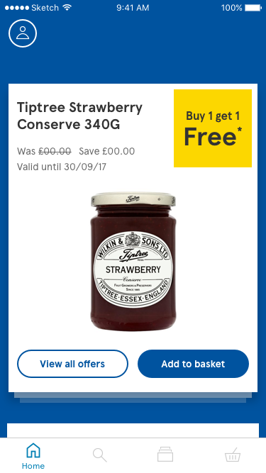
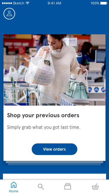
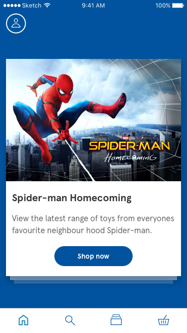
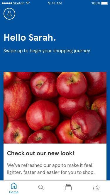
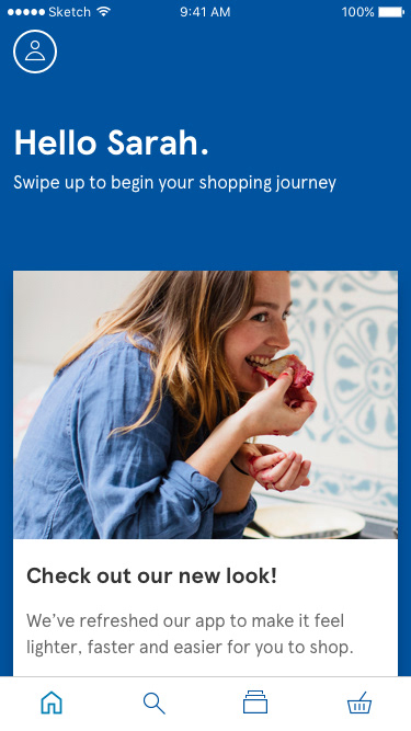
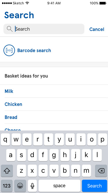
Consisted of transforming the home screen into a shopping assistant. The home screen would consist of cards containing favourites, book a slot and much more. Fly up navigation was a new idea considered for this design, making search more prominent in a make shift tab bar. The theory was that most users would shop via their favourites card and then revert to search for other products.
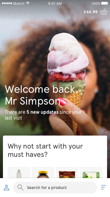
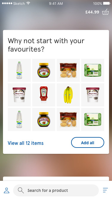
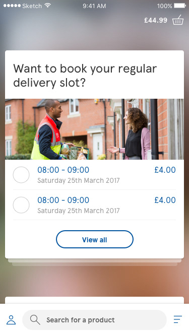
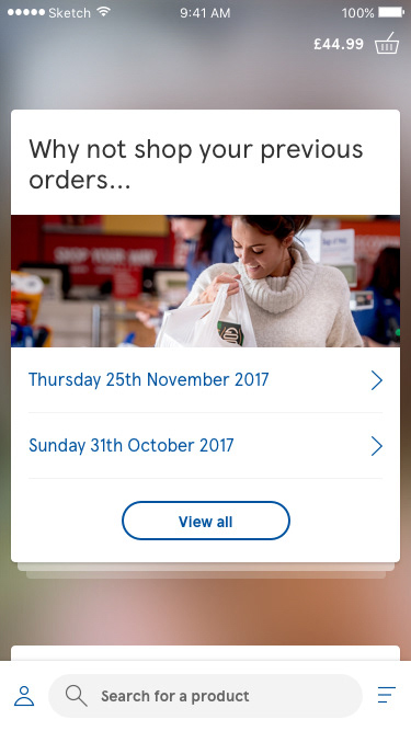

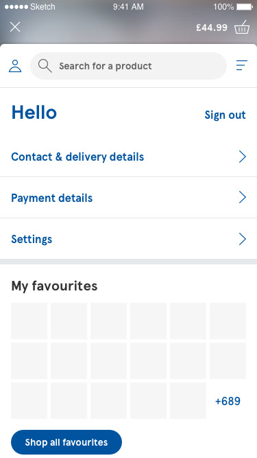
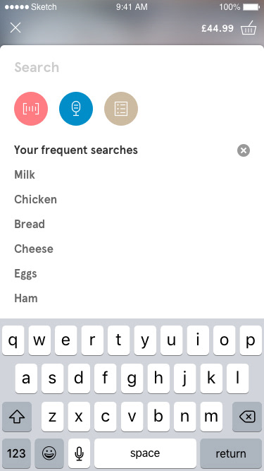
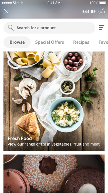
Concept two.
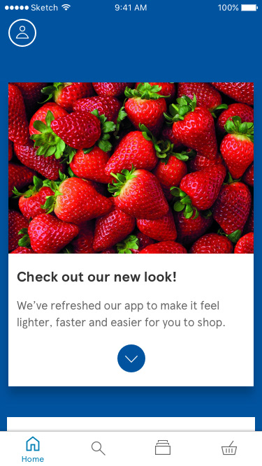
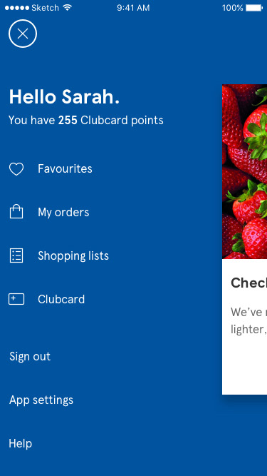
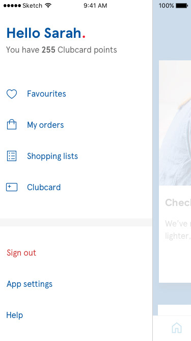
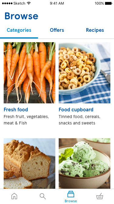
This concept looked at retaining the card concept but returning to a much simpler navigation using tabs. With the brief asking us to look at innovating the app I experimented with the profile being hidden on the side, and with animation applied when revealing this area it would provide a little personality.
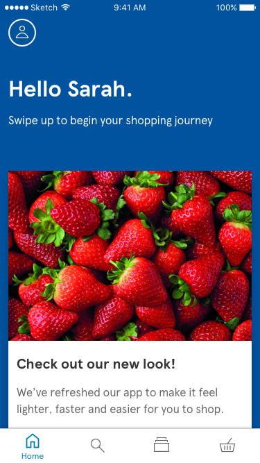
Concept three.
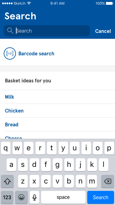
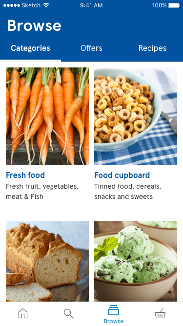
This concept looked at using the latest iOS native elements across key pages while restyling the profile section to match updated brand guidelines.
Product page browser.
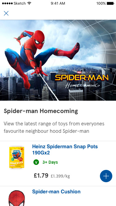
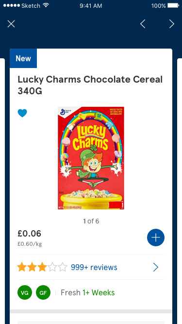
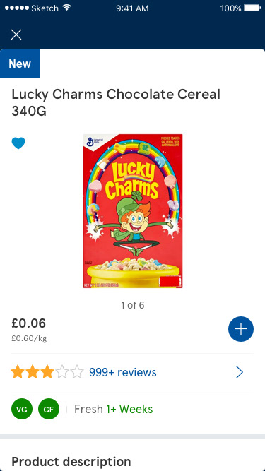
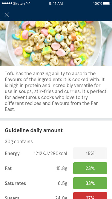
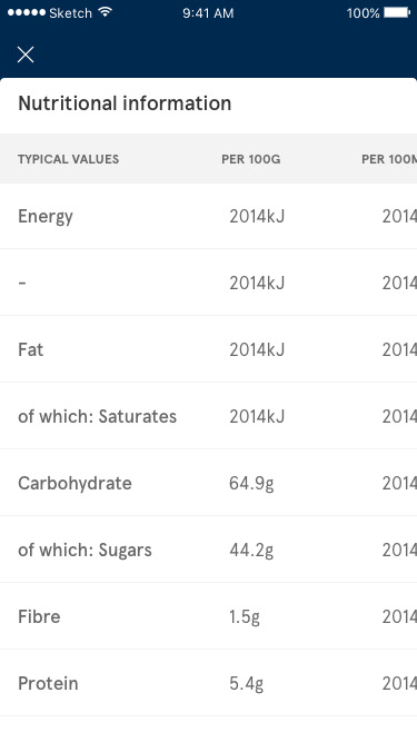
This concept looked at introducing a product page browser, allowing users to view a partial of view of the PDP while getting to see a much larger product image. This tested surprisingly well and users naturally browsed through the pages without any prompts.
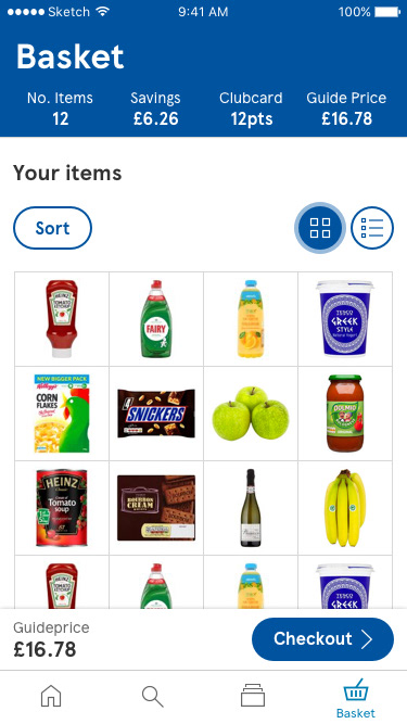
Throughout this project the team explored other ideas such as dietary profiles, exposed filters, scan shopping lists and even looking at how we could streamline the basket experience.