Jack Roles - Lead Product Designer
The challenge
The Babylon triage experience on both web and app needed to be updated to match the newly defined design language. The experience did not have a dedicated design team and had an inconsistent design language that contained old fonts, colours, components and iconography.
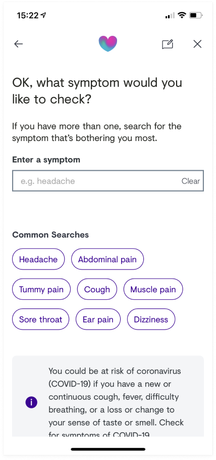
Search for a symptom screen on the old triage experience.
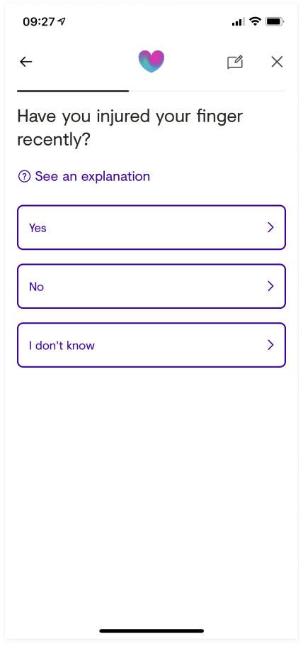
A screen from the old triage experience asking the user a question.
This project was just about updating the design language. Unfortunately, we didn’t have the time or resources to make wholesale changes to the content or user experience. However, we could improve aspects of the experience by making the interface easier to use and consistent with the updated design components and design language.
One of the biggest challenges was to ensure that the design worked seamlessly across web and app. The app would use the same web experience, so it was fundamental that the design didn’t look or feel like a web product within the app.
What changes did I make?
Listening to the research
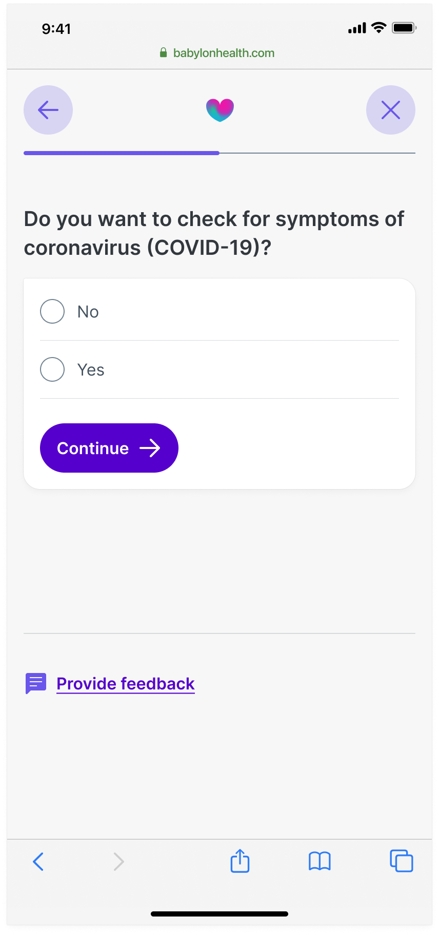
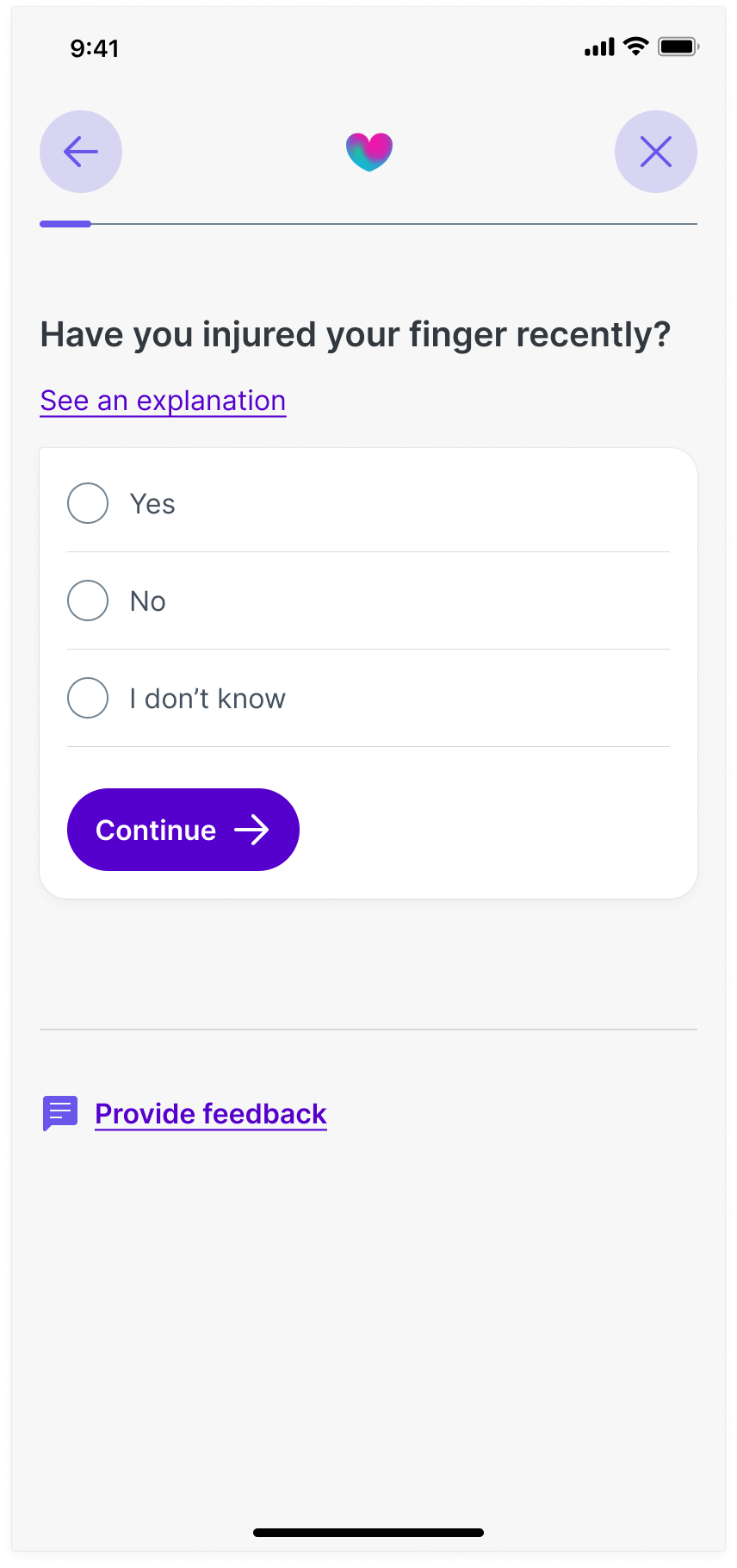
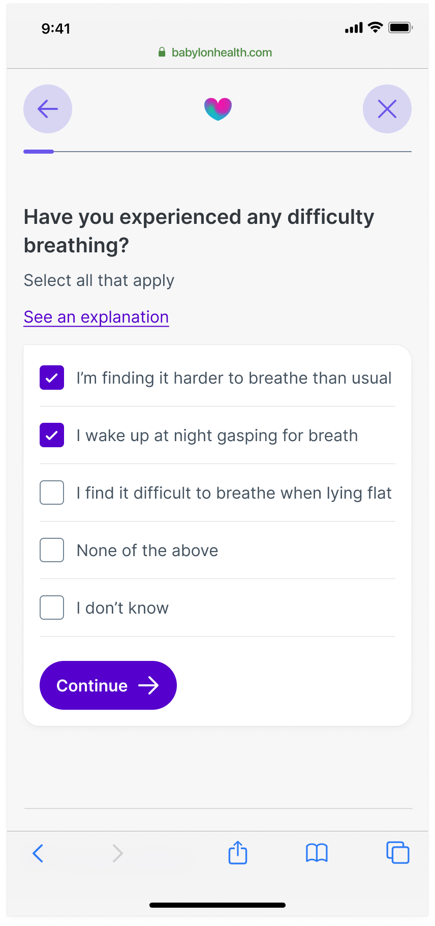
The existing product automatically shifted users to the following screen after selecting an option. While this moved users through the process, it was quickly deemed flawed. Our research team had insights that informed us many users were missing options that didn’t fit into the landing view of their device. As a result some users were not scrolling to see all the possible options and therefore would make a choice based upon what they could see in view. This was common on questions were users can only select one option from a list.
To help resolve this we made it mandatory for a submit button to be included after the last option, regardless if the user could select one or multiple options. This would mean users would have to scroll to see all their options before submitting and progressing.
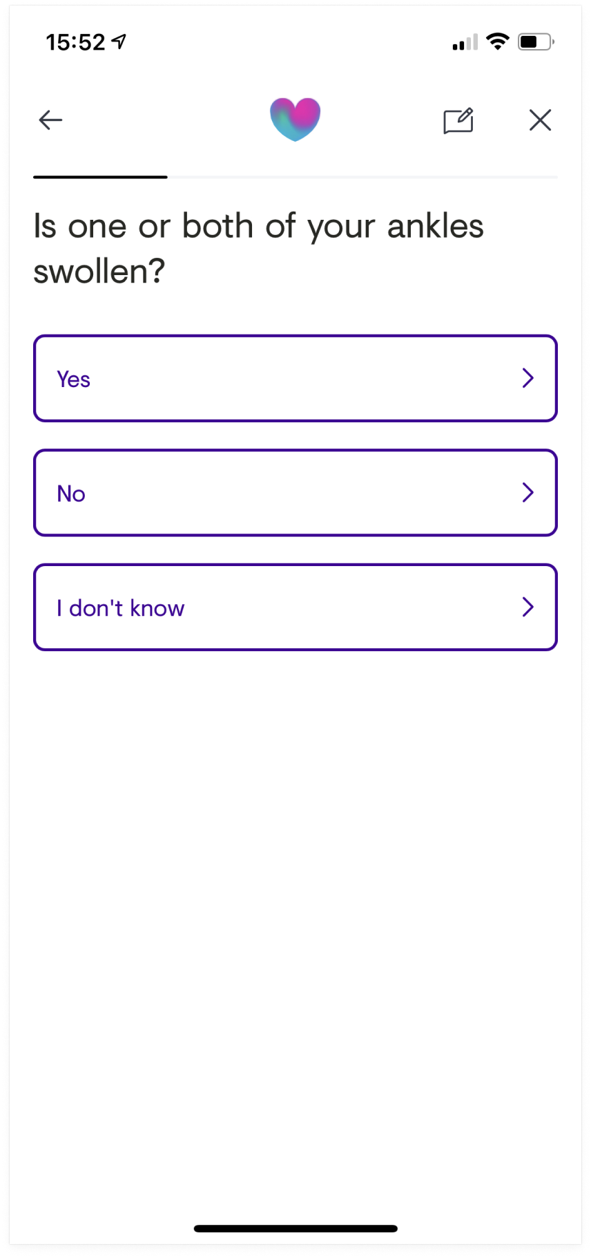
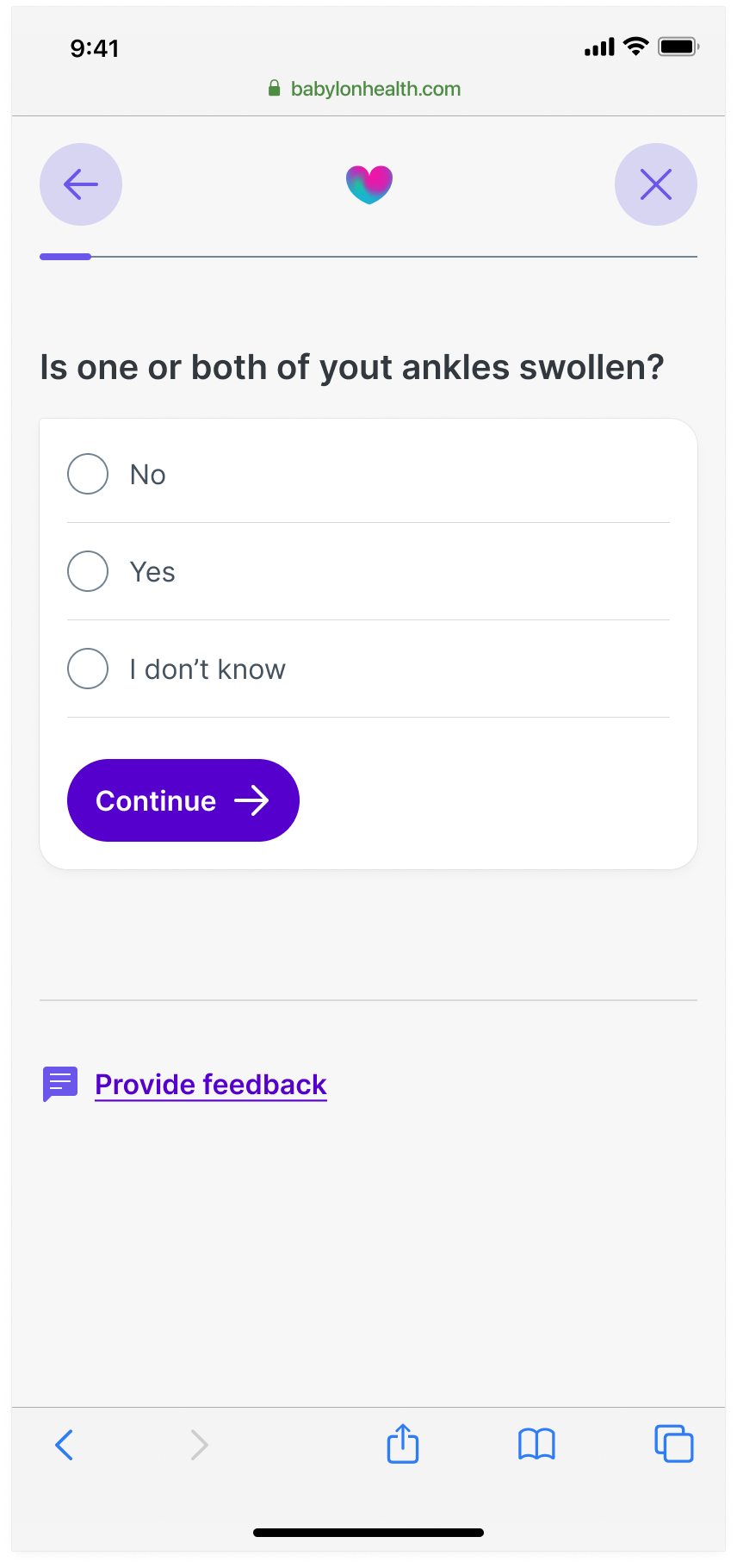
A screen from the old experience that allowed users select one option from a list.
A screen from the new experience that allows users to select one option from a list.
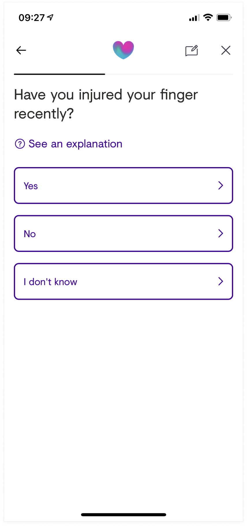
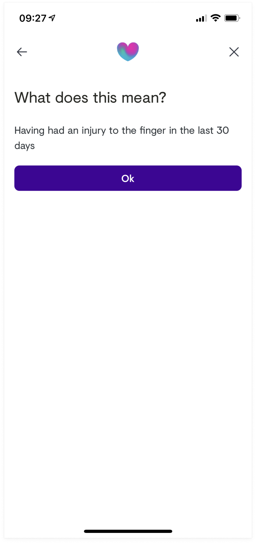
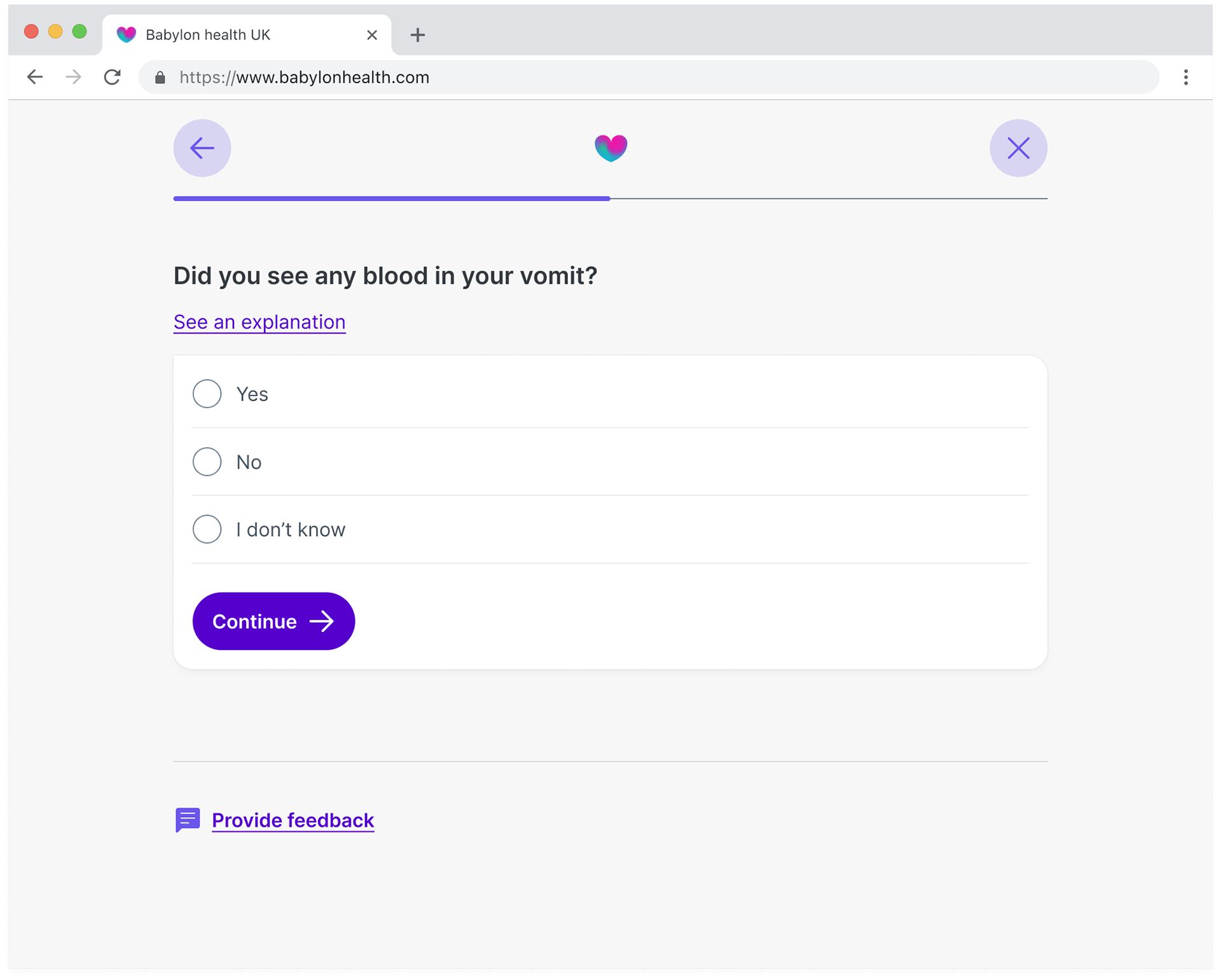
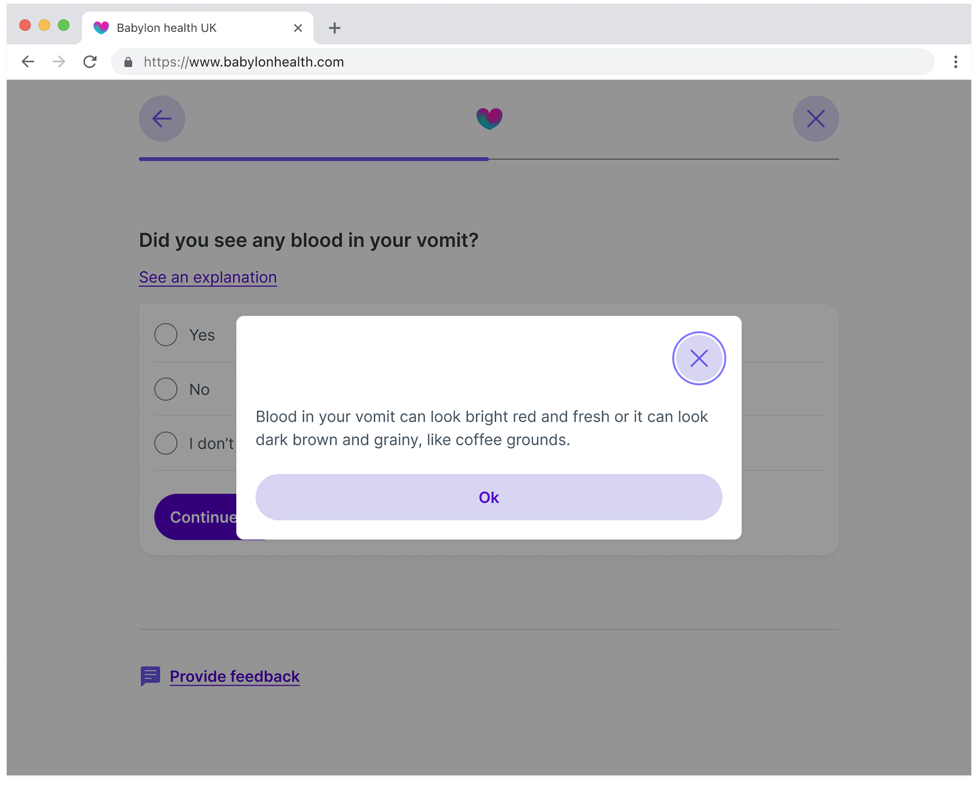
Explanation links
Some of the questions would require an explanation link in order to include more detail and context to what was being asked. In the existing experience the link would navigate the users to a new page, taking them away from the question and the possible answers, making the experience quite jarring.
To improve this, explanation links would now display in a popover instead of navigating to a new page. The aim of this was to keep the user on the page and the question they’ve just been shown instead of navigating them away. The popover would sit on top of a scrim so the user could still view the question and they would know they hadn’t navigated away from the screen.
A screen from the old experience that provided users with an explanation link.
The screen that provided users with more context to the question they have been asked.
A question from the new experience that provided users with an explanation link.
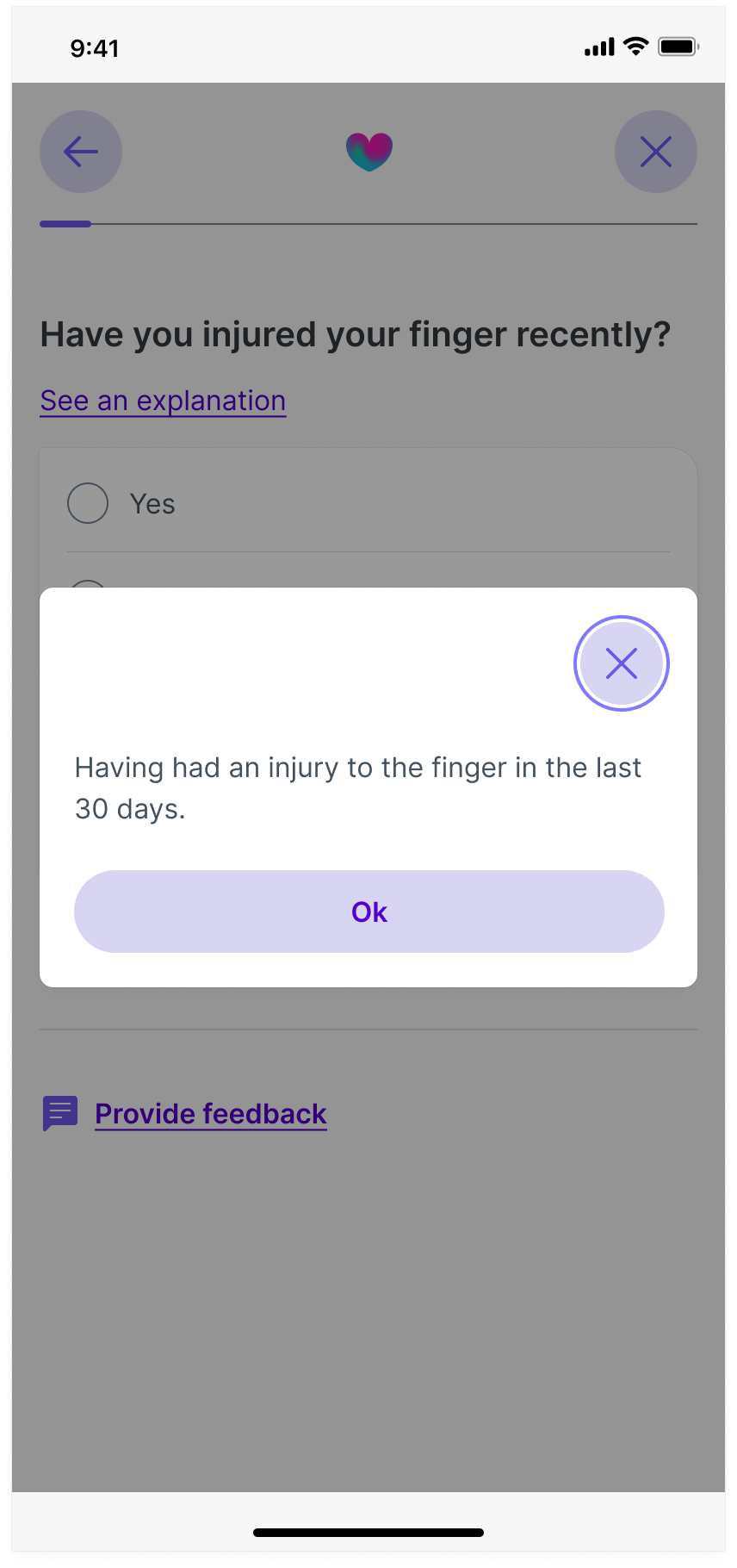
On the new experience the 'see an explanation link displays the content in a popover.
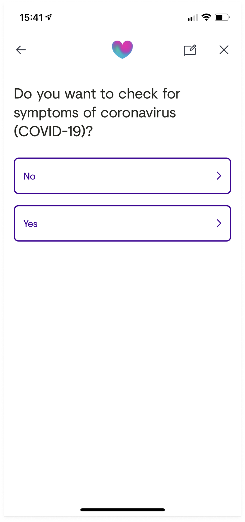
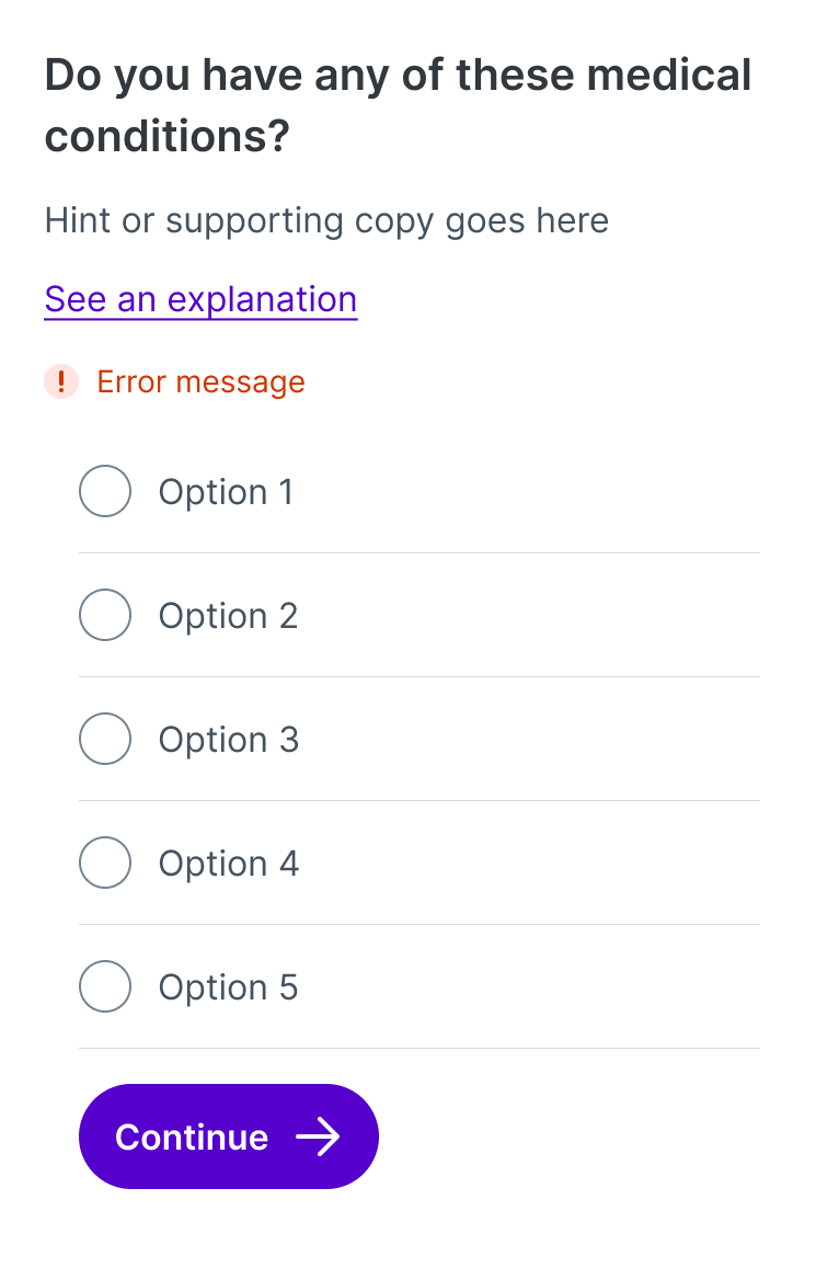
Replacing buttons with radio buttons
The existing triage experience used buttons as if they were radio buttons and selecting an option would automatically move the user through the process. As mentioned previously, existing research demonstrated that some users would miss options that didn’t fit into view. The style of these buttons were also completely different to any other button used across the app or web.
To improve this I used the newly defined form and button language. It was important to demonstrate how scalable the new language was whilst also showing how to correctly apply these new components, especially when using the new form language.
The old approach to single selection used buttons.
The new approach to single selection uses radio buttons from the new design language.
Design details
Splitting the question and the card
The aim here was to reuse and test as much of the design language as possible, especially our form designs and how they would work with our cards.
I decided to separate the question and the input options. The idea was to place the inputs in the card container to make it clear to users that this was the area that they could interact with and add their data. It also helped provide a clear, reusable structure when including errors and ‘see explanation’ links as part of the question.
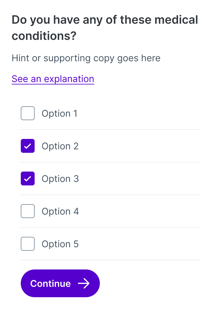
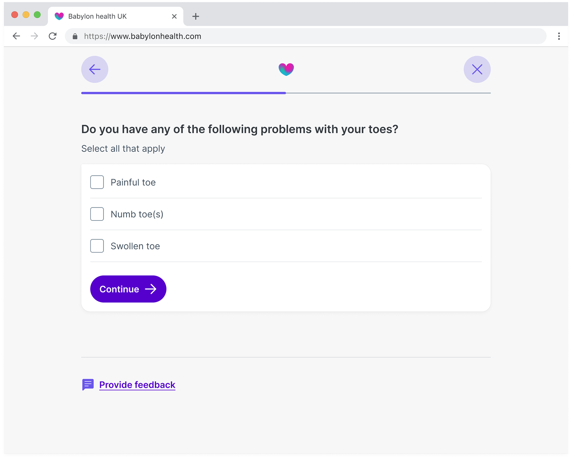
Question component that lets users select one or more option.

Question component displaying an error if an option isn't selected and the user attempts to progress.
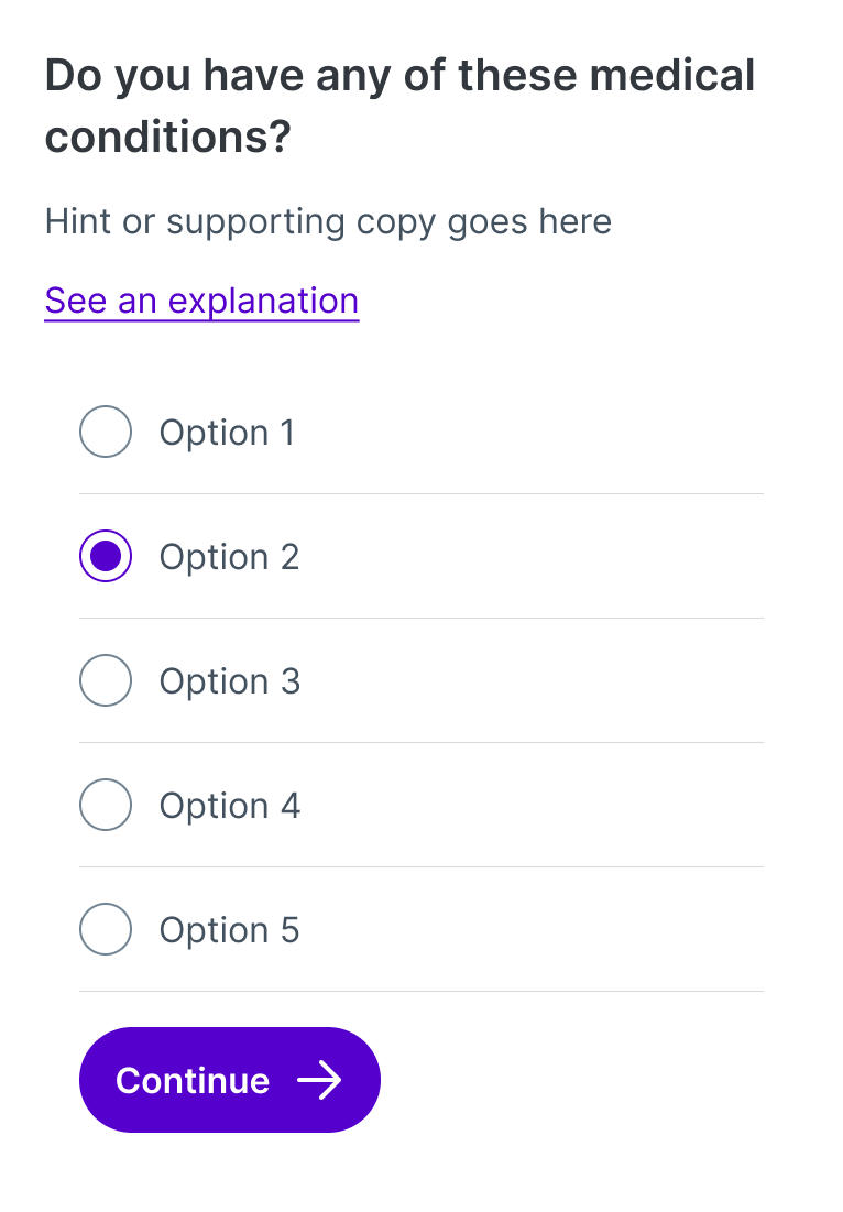
Question component that lets users select a single option.
Question component displaying an error if an option isn't selected and the user attempts to progress.
The question would always remain fixed at the top of the page, 52px away from the navigation bar. This was so that the user would always know the position of the next question while providing breathing room between the navigation bar and the content below.
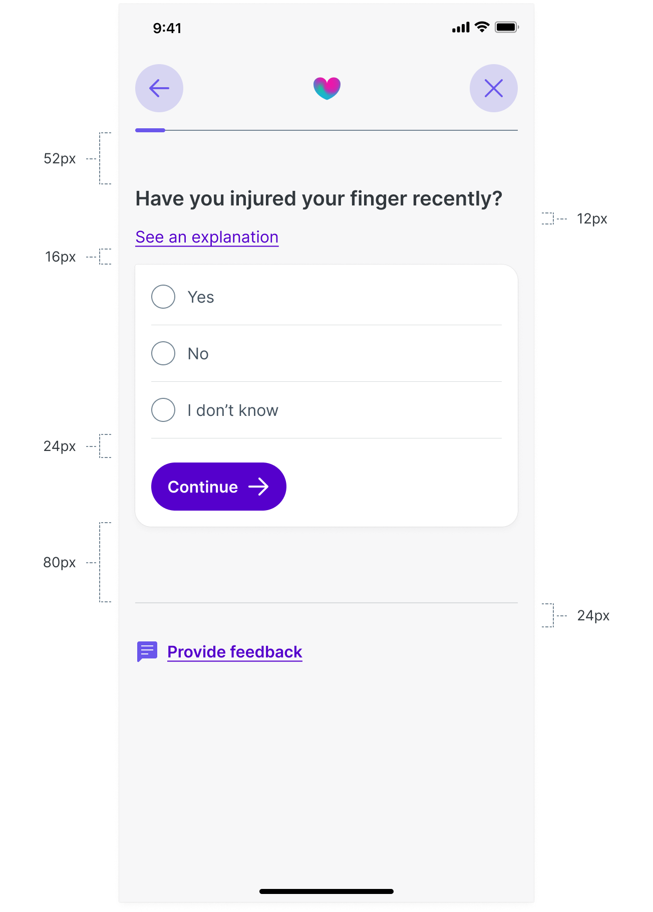
A guide on the spacing layout of the triage questions.
2px corner
For the final card design I deviated away from what we had created in the design language, but only ever so slightly. Instead of using a 16px radius for each corner of the card, the top left corner that was directly underneath the question would use 2px.
One reason for this was to provide better left alignment with the question above. Another reason I introduced 2px to the top left corner was to have a consistent style with our chat bubble that the design system team had defined for chat assistant and member support. We wanted these input cards to work across triage and the chat experience so that our users would have consistent experience.
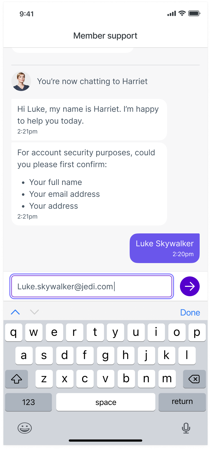
Example of the new members support chat
Example of a question on the new triage experience
As well as redesigning the questions in the triage experience, I had the opportunity to introduce the new design language to the symptom selector, results, condition pages and more.
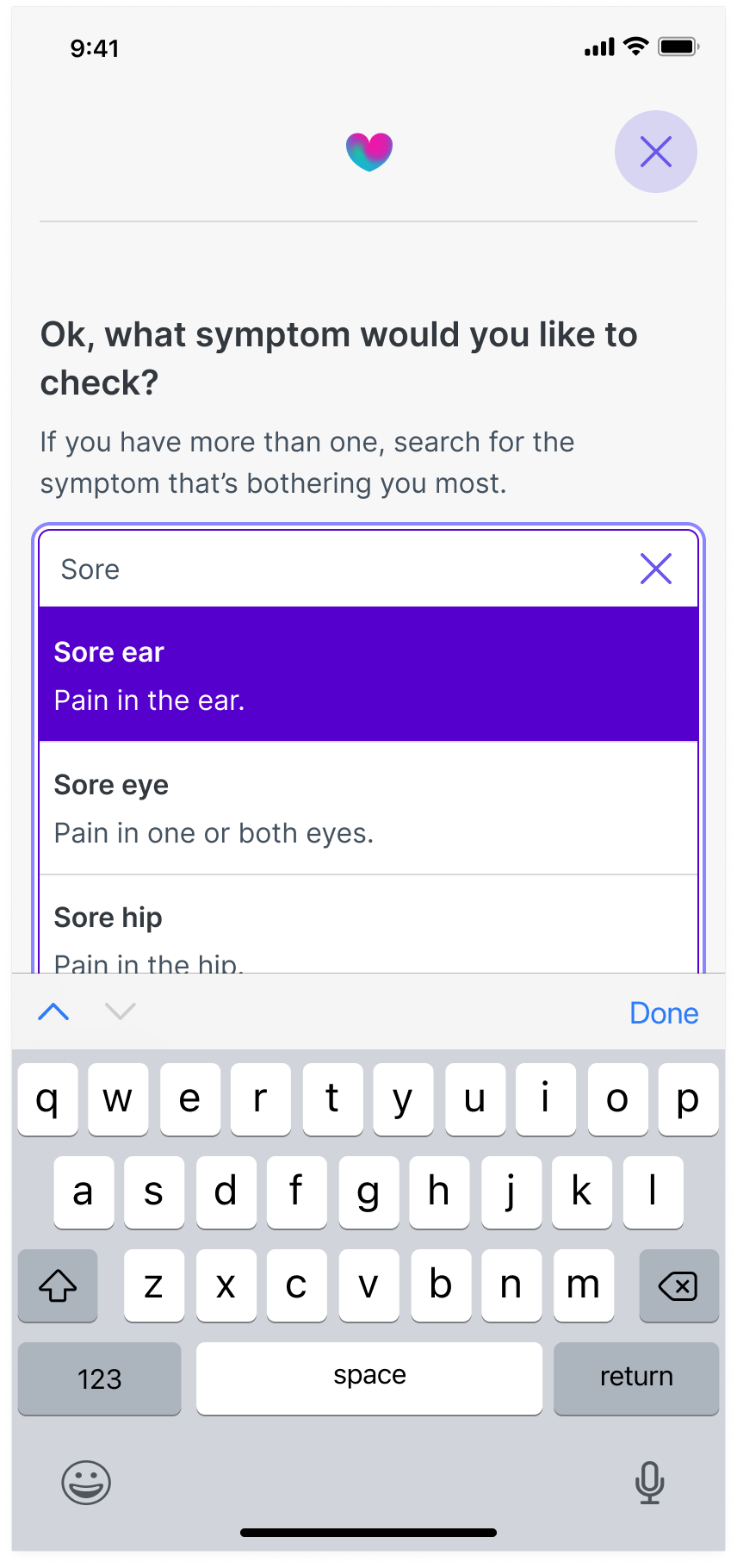
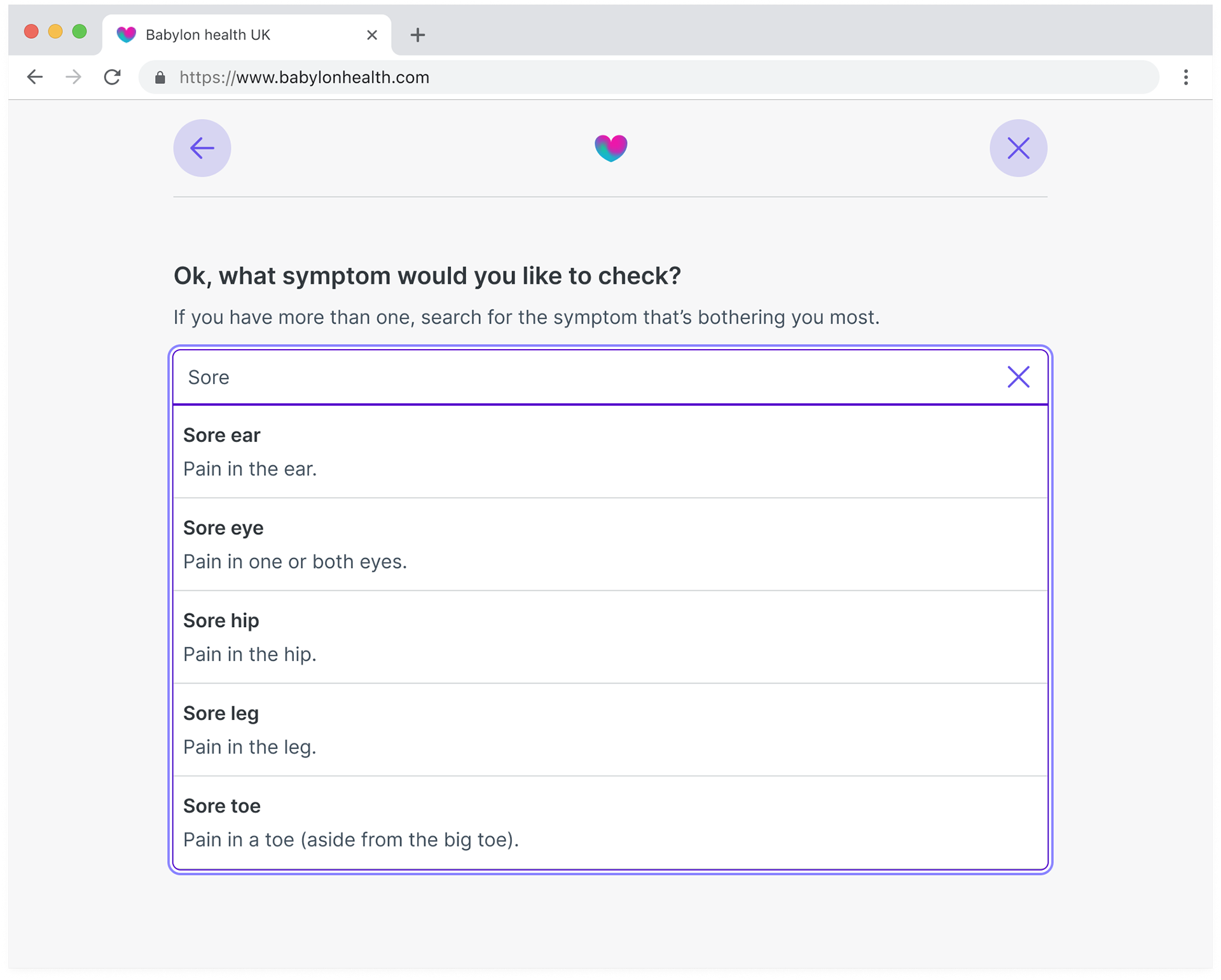
Auto suggest search results.
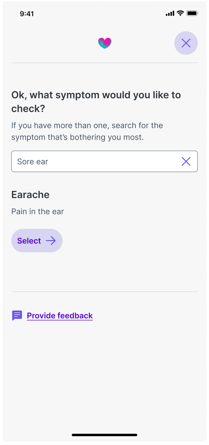
Auto suggest complete.
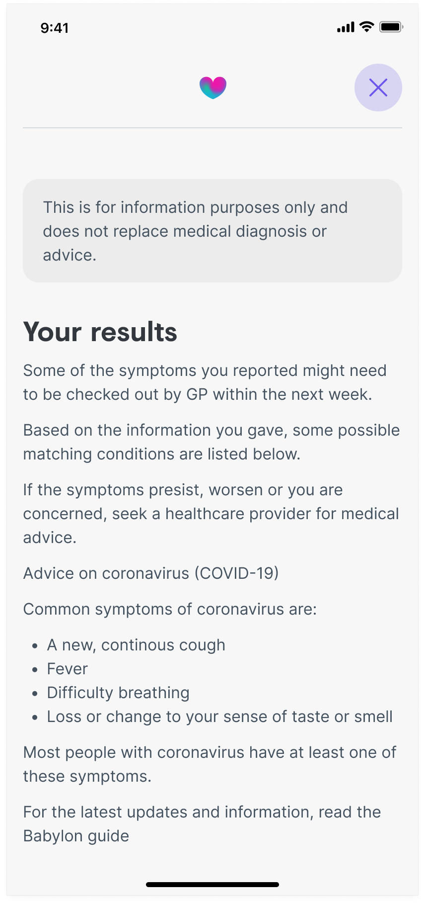
Results landing page.
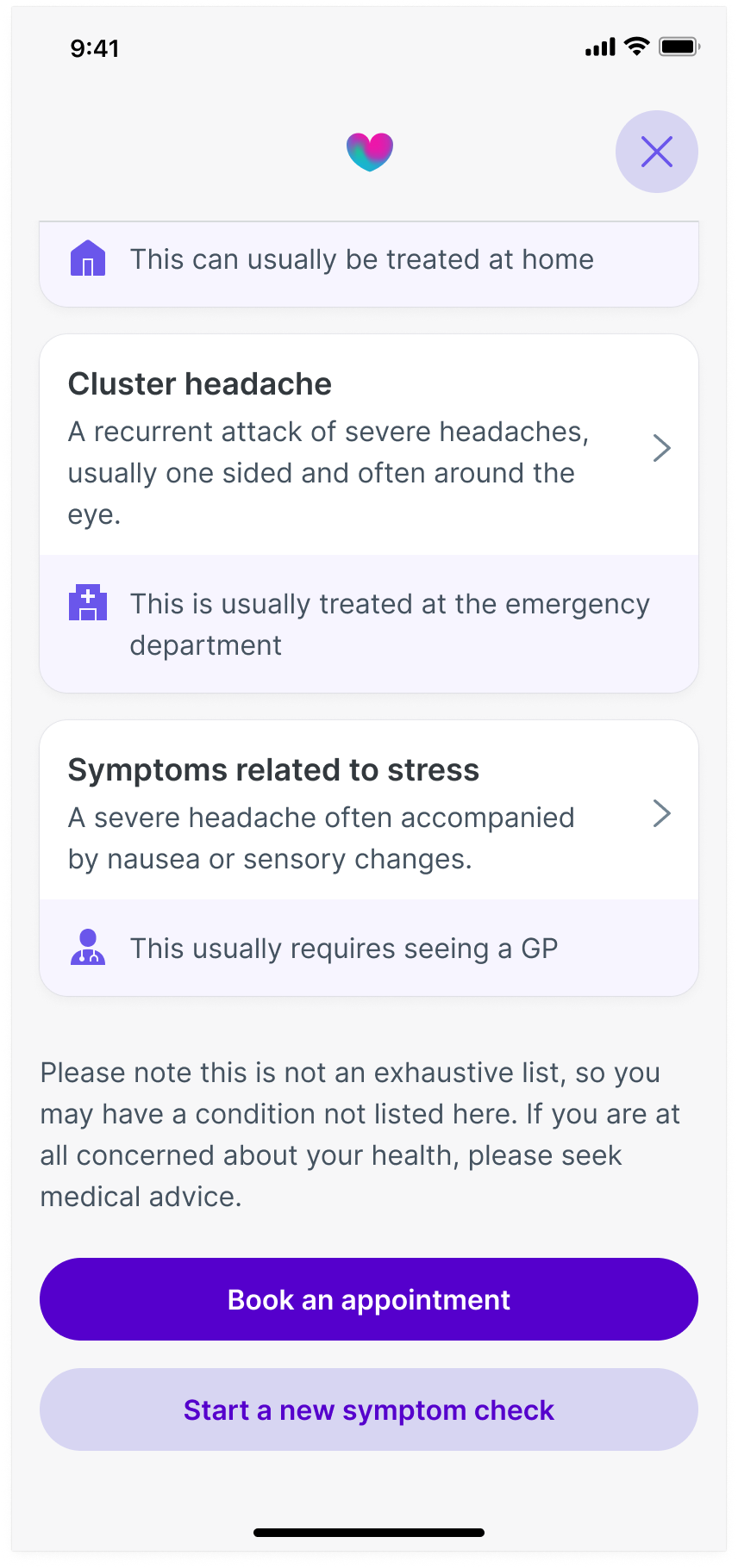
Results page showing multiple possible outcomes
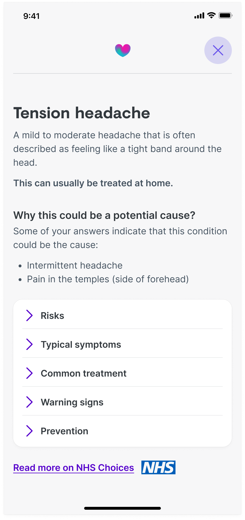
Conditions landing page
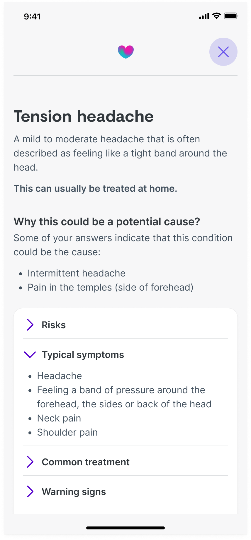
Conditions landing page with an open accordion
Desktop examples
Desktop example of auto suggest results.
Desktop example question that allows users select one or more option.
Desktop example question that allows users select one option.
Desktop example showing the explanation to a question in a popover.