Jack Roles - Lead Designer.
What is Jack's?
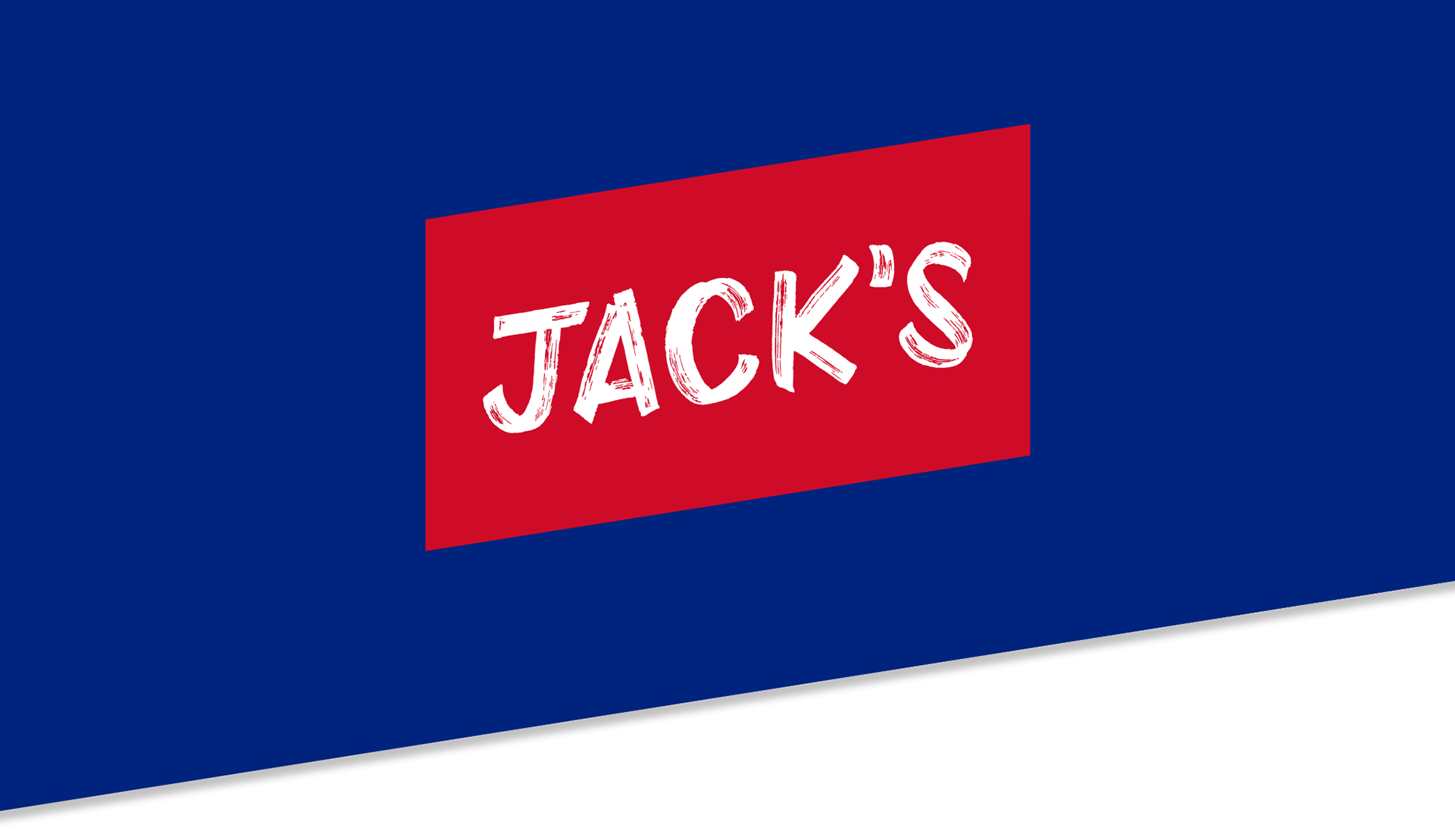
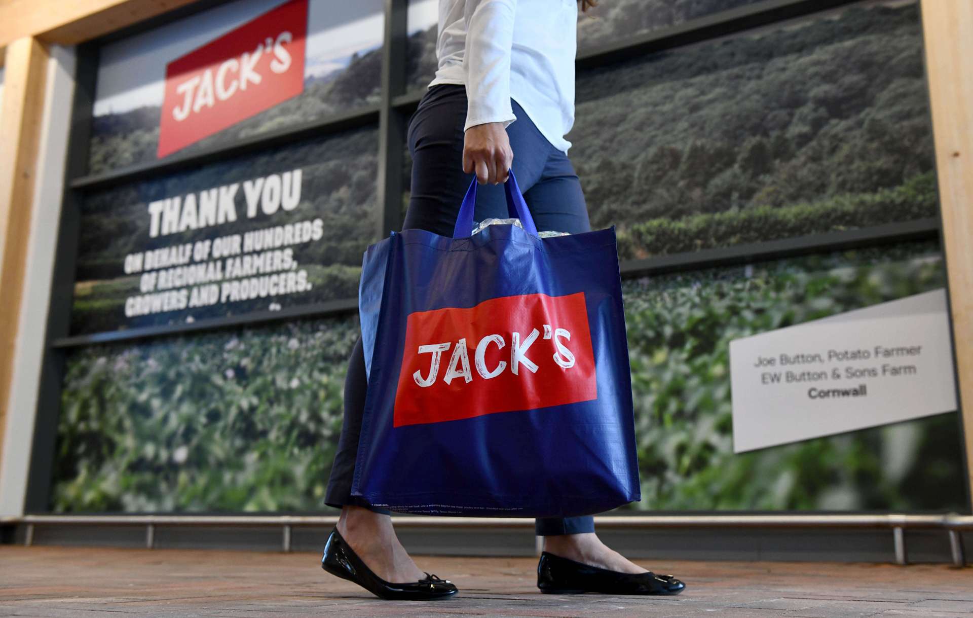
Jack’s is a new brand, and stores that celebrate the values and ethos of Tesco’s founder, Jack Cohen. The launch of the new brand marked the beginning of Tesco’s centenary.
The idea was for Jack’s to go head to head with other discount retailers in an attempt to slow their market share.
Jack’s stores would only stock 2,600 lines, with a USP of having 8 out of 10 products grown, reared or made in Britain. In addition to Jack’s branded products, stores would also stock familiar grocery brands, a fresh five offering and a range of general merchandise on a “When it’s Gone, It’s Gone” basis.
"Would a scan as you shop app work for Jack’s stores?"
This was the question brought to us by the Tesco CEO and the Jack’s team. They wanted to introduce a mobile scan as you shop (MSAYS) app, that would allow users to scan their items and pay at the till as part of the new store proposition.
The hypothesis was that introducing an MSAYs app would provide Jack’s with another USP to differentiate the brand between other discounters.
The brand and website had already been created by Wolff Olins.
Branding of Jack's was executed by Wolff Olins.
The branding and even designs for the website had already been signed off and agreed before I joined the project. Wolff Olins had produced a very basic, one page PDF style guide for digital to follow. This included colours, fonts and examples of the website.
This style guide was not extensive enough for the app and it’s vast edge-case scenarios. This resulted in modifications and the creation of rules to follow.
The colours used for Jack’s were originally created for print with the assumption they would work for digital. I had to tweak colour values in-order to meet the minimum WCAG AA standard contrast ratio. Another concern was that there was no consideration for error handling or success states. To move the project along I suggested using Tesco’s error and success colours in order to prevent a long sign off process.
Jack’s main font was unreadable and unsuitable for UI. Market Sans was introduced for headings and call to actions, with Calibre being used for body copy.
After trialing Market Sans with some UI elements I discovered it wasn’t readable and only available in uppercase, therefore making it unsuitable for UI in the app. I compromised with Wolff Olins on only using the font for the ‘Hello’ message. Calibre was then used as the main font throughout the app.
Wolff Olins and Jack’s needed some design direction for the app.
I advised Wolff Olins and the Jack’s team on the issues we would face using the proposed iconography.
It was suggested that the icons be redesigned in order prevent issues when scaling and to make the stroke thickness 2px. To avoid distortion, it was important that the icons were designed on the pixel. I directed the team on the iconography that was required for the app, in-order to meet the various scenarios we would encounter.
We used the core journey and design from the Scan Pay Go app.
Working to a tight deadline, we had to move with speed and ferocity. With that in mind we used the core parts of the Scan Pay Go (SPG) app that was being trialled in the Tesco Heart store.
By removing the add payment card and checkout flows of the existing app it gave us the basic flow we required for Jack’s. With the basic flow already determined, we needed to focus on the transfer to till process and it’s various scenarios.
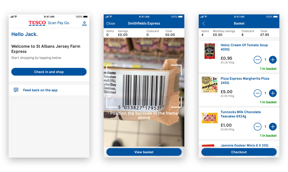
Example screens of the Scan Pay Go app.
Our developers were in the dark, believing this was a theming task.
Due to the secrecy of the project, few people in Tesco new about Jack’s. Our developers were under the impression that we were all working on a theming task for an international Tesco store.
This made communication and explaining why certain decisions had been made difficult, especially as to why we had two new fonts, colours and a new set of icons.
Our developers were made aware of the Jack’s project 2 weeks before launch to ensure a smooth release of the app.
Restyling Scan Pay Go by changing one line of code.
Working with our engineers we developed a theming architecture which allowed us to change an app’s fonts, assets, colours and other styling options. This meant we could quickly and easily rebrand and restyle an entire app by changing just one line of code.
This also enabled us to use different fonts for each theme, and even have multiple fonts in one theme if necessary, with perfectly calculated font line heights allowing for pixel perfect design.
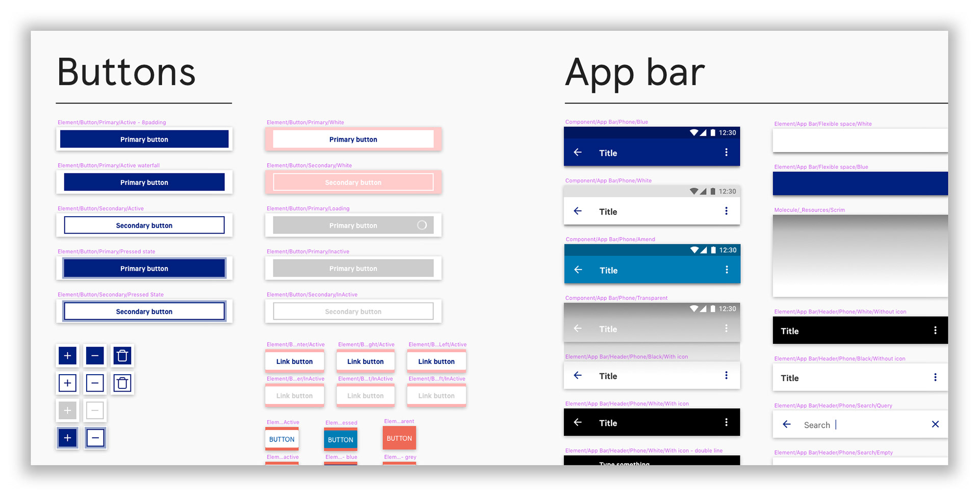
Creating the Jack’s centralised design system.
Using copies of the Tesco iOS and Android pattern libraries I updated fonts, colours, icons and buttons without breaking it’s architecture.
This demonstrated how robust the Tesco design system was. It paved the way for more effective collaboration between designers and engineers, which ultimately enabled us to deliver such an elegant theming solution as well as a greater level of design consistency across our apps.
Jack’s would be the first store to use a new style of barcode.
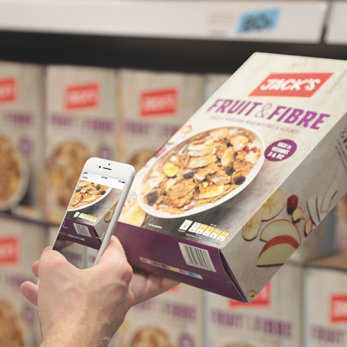
Jack’s store would use data embedded barcodes on a variety of it’s products. These new barcodes are a way of tracking the expiry dates of products and allow stores to manage stock better by having a live view of their stock holding.
Having data embedded barcodes also avoids the need for colleagues to manually check the expiry dates of products.
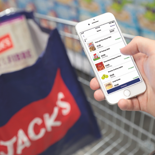
Data embedded barcodes created a unique challenge. Although these barcodes provided stores with a view of their stock holding, they caused some issues for Smart Shop. Products using data embedded barcodes required users to scan to add and remove item to the basket.
As a result of this we decided that all products in Smart Shop had to follow the same process. To make it even clearer we removed the plus and minus buttons on the product cards.
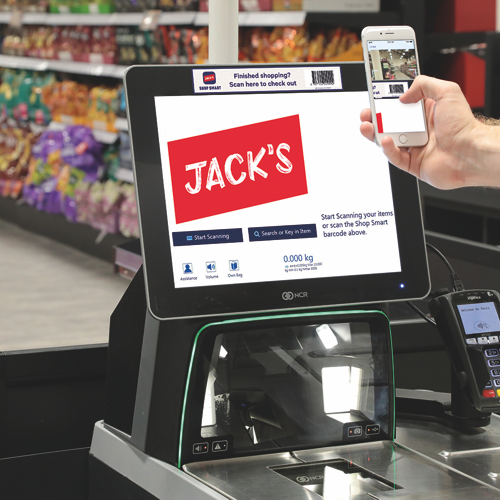
Service checks had to be handle by the self-service tills.
This was managed by the self-service till team in Tesco, under ours and the Jack’s teams instruction. Due to the time restrictions of the project we were reliant on the self-service tills handling service check messaging for the initial release. The app would not inform the user that a check was required.
The final product
Jack's Shop Smart. Scan items, track your spending and transfer and pay at the till.
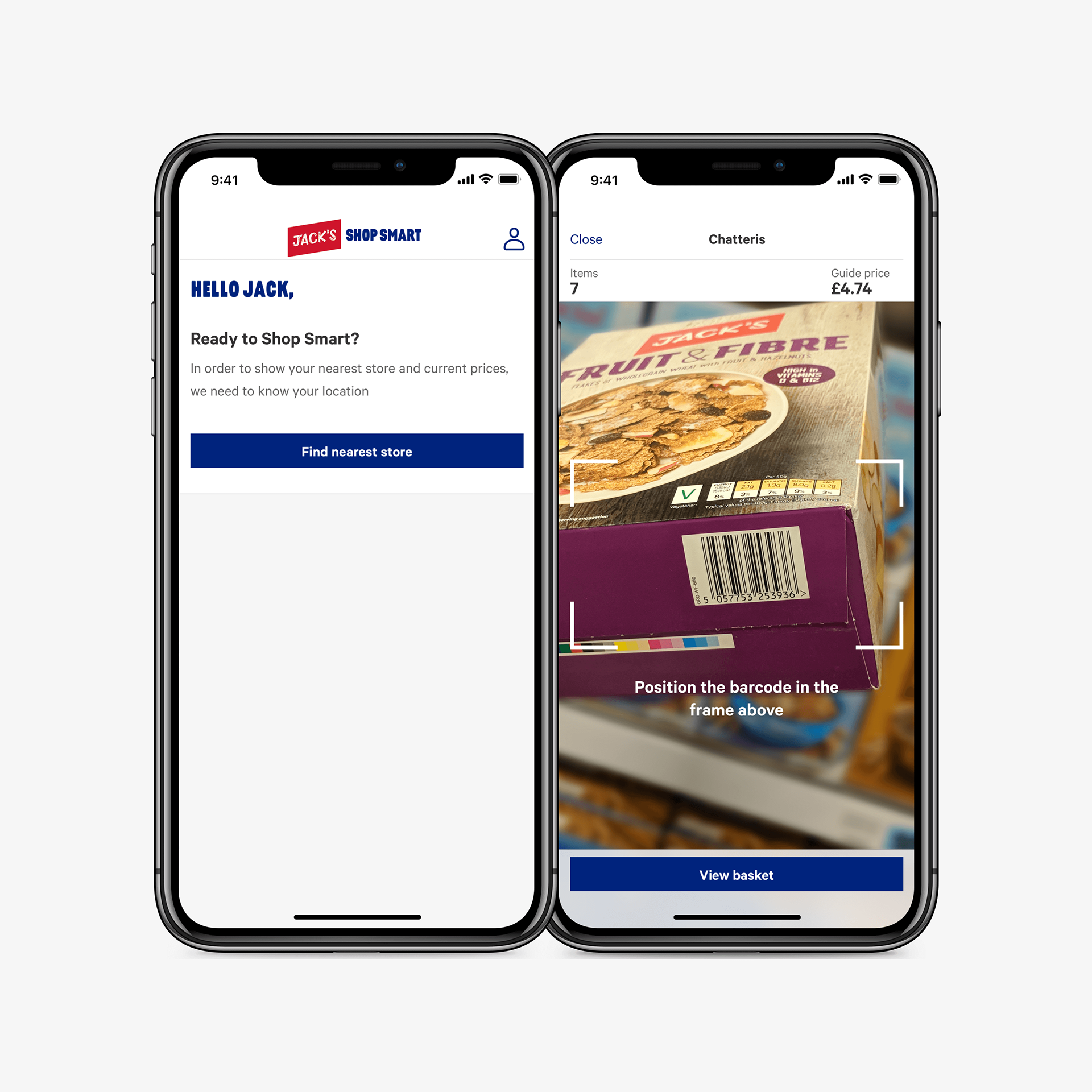
Examples above show the home and scan screens.
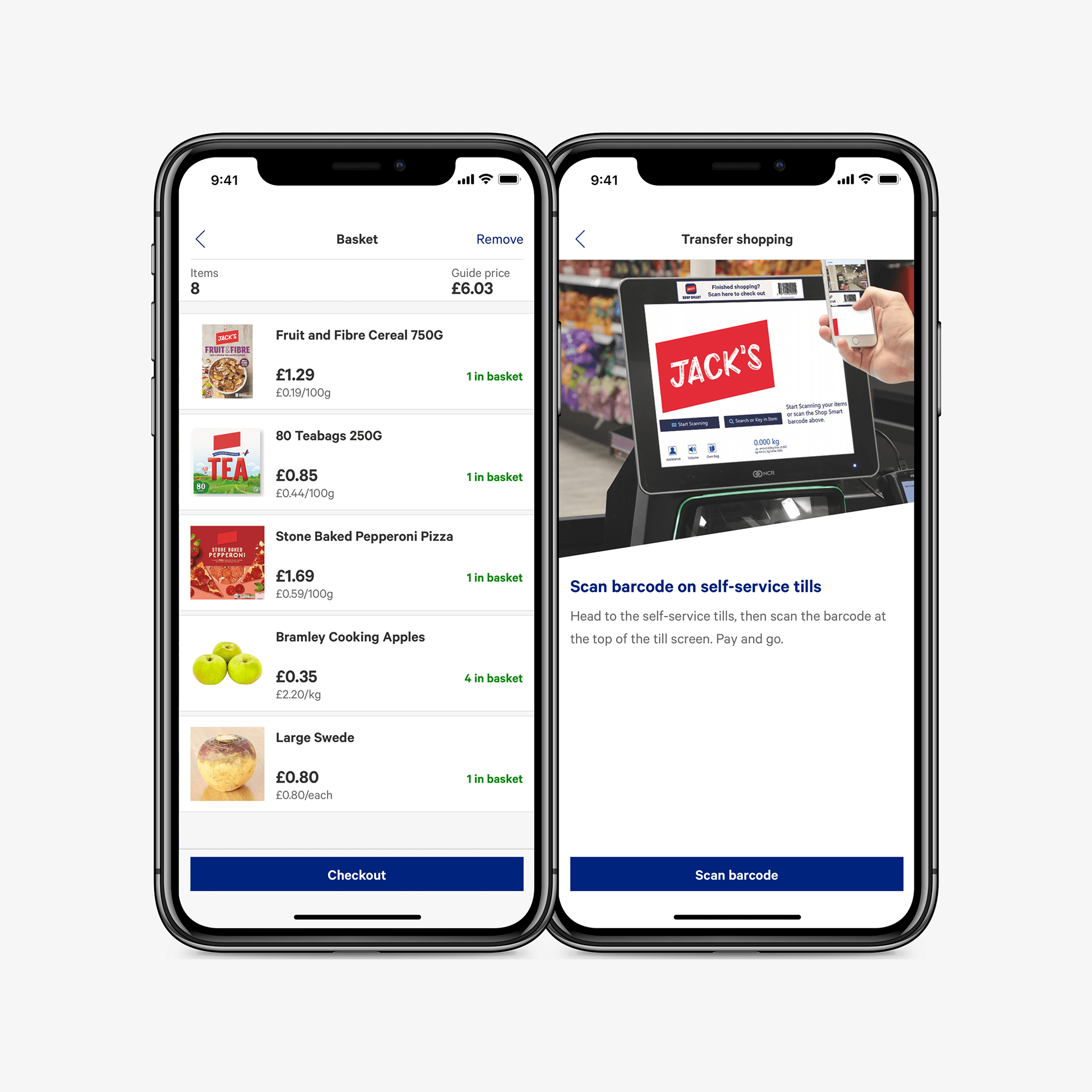
Examples above show the basket and the transfer to till on-boarding screen.
What does the future hold for Jack’s Shop Smart?
After the launch of Jack’s investment and priorities in the online part of the business changed, leaving Shop Smart with minimal support. Shop Smart has a bright future, and if given more focus can become a powerful tool for the discounter.
With limited number of stores Jack’s and Shop Smart is a perfect platform to test future in-store features before rolling out a Tesco version.