Jack Roles - Senior Designer.
The problem
The marketing sites were not accessible, they didn’t have focus states, heading structures, alt text and colour contrasts failed throughout the site. There were also no reusable templates or components for content, marketing would make custom designs for each page. An example of the inconsistency was that each page had its own custom 'download the app' banner at the bottom of each page. Not having a dedicated team to run these sites was causing major issues.
The marketing sites had bigger problems. New pages took days to design and build, which wasn’t meeting the demands of the marketing team. However, the biggest problem was that the new US site had multiple accessibility failures, and was facing legal challenges because of it.
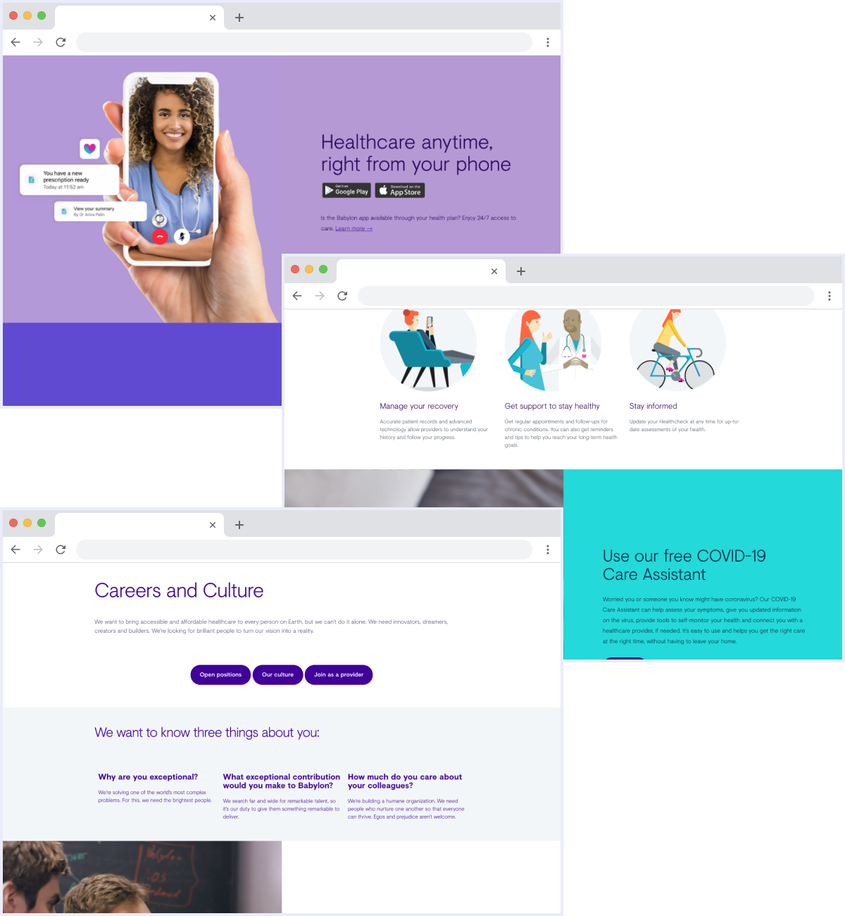
Examples of the old marketing site panels
To help fix these major issues the MarTech team was established and consisted of an engineer, PM, website manager and 2 accessibility experts. The team was created to fix these issues, with the aim of getting the site back to a solid and accessible foundation. The team was given a tight deadline to turn things around, with design only having 2 weeks to create reusable content panels ready for production.
Design approach
Components were designed using existing live content on the site, this provided a base to start design from and demonstrated the different types of content blocks that would be needed. It’s important to remember that this wasn’t a full redesign of the site. The purpose was to get the site back to a solid foundation and provide teams with components and templates so that they could deliver with speed and confidence going forward.
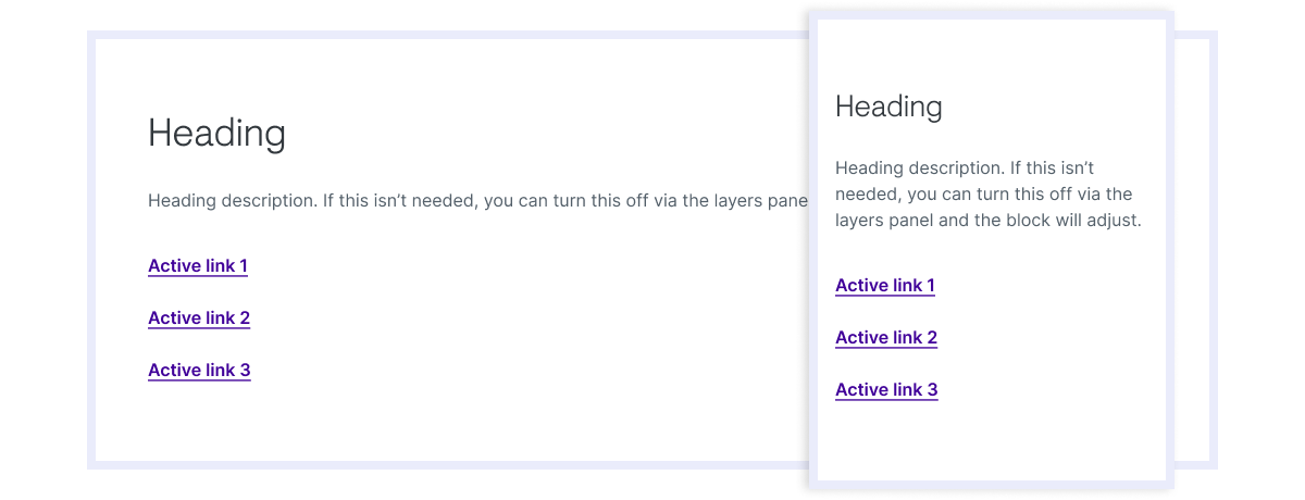
The design of the components were kept simple so that they were easy and flexible to use, the tight deadline also encouraged the idea of simplicity. I designed them as stackable blocks so that pages could be designed quickly and easily, with only content needed to be added.
Each component also had Figma's auto layout feature applied, which meant the panels would dynamically grow when the content was added.
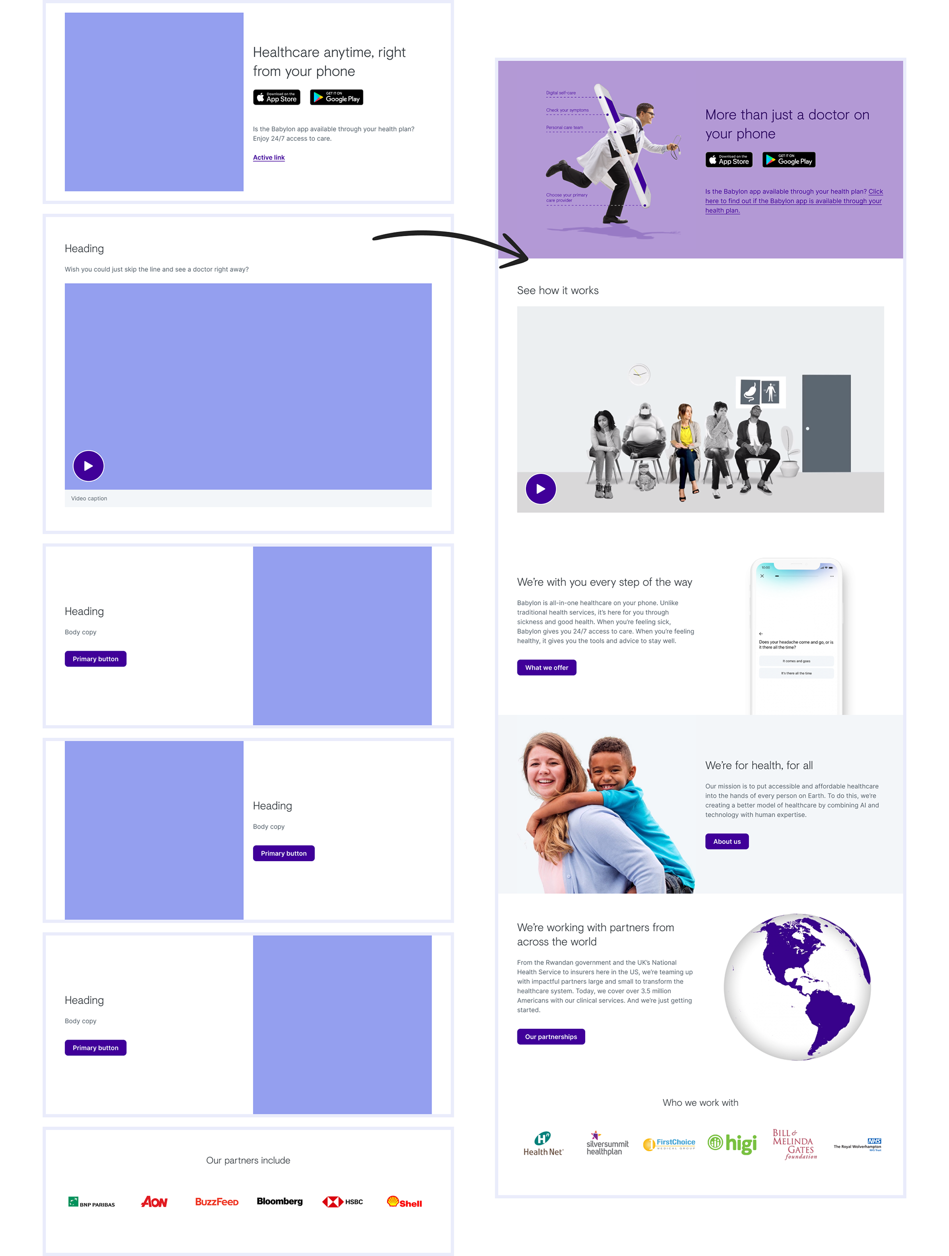
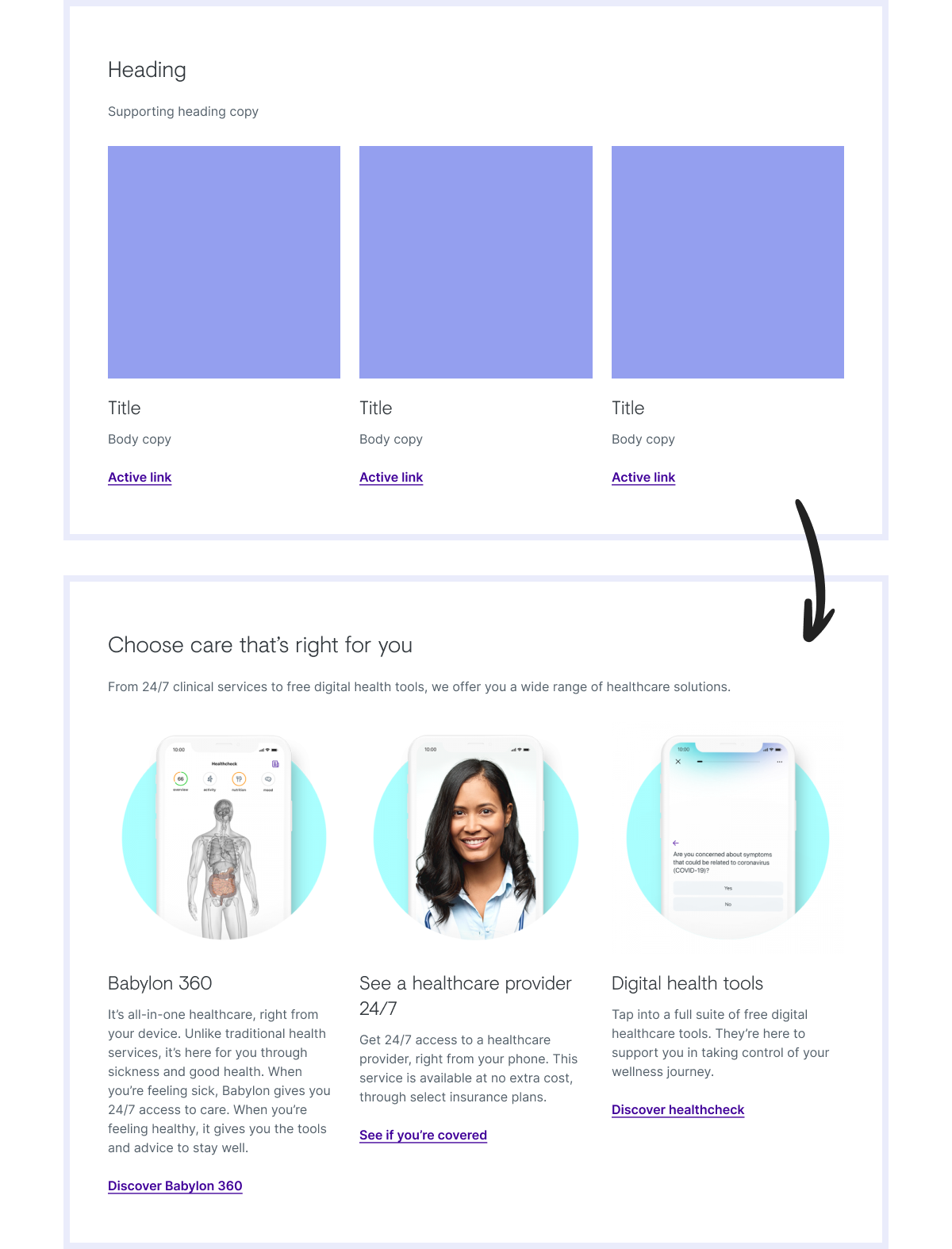
The new content panels being used on the updated Babylon US site
Designs reused the accessible web components defined by the DNA design system team, these included inputs, text styles, buttons, link styles and navigation patterns. The components also used the layout grid defined by the design system, allowing me to focus on the content structure. This helped with the speed of delivery and ensured we had consistency with the rest of our web components.
If the panels needed to be interactive, they would use the button and link language from the DNA design system.
The final components were then added to the web Figma library so that all web components are housed in a single component library.
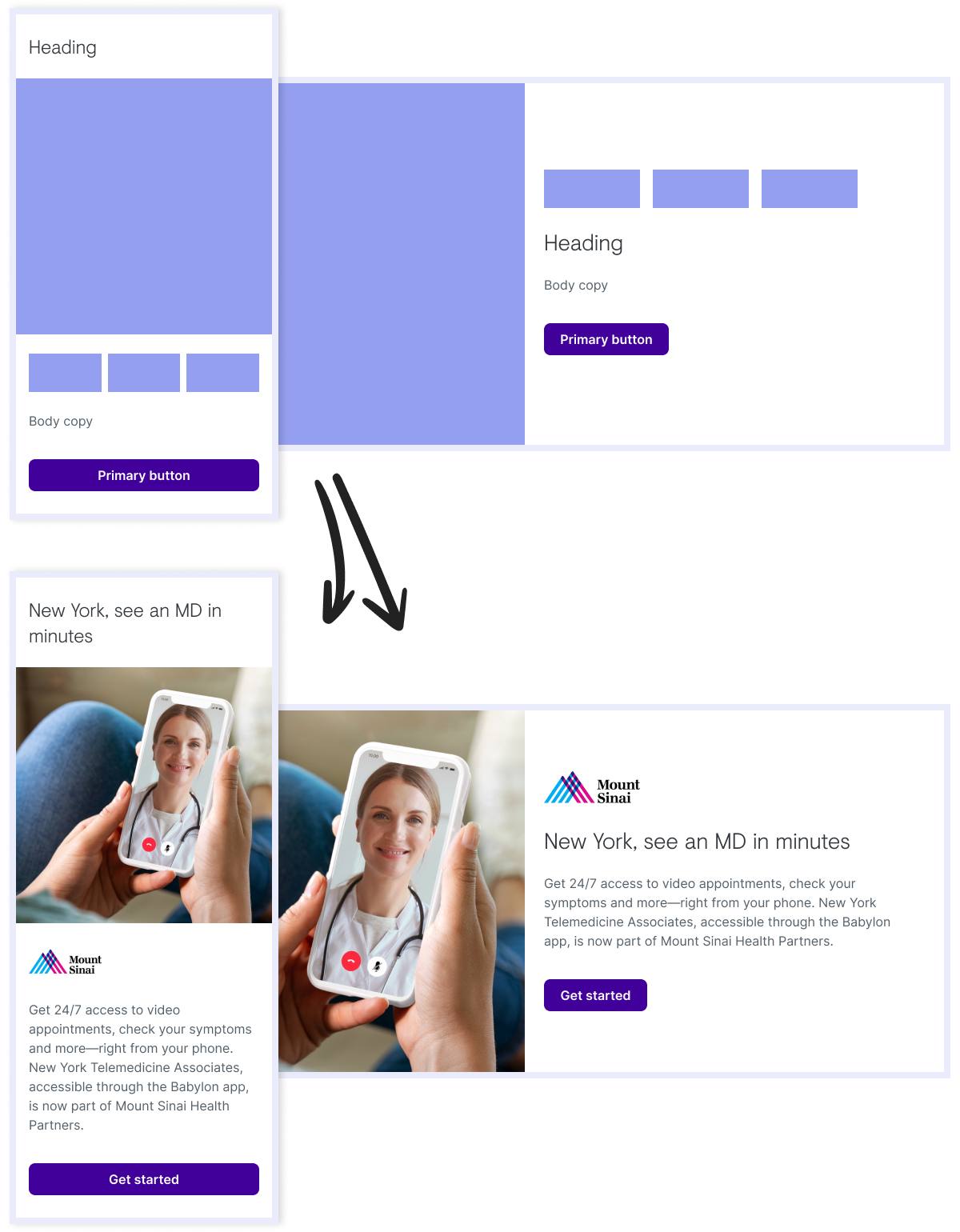
Hero banner with icons component, before and after content is applied
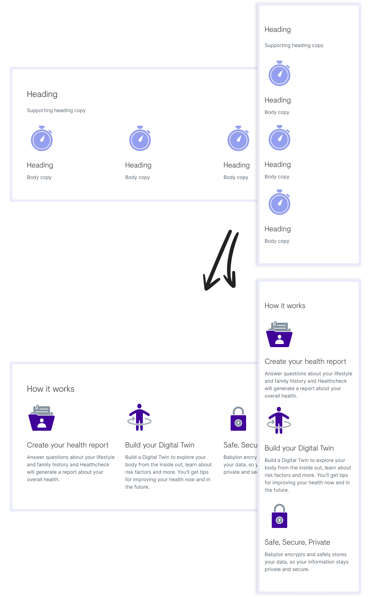
3 column graphics component, before and after content is applied
What was my impact?
• I led the design of these new content components for the Babylon marketing sites.
• I set up daily design reviews with the MarTech team to share progress, gather feedback and review any potential accessibility issues.
• Created a set of content components that would be used to update and create new pages going forward. Adding these to our core web library, so that all web components had one central library.
The results
What's next?
• We plan to make the component variants match the content platform, designers will then know what is possible for each panel on the CMS through Figma.
• Updating the header and footer to offer better navigation of the site.
More examples
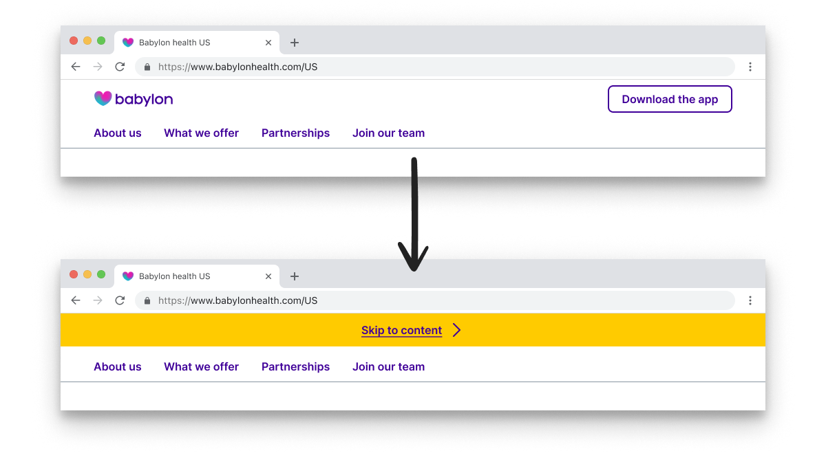
The skip navigation link component
3 column stamp component
Page content component with a list of links

Article post component
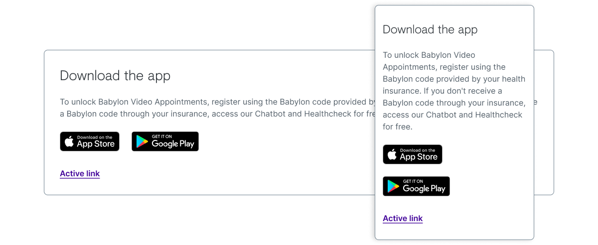
The new global 'download the app' component