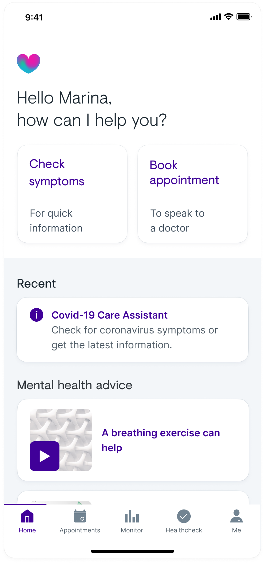
Example of the previous Babylon health app home screen, which contained the split background.
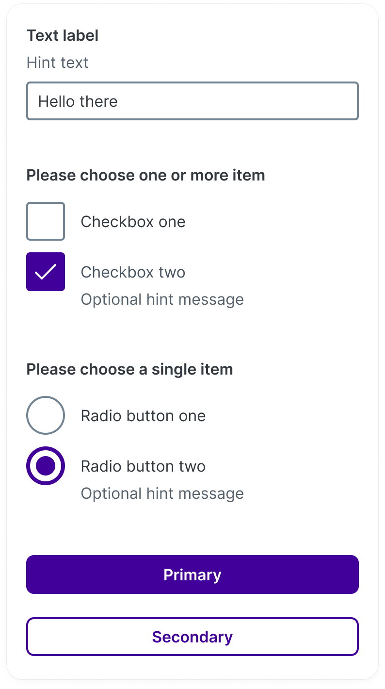
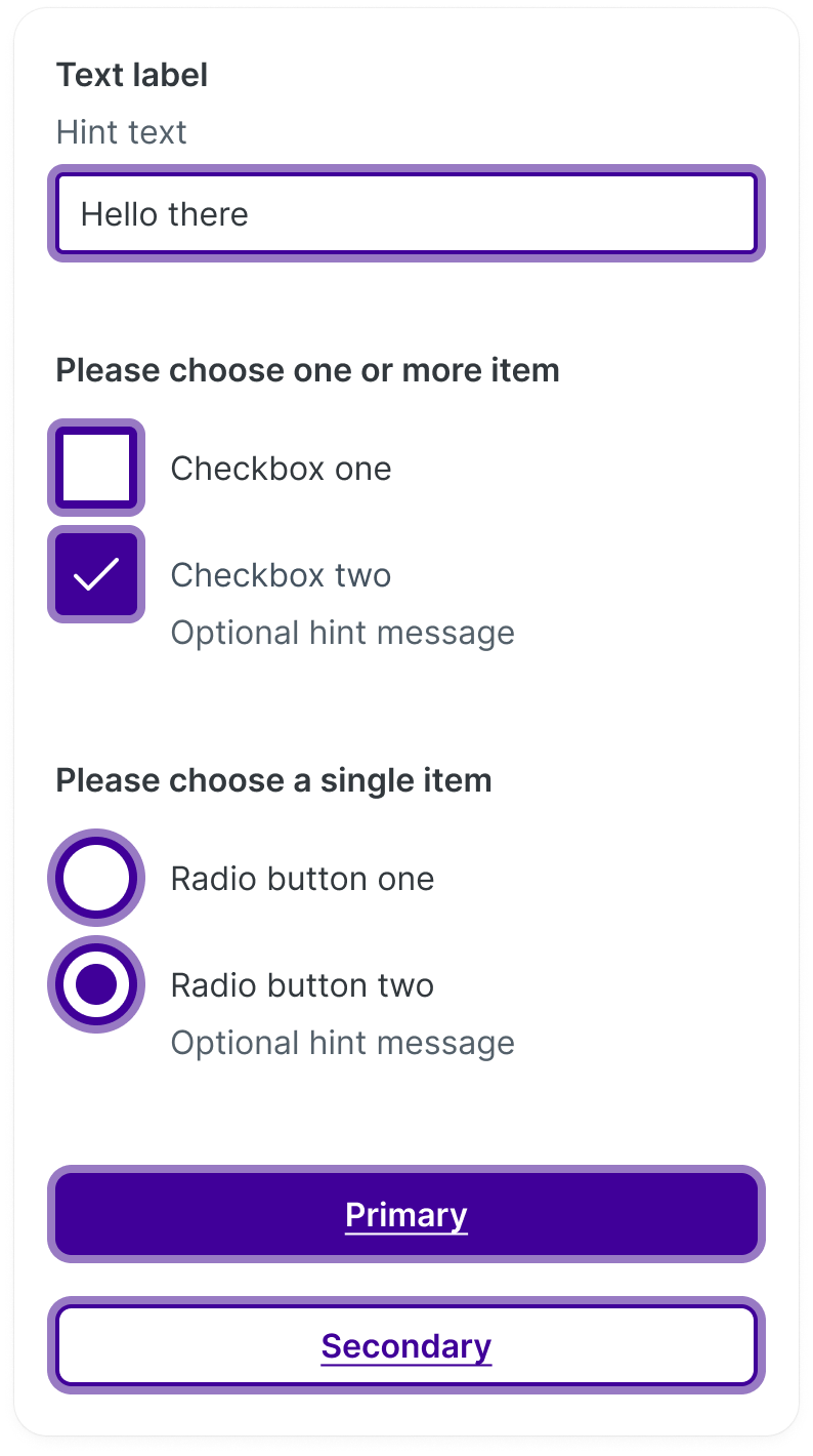
Default states of inputs and buttons in the old Babylon design language
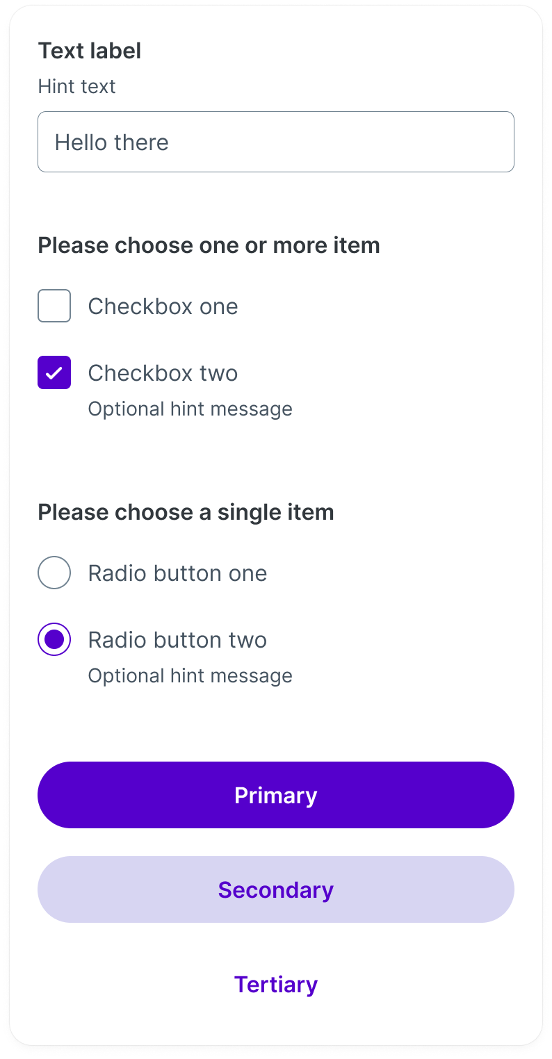
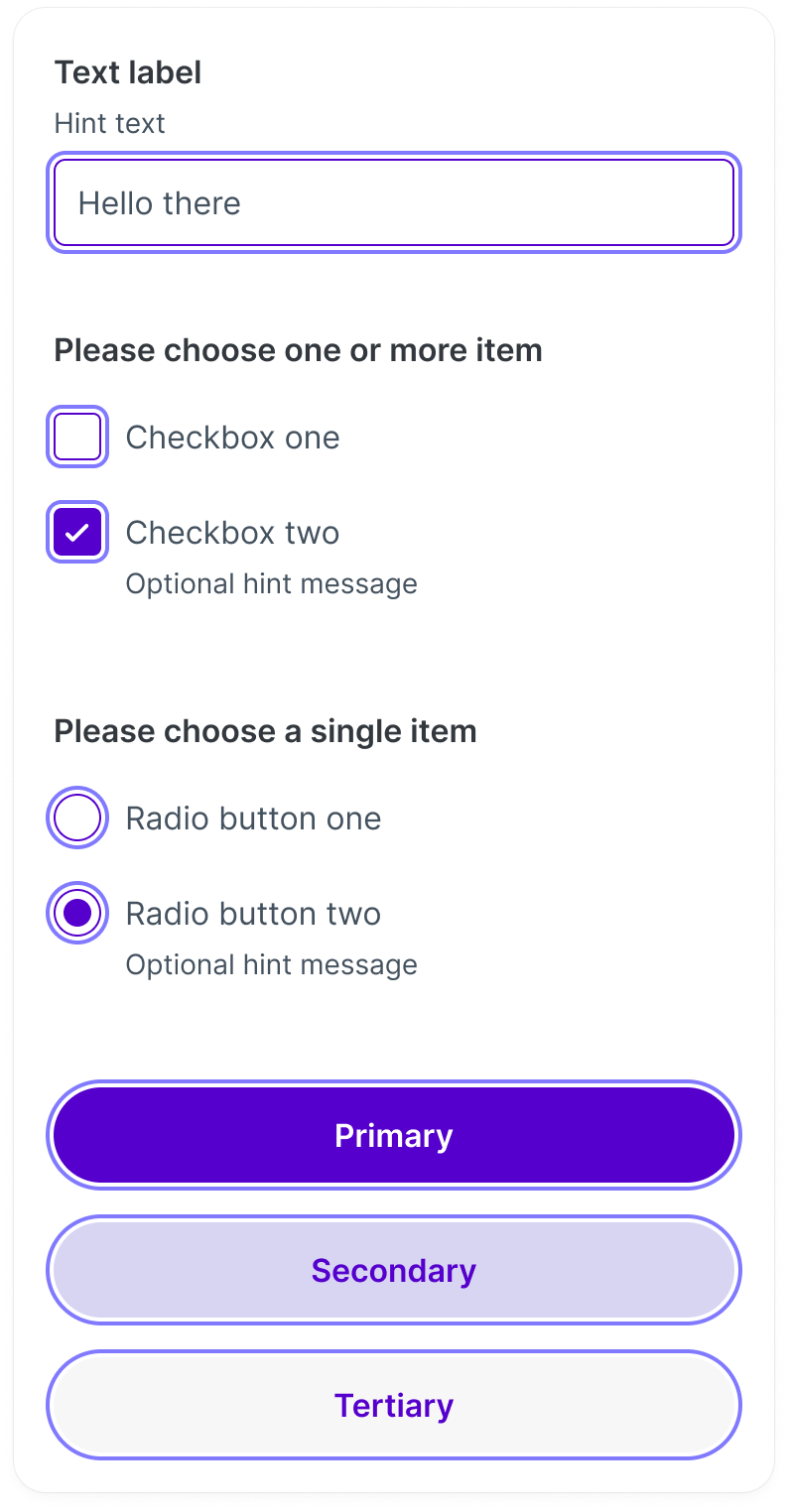
Default states of inputs and buttons in the new Babylon design language
Focus states of inputs and buttons in the old Babylon design language
Focus states of inputs and buttons in the new Babylon design language

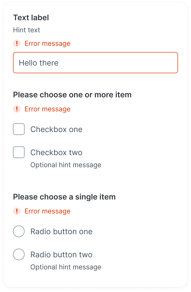
Error states of inputs and buttons in the old Babylon design language
Focus states of inputs and buttons in the new Babylon design language
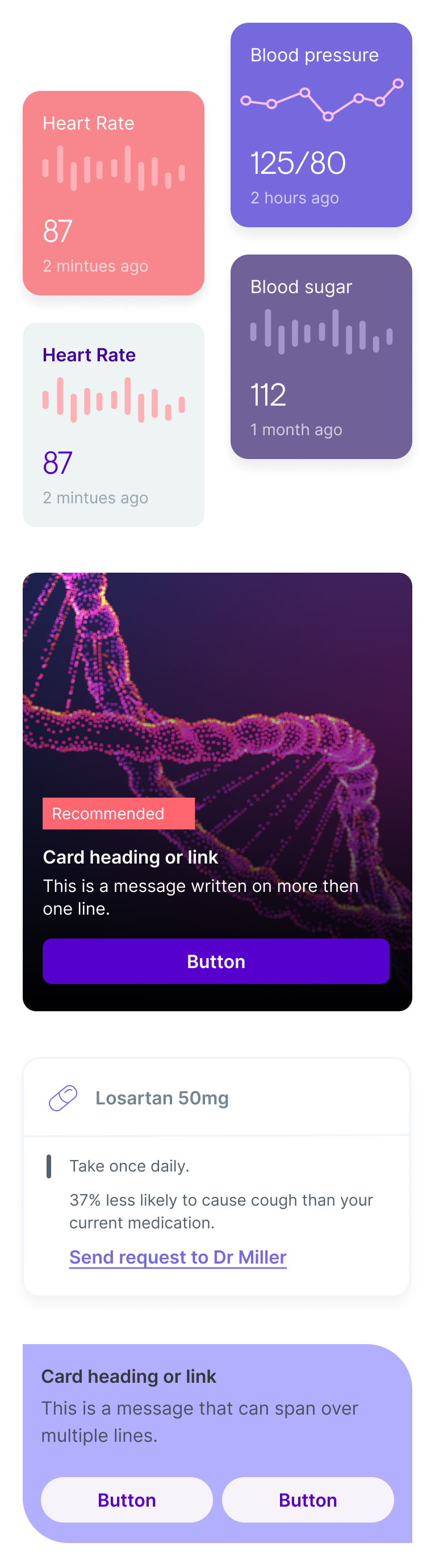
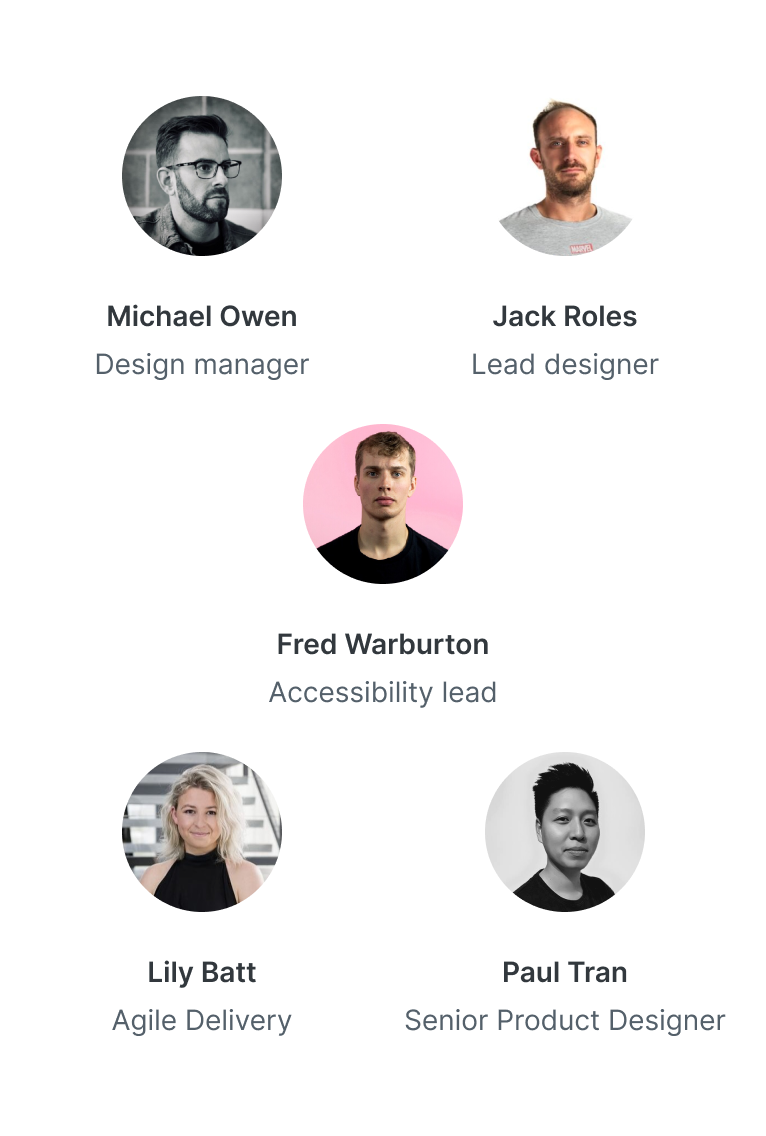
A small snippet of cards from our discovery work.
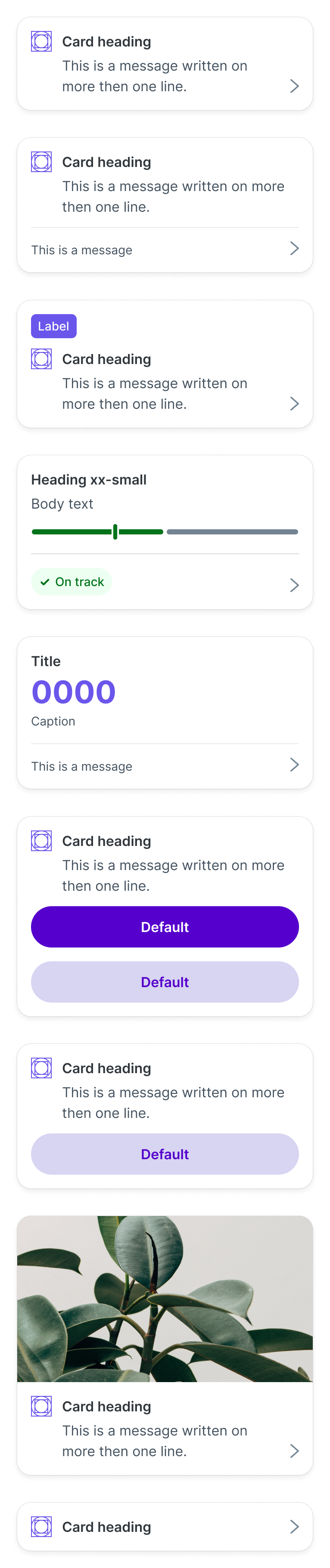
Final designs of the cards in light mode
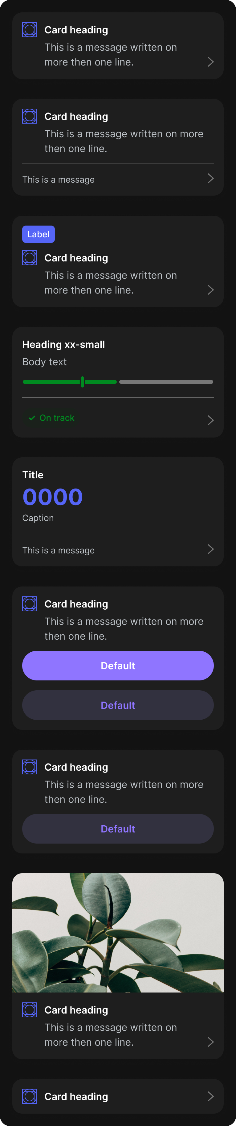
Final designs of the cards in dark mode
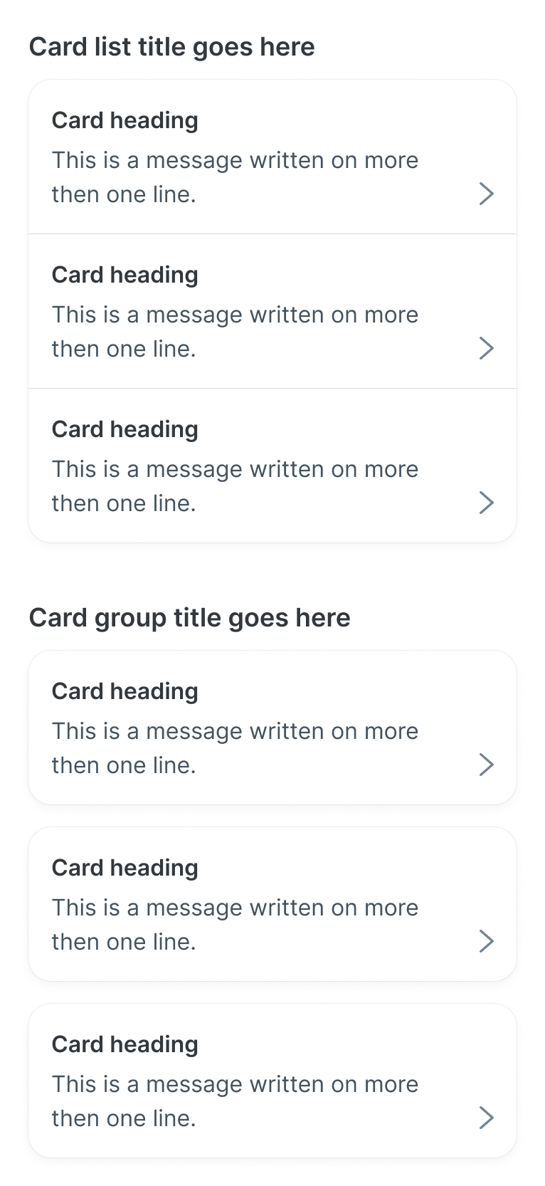
Examples of card lists and groups in light mode
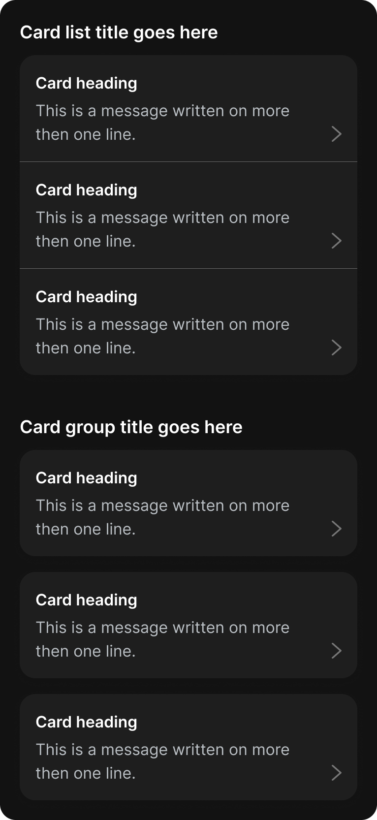
Examples of card lists and groups in dark mode
In terms of laying out our components, we positioned them on a templated frame. We wanted to include small snippets of documentation, links to Storybook and examples of where the component is used. The idea was to show our designers the information they required within Figma instead of linking them to an external source and out of the tool. The aim was to then include more detailed documentation to the DNA design system site, but due to time and resource constraints this would have to wait.
An example of one of our component frames. Please note, these components were created prior to the component properties feature.
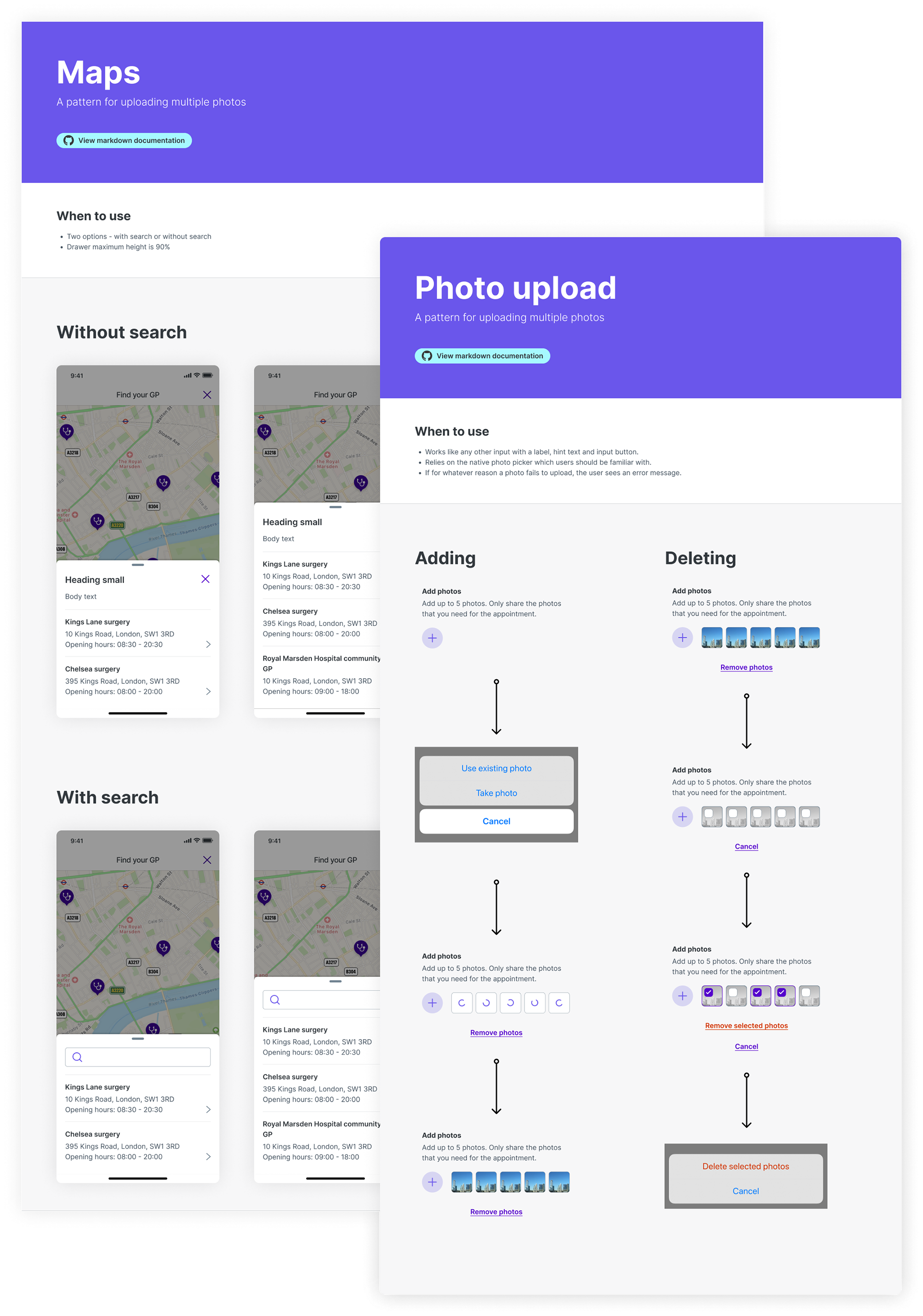
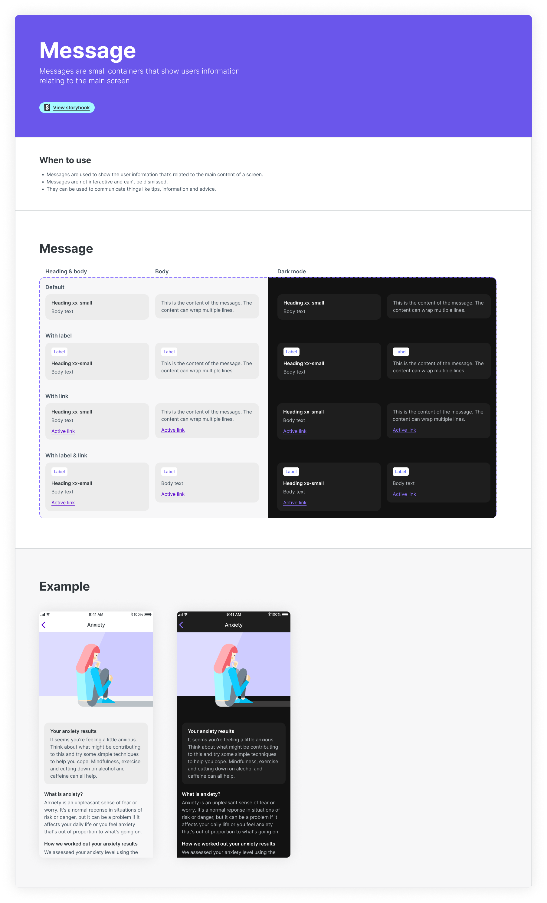
Example of our maps and photo upload patterns