Jack Roles - Senior Designer.
Why did the app need to be redesigned?
The existing app was responsible for 29% of the online revenue and growing. However the Xamarin platform had become fragile and was no longer sustaining the requirements of our users or the needs of the business. The plan was to re-platform to a fully native app, implement Tesco’s Digital Design Language (DDL) and align the app with the new brand expression.
The Tesco app on the Xamarin platform.
“We want the new app to innovate grocery shopping.”
That was the ambitious brief set by the leadership team before I joined the project. The team had already spent 6 months looking at innovation using Googles sprint method. Their ideas solely focused on new navigational approaches and bespoke interactions, steering too far away from the existing app.
Visually the designs looked appealing, but in practice they weren’t suitable or accessible for Tesco’s wide range of users, and in many cases weren’t realistic.
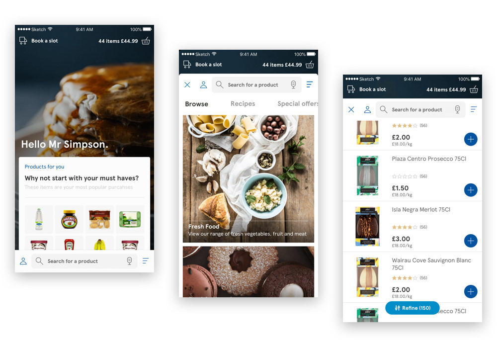
Concepts from the discovery phase of the project.
Prototype of one of the tested concepts. Video courtesy of Justin Stach
The discovery phase spent too much time focusing on animated interactions and not the user experience. With no clear objectives or design principles, the experience become disjointed and moved too far away from the existing app.
The process also highlighted how complex e-commerce is and could not be solved in 1-2 week sprints. Failure to communicate with engineering teams and ignoring the new brand expression meant that the focus of the project had to be made simpler.
Clear and measurable objectives.
It was important for the team to have clear and measurable objectives. These were important, not just to critique design but also to ensure the success of the final app and us as a team working on it. They allowed the whole team to establish standards and evaluate our performance throughout. To keep it simple we agreed on 3:
1. To re-platform the grocery app.
2. Design using native first.
3. Align designs with the updated Tesco brand (Digital Design Language).
Establishing the teams design principles.
As well as having clear objectives, it was important to have clear design principles. By having simple objectives and design principles, it gave the team something to evaluate their designs against. Using Tesco’s ‘Every Little Helps’ slogan we came up with the following principles:
Can every person use it?
Design inclusive products - start with best practice and common native patterns.
Is it ‘little’ enough?
Iterate tirelessly to communicate intent - don’t over embellish.
Does it help?
Solve the right problems - focus relentlessly on customer needs.
Working with The App Business.
Tesco appointed The App Business (TAB) as their expert mobile partner. They were originally appointed to accelerate the delivery of a brand new mobile service - Tesco Now.
After the successful delivery of Tesco Now, TAB’s developers, testers and agile delivery lead were retained to help with the delivery of the new groceries app. We requested the support of two designers from TAB, with Android experience, to assist myself and our design lead on the project.
TAB’s developers also led and guided our off shore development team in Bengalura, India. They were our gate keepers of development, ensuring that the app was built to an extremely high standard, consistent with our designs and functioned as intended.

The App Business logo.
We needed clear and open communication throughout.
This was essential. To begin with we made sure there was a design presence at every stand up and relevant meeting. By inserting design into the developer process, this showed that design were ready to support at any time.
Development is design. Working closer with developers ensured that designs were realistic and feasible.
It was also essential that we worked closely with the brand and DDL team. We had to communicate changes and alterations needed for the new brand expression to work on the app.
Thinking native first.
Instead of designing first and then building, we worked with our lead developers to establish all the components and features that existed within Apple and Androids native design language.
We then added Tesco’s design language on top, replacing fonts, icons and colours with those of the DDL.
Working this way helped us to add to our shared design language and would later help to ensure that a cell and component in design matched a cell and component in code.
Tesco's new brand expression.
A key objective was to ensure that the app was aligned with Tesco’s new brand expression. To achieve that we followed Tesco’s Design language (DDL). The DDL is a continually updated and expanding toolkit that designers use to design and build Tesco digital products consistently and quickly.
It was our responsibility to adopt and expand the language for the app and ensure that our addition would scale and work in the future.
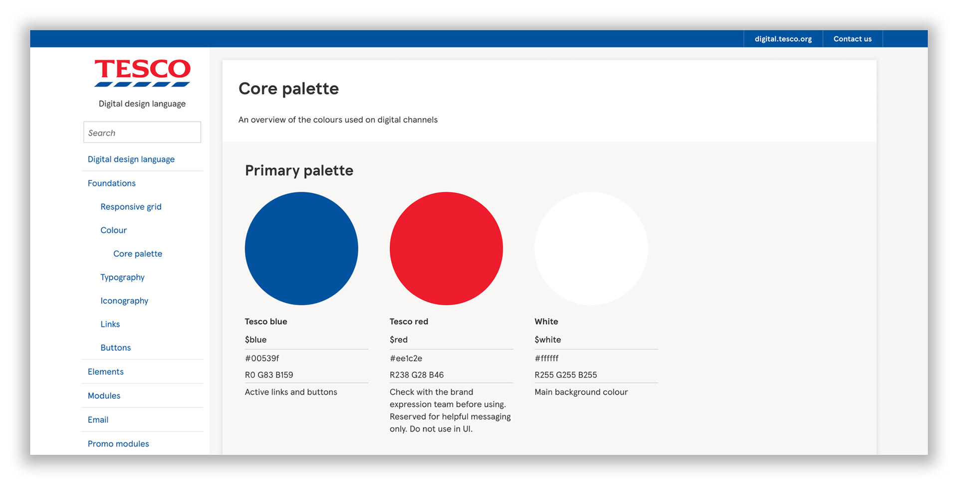
The design toolkit for Tesco's digital products.
Creating and using the centralised design system.
The biggest, and most exciting change in the project happened in September 2017 by utilising Sketches new feature, Libraries. Using the Beta, myself and two designers created a centralised design system - for iOS and Android using Sketch libraries.
The library has Tesco’s design language and native patterns at it’s core. The system encourages the re-use of components and elements when constructing pages or products.
By encouraging the reuse of components and elements it resulted in reduced duplication, greater design consistency and fewer designs coming back for amends and checks. You can read more on the design system here.
"How was it done on the current app?"
This was a common question throughout.
We had to concede that certain aspects of the existing app were done for a reason. Certain pages and journeys performed so well that they only needed to be aligned with the new brand expression. Aligning with parity ensured our output would be flexible enough to withstand the numerous edge-case scenarios that come with e-commerce.
Using Realtime Board, a realtime collaboration tool, we were able to compare current Xamarin flows with the new designs. Boards could be shared with anyone involved in the project, allowing the design team to work closer with product and development.
Realtime Board was also used for speedy grooming. Together we could identify opportunities, document potential problems and provide rationale behind ideas.
Moving to a tab navigation bar.
Search and favourites both deserved a place on the tab navigation bar. Together, favourites (40%) and search (33%) account for 73% of all basket adds. They are the two highest contributors to basket size on the Xamarin app.
We believed that by always being one tap away from favourites and an active search state, visits to both would be maintained with the current Xamarin app.
It was also believed that by always being one tap away from the favourites list would reduce user frustration. On Xamarin, to view the favourites list from the burger menu requires 3 taps.
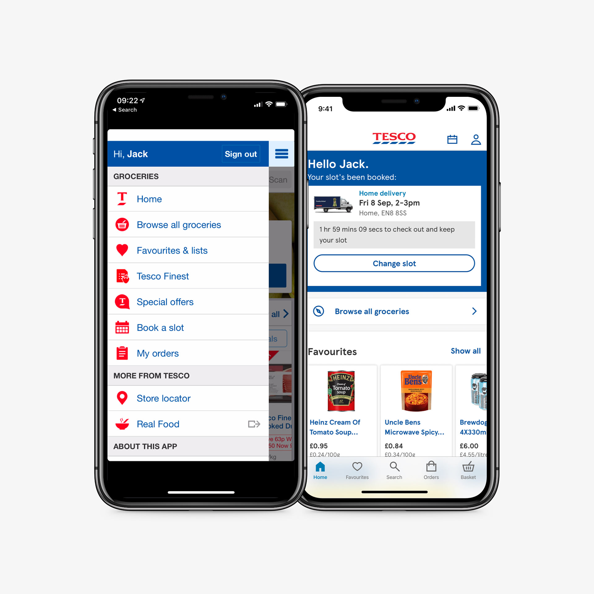
From burger menu to tab navigation.
Designing for accessibility from the start.
Tesco is a service, so it was our duty to ensure that the app could now be used by everyone. To start, we agreed that colours in the design system had to meet AA standards as a minimum and that text was legible at every size.
This encouraged thoroughness and rigour in our designs and that all designs followed the 3 design principles we had established. It was also essential to us that dynamic text and voiceover went into consideration within each JIRA ticket.
Dynamic text.
What did Apple think? 🍏
A few of us from the team met with Mike Stern, Apples platform experience and design evangelism manager, to run through the designs of the app and get some feedback.
Mike provided us with some valuable improvements and points to consider. For example, our original buttons were too big, Apple use minimum tap target size of 44px squared.
An interesting point was around the Home page. The term is very uninformative of what it actually means - “Browse” may be a better term, or something else.
Overall, they were really impressed - and needless to say, excited we were re-building the app natively.
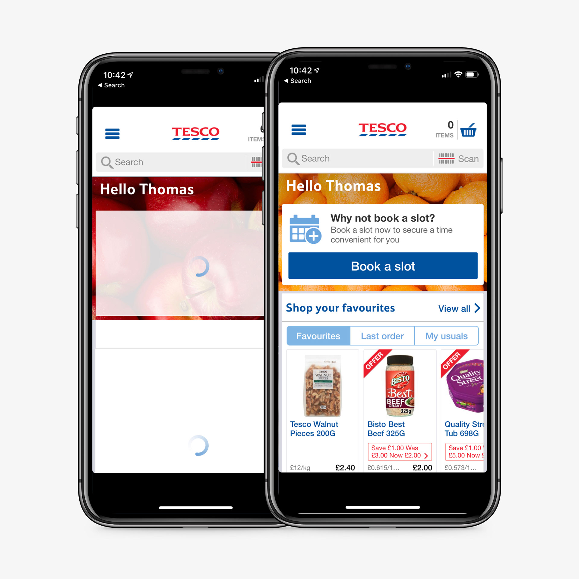
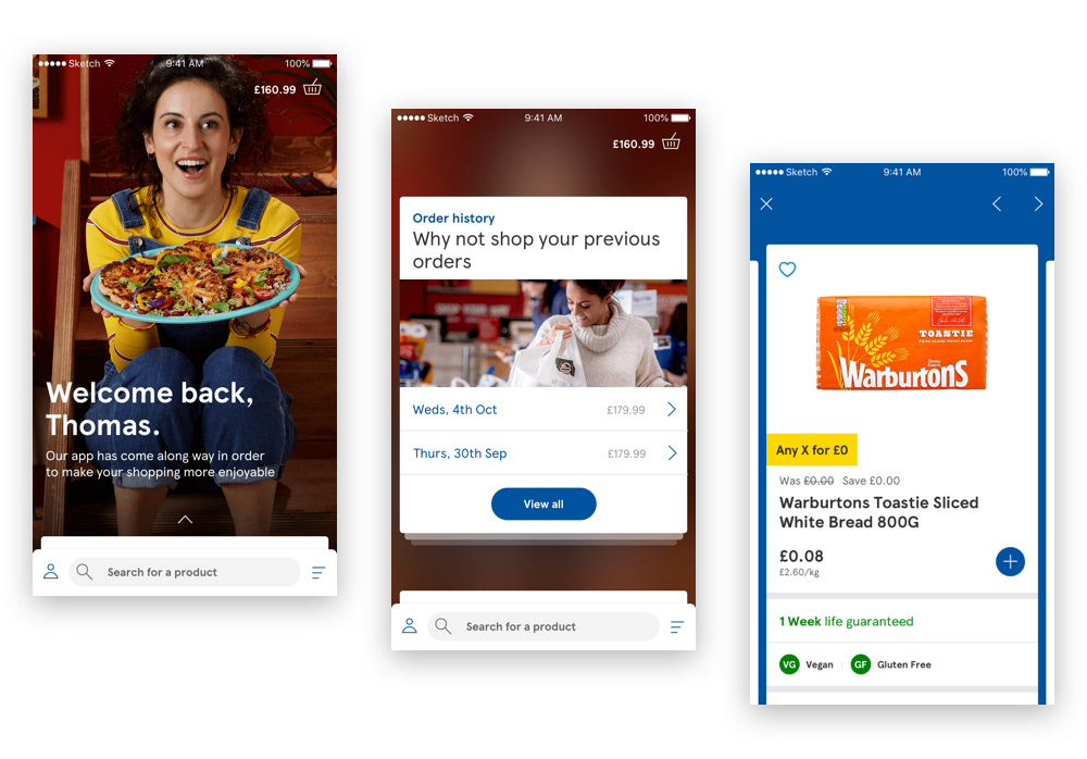
The end result.
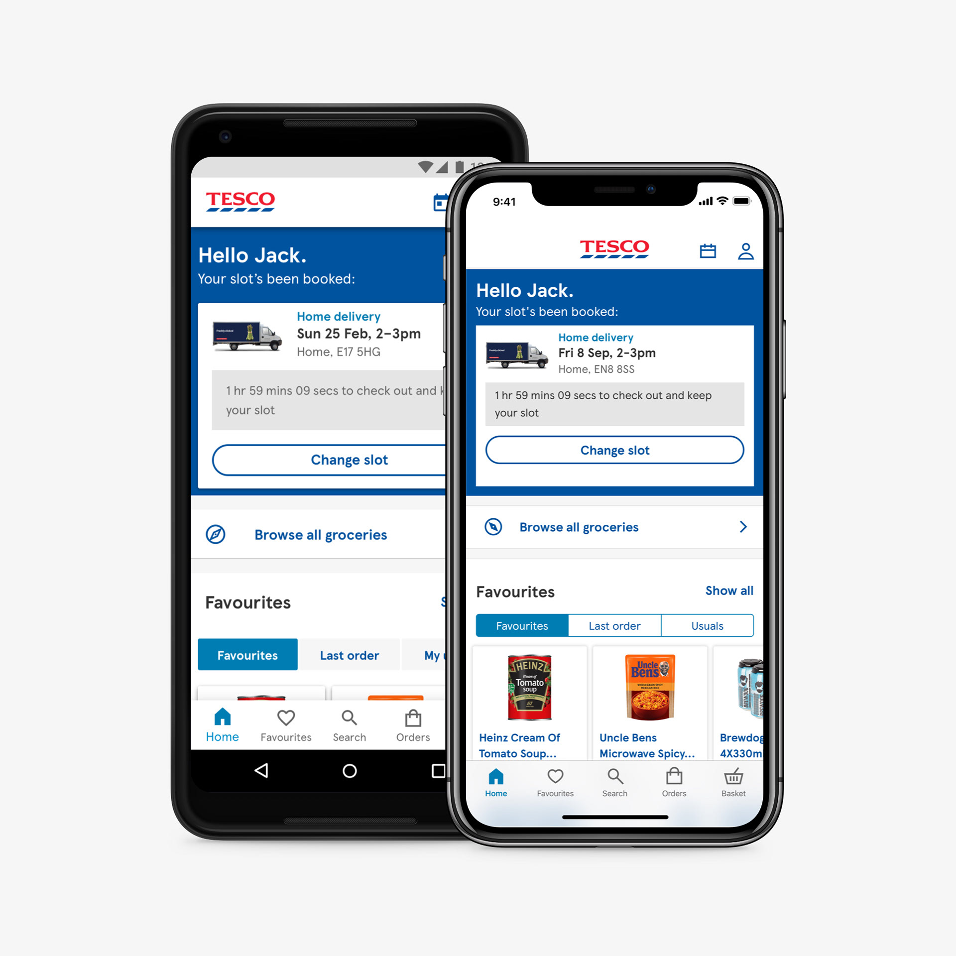
The home screen.
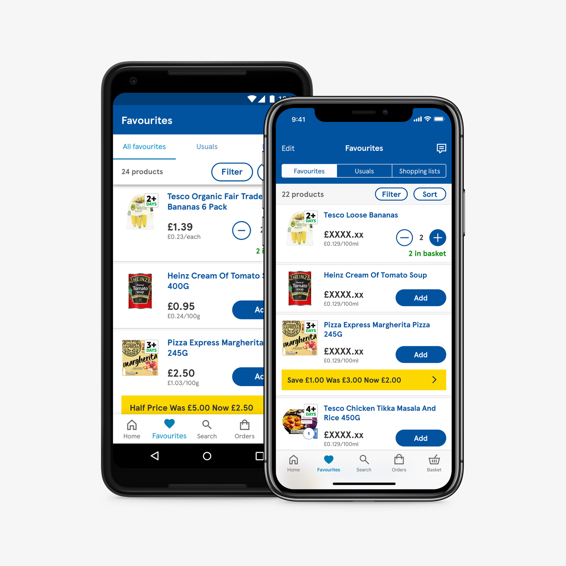
Favourites.
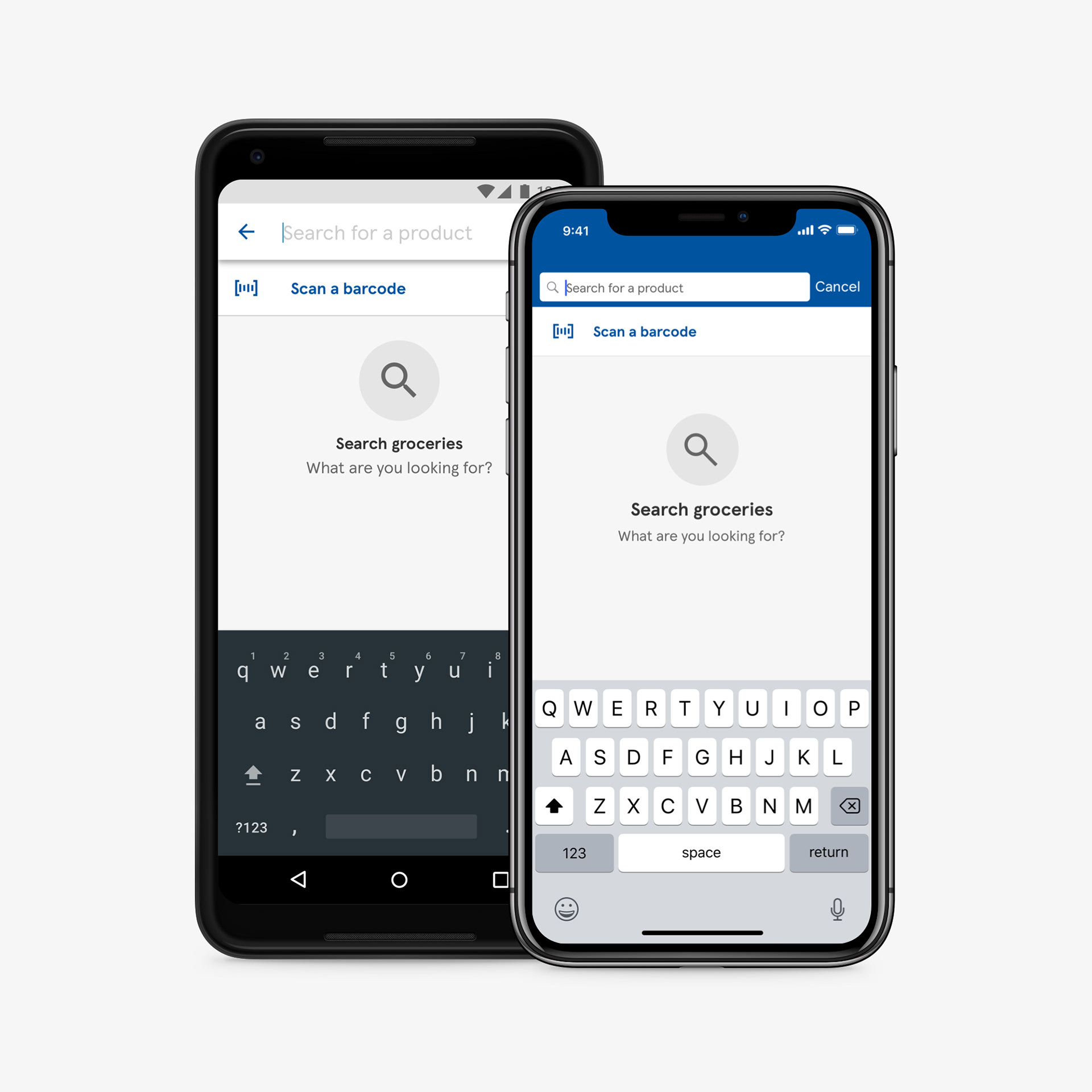
Search empty state.
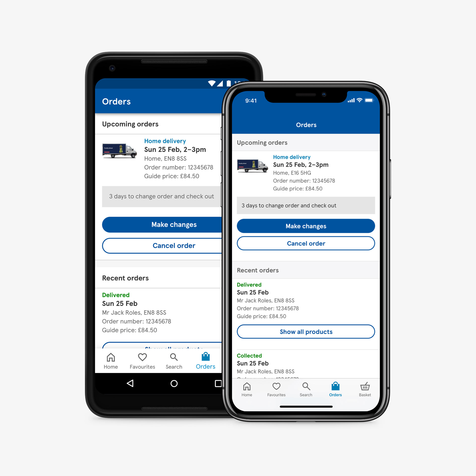
Orders.
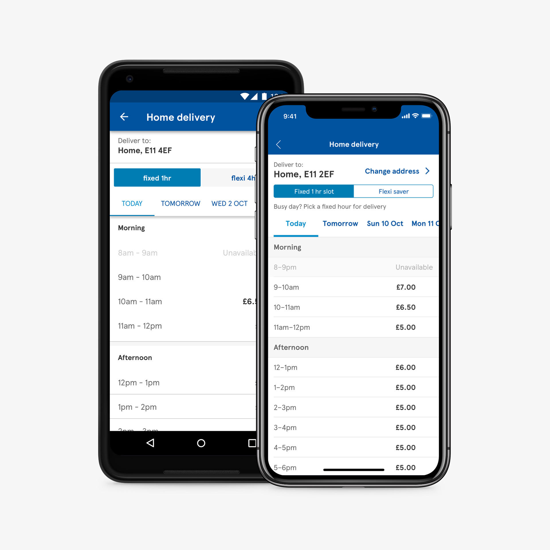
Book a slot matrix.
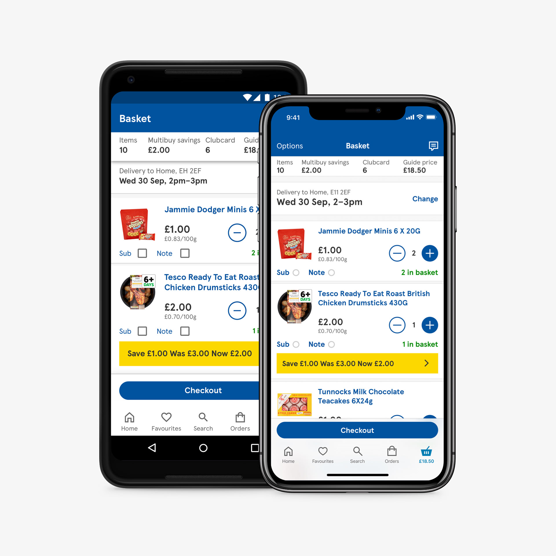
Basket.
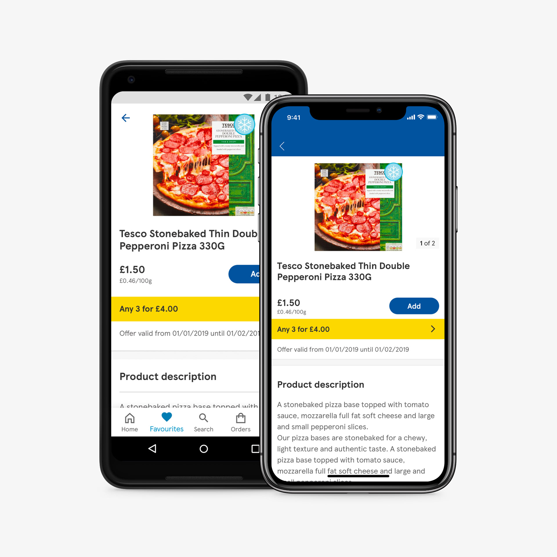
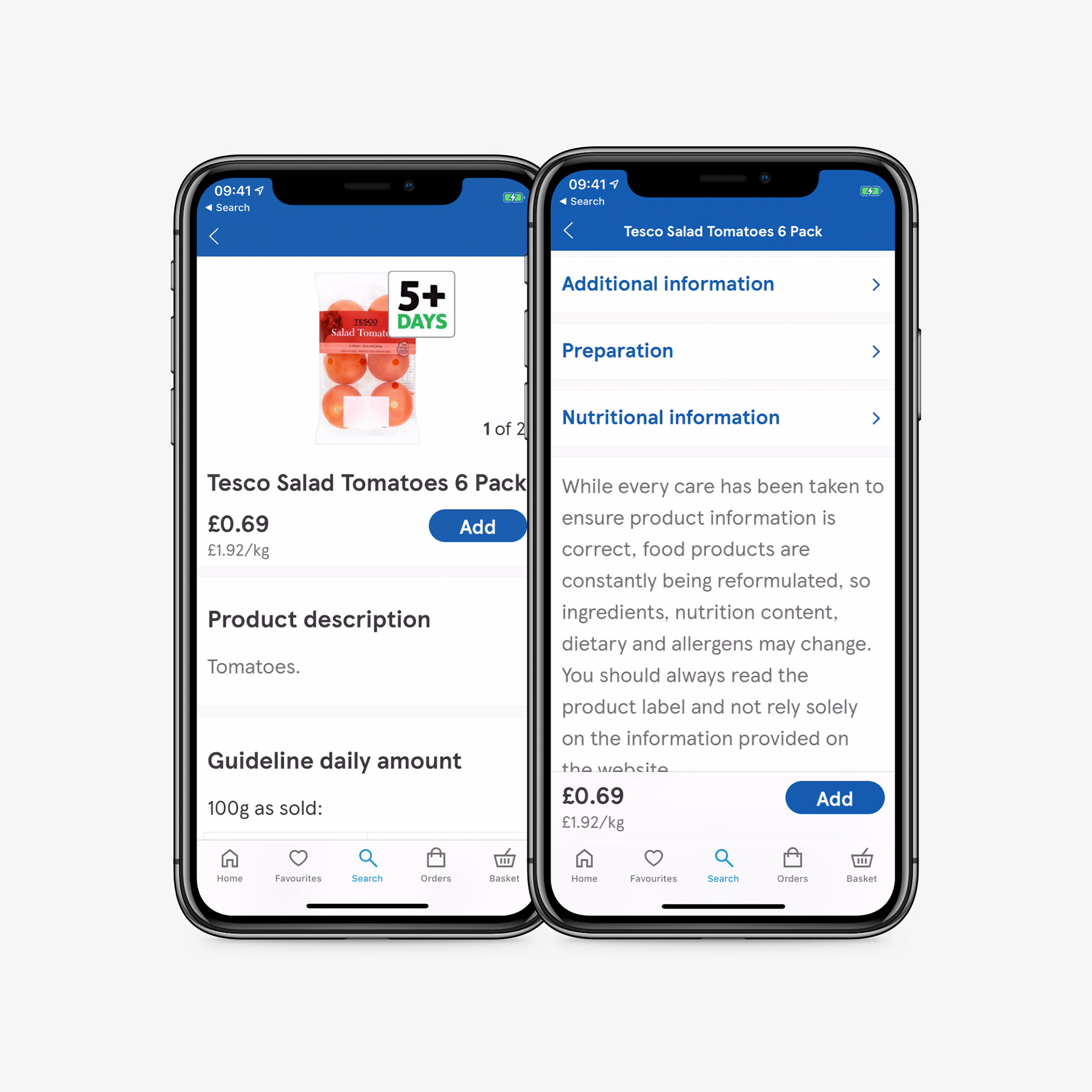
Product details page (PDP).
Thank you for looking.